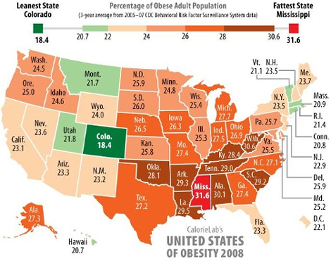
Yesterday I noticed that Richard Florida and Andrew Sullivan re-posted a map (created by calorielab) that color coded US states by the percentage of the population that was obese. I wondered if a similar map existed for Canada. Although there are several that highlight obesity – such as this one and this one – none are quite like this one. More importantly, none allowed for an easy and direct comparison between the two countries.
So I’ve taken the calorielab map, remade it, and extend it to all of North America by applying its criteria to Canadian provinces (and by using some Statistics Canada figures found here). The result is a “green armband” (of relative health) stretching across the continent.
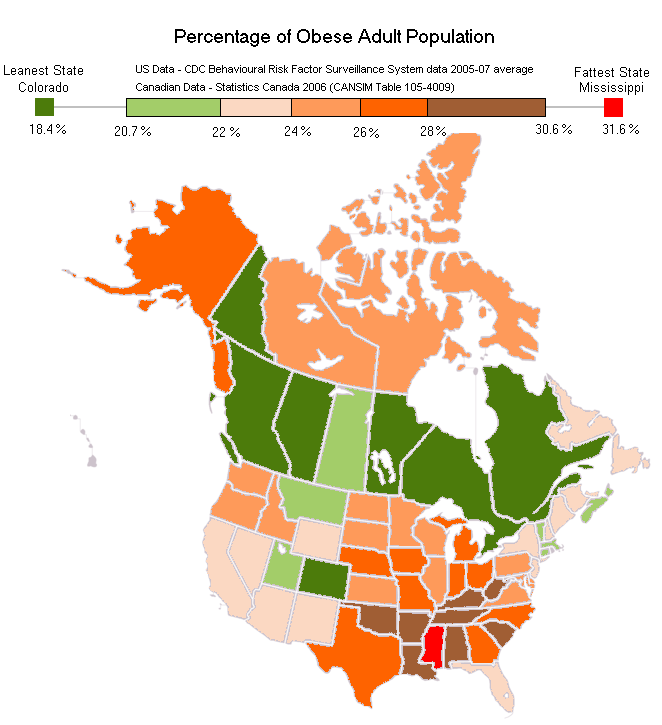
If Canadian provinces were ranked along side US States, they would rank 1st (BC), 2nd (QC), 3rd (ON), 4th (AB) and tied for 5th (MB) (YK) as the least obese provinces/states. Colorado would be the first American state placing 7th, with the provinces of NS in 8th and SK in 9th. PEI and NB would appear 15th and 16th and NFLD would appear 19th. NWT and NU would close out in 30th and 31st position. You can see the original chart at the bottom of this page.
Actually even some of the grimmer looking patches of Canada’s map have a silver lining. The Arctic Territories, specifically Nunavut (NU) and the North-West Territories (NWT), appear obese and thus unhealthy. However, Statistics Canada notes that obesity criterion for Inuit populations should be more relaxed since a high BMI does not appear to have the same health risk for Inuit as for non-Inuit. Interesting, eh?
And here is the original map I’m riffing off of…