Two years ago I saw that Richard Florida and Andrew Sullivan had re-posted a map created by calorielab that color-coded US states by weight.
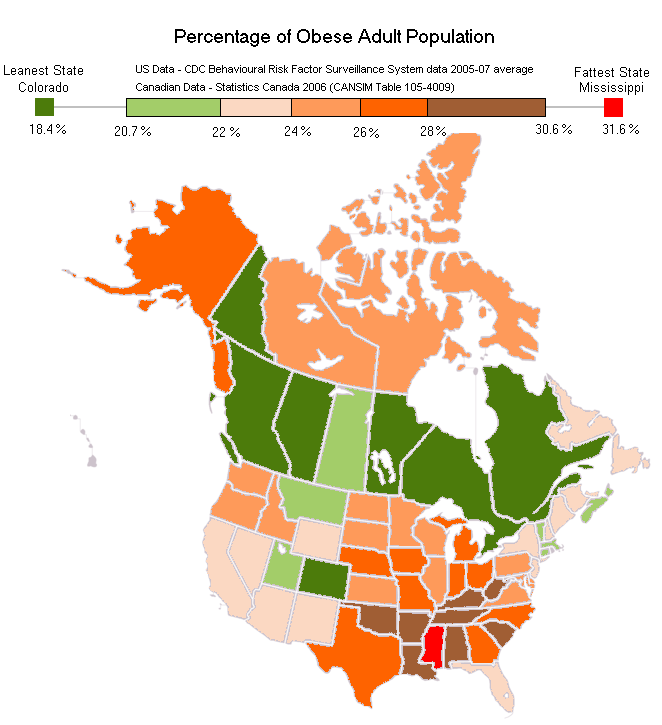
As I found it interesting I created a North America wide map the included Canadian data (knowing that it probably would be a perfect apple to apple comparisons). The map and subsequent blog post turned into one of my best viewed pages with well over 20,000 pageviews.
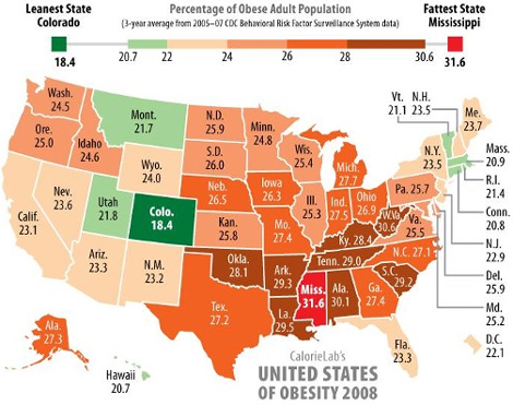
The very cool people over at Calorie Labs informed me that they have released an updated version of the American map (posted below, you can see the original at their site here). Not too much has changed, but after looking at the map I’ve a few comments.

Calorie lab’s release of an updated version of the map has triggered a few thoughts and some lessons that I think should matter to policy makers, health-care professionals and citizens in general. Here they are:
The Good
The amazing people at Calorie Lab. When I created the map 2 years ago I didn’t even check to see if their work was copyrighted. Although the data was public domain, I copied Calorielab’s colour palette as I was trying to create a “mash-up” of their work with Canadian data. I wanted the maps to look similar. My map was a derivative work.
Did the people at Calorielab freak out? No. Quite the opposite. They reached out, said thank you and asked if I needed help.
It seems this year they’ve gotten even cooler. I don’t remember if the original map’s license but with the publishing of their 2010 update they wrote:
CalorieLab’s United States of Obesity 2010 map is licensed for use by anyone in any media and can be downloaded in various formats (small GIF, large GIF, SVG, EPS).
There’s a line directed specifically at people like me. It says, please, use this map! Not only is the license open but they’ve provided it in lots of formats (Which is great cause two years I had to recreate the thing from scratch and it took hours).
So naturally you are wondering, where is David’s 2010 mashup-Northern American Fatness Index.
The Bad
The bad is that trying to find the Canadian data is a pain. A couple of times a year I get a cool idea for a visual or graph that Statistics Canada data might help me create. In minutes I’m on their webpage and, within 5 minutes, I’m walking away from my computer fearing I might throw it out the window.
StatCans website may be the worst, most inaccessible government website in the western world. Whatever data you are looking for always seems to be at least one more click away.
It spent an hour trying to find data that StatsCan allegedly wants me to find. (This in an era of google where I generally find data people don’t want me to find, in minutes). Ultimately, I think I found the relevant data on overwieight/obesity figures by province (but who knows! Should I be choosing peer group A, or B, or C, D, E, F, G? None of which have labels explaining what they mean!).
The Ugly
Sadly, it gets worse. Even if you a) locate the data on Statscan’s website and b) it is free, it will probably still be inaccessible. The only way the data can be viewed is with a Beyond 20/20 Professional Browser. You need to learn a new software package, one 99.9% of Canadians have never heard of, and that only works on a PC (I’m on a mac). The data I want is pretty simple, a CSV file, or even an Excel spreadsheet would be sufficient, something the average Canadian could access. But I guess it is not to be.
So I give up.
You win StatsCan. There are 10s of thousands of Canadians like me who would love to do interesting things with the data our tax dollars paid to collect, but even when your data is free and “open,” it isn’t. You’ve enjoyed tremendous support in the last month from those Canadians who understand why you are important (including me) but many Canadians have had to go up a steeper learning curve around why they should care. I might suggest they’d have gotten up that curve faster if they too could have used your data.
Myself, healthcare professionals, students and countless others could paint innumerable stories explaining Canadians and Canada to one another – helping us grasp our history, our social and health challenges, as well simply who we are. But we can’t.
In the end I’m still one of your biggest supporters, but frankly even I feel alienated.
Note: If someone wants to help me get this data, I’ll take a cut at recreating the map again, otherwise, as I said before. I give up.
