Category Archives: reviews

My LRC Review of "When the Gods Changed" and other recommended weekend readings

This week, the Literary Review of Canada published my and Taylor Owen’s review of When the Gods Changed: The Death of Liberal Canada by Peter C. Newman. For non-Canadians Peter Newman is pretty much a legend when it comes to covering Canadian history and politics, he was editor of the country’s largest newspaper and main news magazine and has published over 35 books. I also think the review will be of interest to non-Canadians since I think the topic of the decline of Liberal Canada are also true for a number of other countries experiencing more polarized politics.

Some other articles I’ve been digesting that I recommend for some Friday or weekend reading:

Why China’s Political Model Is Superior

This one is a couple of months old, but it doesn’t matter. Fascinating read. For one it shows the type of timelines that the Chinese look at the world with. Hint. It is waaayyyy longer than ours. Take a whiff:

In Athens, ever-increasing popular participation in politics led to rule by demagogy. And in today’s America, money is now the great enabler of demagogy. As the Nobel-winning economist A. Michael Spence has put it, America has gone from “one propertied man, one vote; to one man, one vote; to one person, one vote; trending to one dollar, one vote.” By any measure, the United States is a constitutional republic in name only.

Unattractive Real Estate Agents Achieve Quicker Sales

Before getting serious on you again, here’s a lighter more interesting note. I often comment in talks I give that real estate agents rarely use data to attract clients – mostly just pictures of themselves. Turns out… there might be more data in that then I thought! Apparently less attractive agents sell homes faster and work harder. More attractive agents take longer, but get more money. Food for thought here.

Andrew Coyne: Question isn’t where conservatism is going, but where has it gone

Another oldie but a goody. Liberal Canada may be dead, but it appears that Conservative Canada isn’t in much better shape. I’ve always enjoyed Coyne and feel like he’s been sharper than usual of late (since moving back to the National Post). For Americans, there may be some interesting lessons in here for the Tea Party movement. Canada experienced a much, much lighter form of conservative rebellion with creation of the Reform Party in the late 80s/early 90s which split off from establishment conservatives. Today, that group is now in power (rebranded) but Coyne assesses that much of what they do has been watered down. But not everything… to the next two articles!

Environmental charities ‘laundering’ foreign funds, Kent says

Sadly, Canada’s “Environment” Minister is spending most of his time attacking environmental groups. The charge is that they use US money to engage in advocacy against a pipeline to be built in Canada. Of course “Laundering” is a serious charge (in infers illegal activity) and given how quick the Conservatives have been in suing opponents for libel Kent had better be careful the stakeholders will adopt this tactic. Of course, this is probably why he doesn’t name any groups in particular (clever!). My advice, is that all the groups named by the Senate committee should sue him, then, to avoid the lawsuit he’d have to either a) back down from the claim altogether, or b) be specific about which group he is referring to to have the other suits thrown out. Next headline… to the double standard!

Fraser Institute co-founder confirms ‘years and years’ of U.S. oil billionaires’ funding

Some nifty investigative work here by a local Vancouver reporter finds that while the Canadian government believes it is bad for environmental groups to receive US funds for advocacy, it is apparently, completely okay for Conservative groups to receive sums of up to $1.7M from US oil billionaires. Ethical Oil – another astro-turf pro-pipeline group does something similar. It receives money from Canadian law firms that represent benefiting American and Chinese oil interests. But that money is labelled “Canadian” because it is washed through Canadian law firms. Confused? You should be.

What retail is hired to do: Apple vs. IKEA

I love that Clay Christiansen is on twitter. The Innovator’s Dilemma is a top 5 book of all time for me. Here is a great break down of how IKEA and Apple stores work. Most intriguing is the unique value proposition/framing their stores make to consumers which explains their phenomenal success as why they are often not imitated.

Data.gc.ca – Data Sets I found that are interesting, and some suggestions

Yesterday was the one year anniversary of the Canadian federal government’s open data portal. Over the past year government officials have been continuously adding to the portal, but as it isn’t particularly easy to browse data sets on the website, I’ve noticed a lot of people aren’t aware of what data is now available (self included!). Consequently, I want to encourage people to scan the available data sets and blog about ones that they think might be interesting to them personally, to others, or to communities of interests they may know.

Such an undertaking has been rendered MUCH easier thanks to the data.gc.ca administrators decision to publish a list of all the data sets available on the site. Turns out, there are 11680 data sets listed in this file. Of course, reviewing all this data took me much longer than I thought it would! (and to be clear, I didn’t explore each one in detail), but the process has been deeply interesting. Below are some thoughts, ideas and data sets that have come out of this exploration – I hope you’ll keep reading, and that it will be of interest to ordinary citizens, prospective data users and to managers of open government data portals.

TagCloud_GC_OpenData

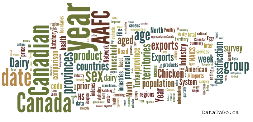
A TagCloud of the Data Sets on data.gc.ca

Some Brief Thoughts on the Portal (and for others thinking about exploring the data)

Trying to review all the data sets on the portal is a enormous task and trying to do it has taught me some lessons about what works and doesn’t. The first is that, while the search function on the website is probably good if you have a keyword or a specific data you are looking for, it is much easier to browse the data in an excel than on the website. What was particularly nice about this is that, in excel, the data was often clustered by type. This made easy to spot related data sets – a great example of this when I found the data on “Building permits, residential values and number of units, by type of dwelling” I could immediately see there were about 12 other data sets on building permits available.

Another issue that became clear to me is the problem of how a data set is classified. For example, because of the way the data is structured (really as a report) the Canadian Dairy Exports data has a unique data file for every month and year (you can look at May 1988 as an example). That means each month is counted as a unique “data set” in the catalog. Of course, French and English versions are also counted as unique. This means that what I would consider to be a single data set “Canadian Dairy Exports Month Dairy Year from 1988 to present” actually counts as 398 data sets. This has two outcomes. First, it is hard to imagine anyone wants the data for just one month. This means a user looking for longitudinal data on this subject has to download 199 distinct data sets (very annoying). Why not just group it into one? Second, given that governments like to keep score about how many data sets they share – counting each month as a unique data set feels… unsportsmanlike. To be clear, this outcome is an artifact of how Agriculture Canada gathers and exports this data, but it is an example of the types of problems an open data catalog needs to come to grips with.

Finally, many users – particularly, but not exclusively, developers – are looking for data that is up to date. Indeed, real time data is particularly sexy since its dynamic nature means you can do interesting things with it. This it was frustrating to occasionally find data sets that were no longer being collected. A great example of this was the Provincial allocation of corporate taxable income, by industry. This data set jumped out at me as I thought it could be quite interesting. Sadly, StatsCan stopped collecting data on this in 1987 so any visualization will have limited use today. This is not to say data like this should be pulled from the catalog, but it might be nice to distinguish between datasets that are being collected on an ongoing basis versus those that are no longer being updated.

Data Sets I found Interesting

Just quickly before I begin, some quick thoughts on my very unscientific methodology for identifying interesting data sets.

  • First, browsing the data sets really brought home to me how many will be interesting to different groups – we really are in the world of the long tail of public policy. As a result, there is lots of data that I think will be interesting to many, many people that is not on this list.
  • Second, I tried to not include too much of StatsCan’s data. StatsCan data already has a fairly well developed user base. And while I’m confident that base is going to get bigger still now that its data is free, I figure there are already a number of people who will be sharing/talking about it
  • Finally, I’ve tried to identify some data sets that I think would make for good mashups or apps. This isn’t easy with federal government data sets since they tend do be more aggregate and high-level than say municipal data sets… but I’ve tried to tease out what I can. That said, I’m sure there is much, much more.

New GeoSpatial API!

So the first data set is a little bit of a cheat since it is not on the open data portal, but I was emailed about it yesterday and it is so damn exciting, I’ve got to share it. It is a recently released public BETA of a new RESTful API from the very cool people at GeoGratis that provides a consolidated access point to several repositories of geospatial data and information products including GeoGratis, GeoPub and Mirage. (huge thank you to the GeoGratis team for sending this to me).

Documentation can be found here (and in french here) and a sample search client that demonstrates some of its functionality and how to interact with the API can be found here. Formats include ATOM, HTML Fragment, CSV, RSS, JSON, and KML. (So you can see results – for example – in Google Earth by using the KML format (example here).

I’m also told that these fine folks have been working on geolocation service, so you can do sexy things like search by place name, by NTS map or by the first three characters of a postal code. Documentation will be posted here in english and french. Super geeks may notice that there is a field in the JSON called CGNDBkey. I’m also told you can use this key to select an individual placename according to the Canadian Geographic names board. Finally, you can also search all their Metadata through search engines like google (here is a sample search for gold they sent me).

All data is currently licensed under GeoGratis.

The National Pollutant Release Inventory

Description: The National Pollutant Release Inventory (NPRI) is Canada’s public inventory of pollutant releases (to air, water and land), disposals and transfers for recycling.

Notes: This is the same data set (but updated) that we used to create emitter.ca. I frankly feel like the opportunities around this data set, for environmentalists, investors (concerned about regulatory and lawsuit risks), the real estate industry, and others, is enormous. The public could be very interested in this.

Greenhouse Gas Emissions Reporting Program

Description: The Greenhouse Gas Emissions Reporting Program (GHGRP) is Canada’s legislated, publicly-accessible inventory of facility-reported greenhouse gas (GHG) data and information.

Notes: What interesting here is that while it doesn’t have lat/longs, it does have facility names and addresses. That means you should be able to cross reference it with the NPRI (which does have lat/longs) to be able to plot where the big greenhouse gas emitters are on a map. Think the same people as the NPRI might be interested in this data.

The Canadian Ice Thickness Program

Description: The Ice Thickness program dataset documents the thickness of ice on the ocean. Measurements begin when the ice is safe to walk on and continue until it is no longer safe to do so. This data can help gauge the impact of global warming and is relevant to shipping data in the north of Canada.

Notes: Students interested in global warming… this could make for some fun visualization.

Argo: Canadian Tracked Data

Description: Argo Data documents some of the approximately 3000 profiling floats were deployed around the world. Once at sea, the float sinks to a preprogrammed target depth of 2000 meters for a preprogrammed period of time. It then floats to the surface, taking temperature and salinity values during its ascent at set depths. — The Canadian Tracked Argo Datadescribes the Argo programme in Canada and provides data and information about Canadian floats.

Notes: Okay, so I can think of no use for this data, but I just that it was so awesome that people are doing this that I totally geeked out.

Civil Aircraft Register Database

Description: Civil Aircraft Register Database – this file contains the current mark, aircraft and owner information of all Canadian civil registered aircraft.

Notes: Here I really think there could be a geeky app. Just a simple app that you can type an aircraft’s number into and it will tell you the owner and details about the plane. I actually think the government could do a lot of work with this data. If regulatory and maintenance data were made available as well – then you’d have a powerful app that would tell you a lot about the planes you fly in. At a minimum would be of interest to flight enthusiasts.

Real Time Hydrometric Data Tool

Description: Real Time Hydrometric Data Tool – this site provides public access to real-time hydrometric (water level and streamflow) data collected at over 1700 locations in Canada. These data are collected under a national program jointly administered under federal-provincial and federal-territorial cost-sharing agreements. It is through partnerships that the Water Survey of Canada program has built a standardized and credible environmental information base for Canada. This dataset contains both current and historical datasets. The current month can be viewed in an HTML table, and historical data can be downloaded in CSV format.

Notes: So ripe for an API! What is cool is that the people at Environment Canada have integrated it into google maps. I could imagine fly fisherman and communities at risk of flooding being interested in this data set.

Access to information data sets

Description: 2006-2010 Access to Information and Privacy Statistics (With the previous years here, here and here.) is a compilation of statistical information about access to information and privacy submitted by government institutions subject to the Access to Information Act and the Privacy Act for 2006-2010.

Notes: I’d love to crunch this stuff again and see whose naughty and nice in the ATIP world…

Poultry and Forestry data

No links, BECAUSE THERE IS SO MUCH OF IT. Anyone interested in the Poultry or Forestry industry will find lots of data… obviously this stuff is useful to people who analyze these industries but I suspect there are a couple of “A” university level papers hidden in that data set as well.

Building Permits

There is tons on building permits., construction.. Actually one of the benefits of looking at the data in a spread sheet, easy to see other related data sets.

StatsCan

It really is amazing how much Statistic Canada data there is. Even reviewing something like the supply and demand of natural gas liquids got me thinking about the wealth of information trapped in there. One thing I do hope statscan starts to do is geolocate its data whenever possible.

Crime Data

As this has been in the news I couldn’t help but include it. It’s nice that any citizen can look at the crime data direct from StatsCan too see how our crime rate is falling (which is why we should build more expensive prisons) Crime statistics, by detailed offences. Of course unreported crime, which we all know is climbing at 3000% a year, is not included in these stats.

Legal Aid Applications

Legal aid applications, by status and type of matter. This was interesting to me since, here in BC there is much talk about funding for the Justice system and yet, the number of legal aid applications has remained more or less flat over the past 5 years.

National Broadband Coverage data

Description: The National Broadband Coverage Data represents broadband coverage information, by technology, for existing broadband service providers as of January 2012. Coverage information for Broadband Canada Program projects is included for all completed projects. Coverage information is aggregated over a grid of hexagons, which are each 6 km across. The estimated range of unserved / underserved population within in each hexagon location is included.

Notes: What’s nice is that there is lat/long data attached to all this, so mapping it, and potentially creating a heat map is possible. I’m certain the people at OpenMedia might appreciate such a map.

Census Consolidated Subdivision

Description: Census Consolidated Subdivision Cartographic Boundary Files portrays the geographic limits used for the 2006 census dissemination. The Census Consolidated Subdivision Boundary Files contain the boundaries of all 2,341 census consolidated subdivisions.

Notes: Obviously this one is on every data geeks radar, but just in case you’ve been asleep for the past 5 months, I wanted to highlight it.

Non-Emergency Surgeries, distribution of waiting times

Description: Non-emergency surgeries, distribution of waiting times, household population aged 15 and over, Canada, provinces and territories

Notes: Would love to see this at the hospital and clinic level!

Border Wait Times

Description: Estimates Border Wait Times (commercial and travellers flow) for the top 22 Canada Border Services Agency land border crossings.

Notes: Here I really think there is an app that could be made. At the very least there is something that could tell you historical averages and ideally, could be integrated into Google and Bing maps when calculating trip times… I can also imagine a lot of companies that export goods to the US are concerned about this issue and would be interested in better data to predict the costs and times of shipping goods. Big potential here.

Okay, that’s my list. Hope it inspires you to take a look yourself, or play with some of the data listed above!

Calculating the Value of Canada’s Open Data Portal: A Mini-Case Study

Okay, let’s geek out on some open data portal stats from data.gc.ca. I’ve got three parts to this review: First, an assessment on how to assess the value of data.gc.ca. Second, a look at what are the most downloaded data sets. And third, some interesting data about who is visiting the portal.

Before we dive in, a thank you to Jonathan C sent me some of this data to me the other day after requesting it from Treasury Board, the ministry within the Canadian Government that manages the government’s open data portal.

1. Assessing the Value of data.gc.ca

Here is the first thing that struck me. Many governments talk about how they struggle to find methodologies to measure the value of open data portals/initiatives. Often these assessments focus on things like number of apps created or downloaded. Sometimes (and incorrectly in my mind) pageviews or downloads are used. Occasionally it veers into things like mashups or websites.

However, one fairly tangible value of open data portals is that they cheaply resolve some access to information requests –  a point I’ve tried to make before. At the very minimum they give scale to some requests that previously would have been handled by slow and expensive access to information/freedom of information processes.

Let me share some numbers to explain what I mean.

The Canada Government is, I believe, only obligated to fulfill requests that originate within Canada. Drawing from the information in the charts later in this post, let’s say assume there were a total of 2200 downloads in January and that 1/3 of these originated from Canada – so a total of 726 “Canadian” downloads. Thanks to some earlier research, I happen to know that the office of the information commissioner has assessed that the average cost of fulfilling an access to information request in 2009-2010 was $1,332.21.

So in a world without an open data portal the hypothetical cost of fulfilling these “Canadian” downloads as formal access to information requests would have been $967,184.46 in January alone. Even if I’m off by 50%, then the cost – again, just for January – would still sit at $483,592.23. Assuming this is a safe monthly average, then over the course of a year the cost savings could be around $11,606,213.52 or $5,803,106.76 – depending on how conservative you’d want to be about the assumptions.

Of course, I’m well aware that not every one of these downloads would been an information request in a pre-portal world – that process is simply to burdensome. You have to pay a fee, and it has to be by check (who pays for anything by check any more???) so many of these users would simply have abandoned their search for government information. So some of these savings would not have been realized. But that doesn’t mean there isn’t value. Instead the open data portal is able to more cheaply reveal latent demand for data. In addition, only a fraction of the government’s data is presently on the portal – so all these numbers could get bigger still. And finally I’m only assessing downloads that originated inside Canada in these estimates.

So I’m not claiming that we have arrived at a holistic view of how to assess the value of open data portals – but even the narrow scope of assessment I outline above generates financial savings that are not trivial, and this is to say nothing of the value generated by those who downloaded the data – something that is much harder to measure – or of the value of increased access to Canadians and others.

2. Most Downloaded Datasets at data.gc.ca

This is interesting because… well… it’s just always interesting to see what people gravitate towards. But check this out…

Data sets like the Anthropogenic disturbance footprint within boreal caribou ranges across Canada may not seem interesting, but the ground breaking agreement between the Forest Products Association of Canada and a coalition of Environmental Non-Profits – known as the Canadian Boreal Forest Agreement (CBFA) – uses this data set a lot to assess where the endangered woodland caribou are most at risk. There is no app, but the data is critical in both protecting this species and in finding a way to sustainably harvest wood in Canada. (note, I worked as an adviser on the CBFA so am a) a big fan and b) not making this stuff up).

It is fascinating that immigration and visa data tops the list. But it really shouldn’t be a surprise. We are of course, a nation of immigrants. I’m sure that immigration and visa advisers, to say nothing of think tanks, municipal governments, social service non-profits and English as a second language schools are all very keen on using this data to help them understand how they should be shaping their services and policies to target immigrant communities.

There is, of course, weather. The original open government data set. We made this data open for 100s of years. So useful and so important you had to make it open.

And, nice to see Sales of fuel used for road motor vehicles, by province and territory. If you wanted to figure out the carbon footprint of vehicles, by province, I suspect this is a nice dataset to get. Probably is also useful for computing gas prices as it might let you get a handle on demand. Economists probably like this data set.

All this to say, I’m less skeptical than before about the data sets in data.gc.ca. With the exception of weather, these data sets aren’t likely useful to software developers – the group I tend to hear most from – but then I’ve always posited that apps were only going to be a tiny part of the open data ecosystem. Analysis is king for open data and there does appear to be people out there who are finding data of value for analyses they want to make. That’s a great outcome.

Here are the tables outlining the most popular data sets since launch and (roughly) in February.

  Top 10 most downloaded datasets, since launch

DATASET DEPARTMENT DOWNLOADS
1 Permanent Resident Applications Processed Abroad and Processing Times (English) Citizenship and Immigration Canada 4730
2 Permanent Resident Summary by Mission (English) Citizenship and Immigration Canada 1733
3 Overseas Permanent Resident Inventory (English) Citizenship and Immigration Canada 1558
4 Canada – Permanent residents by category (English) Citizenship and Immigration Canada 1261
5 Permanent Resident Applicants Awaiting a Decision (English) Citizenship and Immigration Canada 873
6 Meteorological Service of Canada (MSC) – City Page Weather Environment Canada 852
7 Meteorological Service of Canada (MSC) – Weather Element Forecasts Environment Canada 851
8 Permanent Resident Visa Applications Received Abroad – English Version Citizenship and Immigration Canada  800
9 Water Quality Indicators – Reports, Maps, Charts and Data Environment Canada 697
10 Canada – Permanent and Temporary Residents – English version Citizenship and Immigration Canada 625

Top 10 most downloaded datasets, for past 30 days

DATASET DEPARTMENT DOWNLOADS
1 Permanent Resident Applications Processed Abroad and Processing Times (English) Citizenship and Immigration Canada 481
2 Sales of commodities of large retailers – English version Statistics Canada  247
3 Permanent Resident Summary by Mission – English Version Citizenship and Immigration Canada 207
4 CIC Operational Network at a Glance – English Version Citizenship and Immigration Canada 163
5 Gross domestic product at basic prices, communications, transportation and trade – English version Statistics Canada 159
6 Anthropogenic disturbance footprint within boreal caribou ranges across Canada – As interpreted from 2008-2010 Landsat satellite imagery Environment Canada  102
7 Canada – Permanent residents by category – English version Citizenship and Immigration Canada  98
8 Meteorological Service of Canada (MSC) – City Page Weather Environment Canada  61
9 Sales of fuel used for road motor vehicles, by province and territory – English version  Statistics Canada 52
10 Government of Canada Core Subject Thesaurus – English Version  Library and Archives Canada  51

3. Visitor locations

So this is just plain fun. There is not a ton to derive from this – especially as IP addresses can, occasionally, be misleading. In addition, this is page view data, not download data. But what is fascinating is that computers in Canada are not the top source of traffic at data.gc.ca. Indeed, Canada’s share of the traffic is actually quite low. In fact, in January, just taking into account the countries in the chart (and not the long tail of visitors) Canada accounted for only 16% of the traffic to the site. That said, I suspect that downloads were significantly higher from Canadian visitors – although I have no hard evidence of this, just a hypothesis.

datagcca-december-visits

•Total visits since launch: 380,276 user sessions

What I'm Digesting: Good Reads from the First Week of January

Government Procurement is Broken: Example #5,294,702 or “The Government’s $200,000 Useless Android Application” by Rich Jones

This post is actually a few months old, but I stumbled on it again the other day and could help but laugh and cry at the same time. Written by a freelance computer developer, the post traces the discovery of a simply iphone/android app the government paid $200,000 to develop that is both unusable from a user interface perspective and does not actually work.

It’s a classic example of how government procurement is deeply, deeply broken (a subject I promise to write more about soon). Many governments – and the bigger they are, the worse it gets – are incapable of spending small sums of money. Any project, in order to work in their system, must be of a minimum size, and so everything scales up. Indeed simply things are encouraged to become more expensive so that the system can process them. There is another wonderful (by which I mean terrifying) example of this in one of the first couple of chapter of Open Government.

How Governments Try to Block Tor by Roger Dingledine

For those who don’t know what Tor is, it’s “free software and an open network that helps you defend against a form of network surveillance that threatens personal freedom and privacy, confidential business activities and relationships, and state security known as traffic analysis.” Basically, if you are someone who doesn’t want anyone – particularly the government – seeing what websites you visit, you need Tor. I don’t think I need to say how essential this service is, if say, you live China, Iran or Syria or obviously Egypt, Libya, Tunisia or any of the other states still convulsing from the Arab Spring.

The hour and 10 minute long speech is a rip roaring romp through the world of government surveillance. It’s scary than you want to know and very, very real. People die. It’s not pretty but it is incredible. For those of you not technically inclined, don’t be afraid, there is techno-babble you won’t understand but don’t worry, it won’t diminish the experience.

The Coming War on General Computation by Cory Doctorow

Another video, also from the Chaos Communication Conference in Berlin (how did I not know about this conference? pretty much everything I’ve seen out of it has been phenomenal – big congrats to the organizers).

This video is Cory Doctorow basically giving everybody in the Tech World a solid reality check the state of politics and technology. If you are a policy wonk who cares about freedom of choice, industrial policy, copyright, the economy or individual liberty, this strikes video is a must view.

For those who don’t know Cory Doctorow (go follow him on Twitter right now) he is the guy who made Minister Moore look like a complete idiot on copyright reform (I also captured their twitter debate here).

Sadly, the lunacy of the copyright bill is only going to be the beginning of our problems. Watch it here:

Not Brain Candy: A Review of The Information Diet by Clay Johnson

My body no longer kills me when I come back from the gym. However, I had a moment of total humiliation today: theoretically my ideal body weight is 172 pounds and I weigh 153 Ibs. The woman at the gym calibrated my fat/water/meat/bone ratios, made an inward gasp and I asked her what was wrong. She said (after a tentative, you-have-cancer pause), “You’re what’s technically known as a ‘thin fat person.’ ”

– Douglas Copeland, Microserfs

We know that healthy eating – having a good, balanced diet – is the most important thing we can do for our physical health. What if the same is true of our brains?  This is the simple but powerful premise that lies at the heart of Clay Johnson’s excellent book The Information Diet.

It’s also a timely thesis.

Everyone seems worried about how we consume information, about what it is doing to our brains and how it impacts society. Pessimists believe Google and social media are creating a generation of distracted idiots unable or unwilling to steep themselves in any deep knowledge. From the snide ramblings of Andrew Keen in The Cult of the Amateur to alarmed New York Times executive editor Bill Keller – who equates letting his daughter join Facebook to passing her a crystal meth pipe – the internet and the type of information it creates are apparently destroying our minds, our society and, of course, our children.

While I disagree with the likes of Keen and Keller, your humble author admits he’s an information addict. I love reading the newspaper or my favourite columnists/bloggers; I’m regularly distracted by both interesting and meaningless articles via Twitter and Facebook; and I constantly struggle to stay on top of my email inbox. I’m a knowledge worker in an information society. If anyone should be good at managing information, it should be me. Reading The Information Diet forces me to engage with my ability in a way I’ve not done before.

What makes The Information Diet compelling is that Johnson embraces the concerns we have about the world of information overload – from those raised by New York Magazine authors and celebrated pundits to the challenges we all feel on a day to day basis – and offers the best analysis to date of its causes, and what we can do about it. Indeed, rather than being a single book, The Information Diet is really three. It’s an analysis of what is happening to the media world; it’s a self-help book for information-age workers, consumers and citizens; and it’s a discussion about the implications of the media environment on our politics.

InfoDietIt is in its first section that the book shines the brightest. Johnson is utterly persuasive in arguing that the forces at play in the food industry are a powerful mirror for our media environment. Today the main threat to Americans (and most others living in the developed world) is not starvation; it’s obesity. Our factory farms are so completely effective at pumping out produce that it isn’t a lack of food the kills us, it’s an overabundance of it. And more specifically, it’s the over-consumption of food that we choose to eat, but that isn’t good for us in anything greater than small quantities.

With information, our problem isn’t that we consume too much – Johnson correctly points out that physically, this isn’t possible. What’s dangerous is consuming an overabundance of junk information – information that is bad for us. Today, one can choose to live strictly on a diet of ramen noodles and Mars bars. Similarly, it’s never been easier to restrict one’s information consumption to that which confirms our biases. In an effort to better serve us, everywhere we go, we can chomp on a steady diet of information that affirms and comforts rather than challenges – information devoid of knowledge or even accuracy; cheaply developed stories by “big info” content farms like Demand Media or cheaply created opinion hawked by affirmation factories like MSNBC or FOX News; even emails and tweets that provide dopamine bursts but little value. In small quantities, these information sources can be good and even enjoyable. In large quantities, they deplete our efficiency, stress us out, and can put us in reality bubbles.

And this is why I found The Information Diet simultaneously challenging, helpful and worrying.

Challenging, because reading The Information Diet caused me to think of my own diet. I like to believe I’m a healthy consumer, but reflecting on what I read, where I get my information and who I engage with, in parts of my life, I may be that dreaded thin-fat person. I look okay, but probe a little deeper and frankly, there are a few too many confirmation biases, too many common sources, leaving my brain insufficiently challenged and becoming a shade flabby. I certainly spend too much time on email, which frankly is a type of information fix that really does sap my productivity.

Helpful, because in part The Information Diet is a 21st-century guide to developing and honing critical thinking and reasoning skills. At its most basic, it’s a self-help book that provides some solid frameworks and tools for keeping these skills sharp in a world where the opportunities for distraction and confirmation bias remain real and the noise-to-signal ratio can be hard to navigate.  To be clear, none of this advice is overly refined, but Johnson doesn’t pretend it is. You can’t download critical thinking skills – no matter what Fox News’s slogan implies. In this regard, the book is more than helpful – it’s empowering. Johnson, correctly I believe, argues that much like the fast food industry – which seeks to exploit our body’s love of salty, fatty food – many media companies are simply indulging our desire for affirming news and opinion. It’s not large companies that are to blame. It’s the “secret compact” (as Johnson calls it) that we make with them that makes them possible. We are what we consume. In this regard, for someone that those on the right might consider (wrongly) to be a big government liberal, The Information Diet has an strong emphasis on personal responsibility.

There is, of course, a depressing flip side to this point: one that has me thinking about the broader implications of his metaphor. In a world of abundant food, we have to develop better discipline around dieting and consumption.

But the sad fact is, many of us haven’t. Indeed, almost a majority has not.

As someone who believes in democratic discourse, I’ve always accepted that as messy as our democratic systems may be, over time good ideas – those backed by evidence and effective track records – will rise to the top. I don’t think Johnson is suggesting this is no longer true. But he is implying that in a world of abundant information, the basic ante of effective participation is going up. The skills are evolving and the discipline required is increasing. If true, where does that leave us? Are we up for the challenge? Even many of those who look informed may simply be thin fat people. Perhaps those young enough to grow up in the new media environment will automatically develop the skills Clay says we need to explicitly foster. But does this mean there is a vulnerable generation? One unable to engage critically and so particularly susceptible to the siren song of their biases?

Indeed, I wish this topic were tackled more, and initially it felt like it would be. The book starts off as a powerful polemic on how we engage in information; it is then a self-help book, and towards the end, an analysis of American politics. It all makes for fascinating reading. Clay has plenty of humour, southern charm and self-deprecating stories that the pages flow smoothly past one another. Moreover, his experience serves him well. This is man who worked at Ask Jeeves in its early days, helped create the online phenomenon of the Howard Dean campaign, and co-founded Blue State Digital – which then went on to create the software that powered Obama’s online campaign.

But while his background and personality make for compelling reading, the last section sometimes feels more disconnected from the overall thesis. There is much that is interesting and I think Clay’s concerns about the limits of transparency are sound (it is a prerequisite to success, but not a solution). Much like most people know Oreos are bad for them, they know congressmen accept huge bundles of money. Food labels haven’t made America thinner, and getting better stats on this isn’t going to magically alter Washington. Labels and transparency are important tools for those seeking to diet. Here the conversation is valuable. However, some of the arguments, such as around scalability problems of representation, feel less about information and more about why politics doesn’t work. And the chapter closes with more individual advice. This is interesting, but his first three chapters create a sense of crisis around America’s information diet. I loved his suggestions for individuals, but I’d love to hear some more structural solutions, or if he thinks the crisis is going to get worse, and how it might affect our future.

None of this detracts from the book. Quite the opposite – it left me hungry for more.

And I suspect it will do the same for anyone interested in participating as a citizen or worker in the knowledge economy. Making The Information Diet part of your information diet won’t just help you rethink how you consume information, live and work. It will make you think. As a guy who knows he should eat more broccoli but doesn’t really like the taste, it’s nice to know that broccoli for your brain can be both good for you and tasty to read. I wish I had more of it in my daily diet.

For those interested you can find The Information Diet Blog here – this has replaced his older well known blog – InfoVegan.com.

Full disclosure: I should also share that I know Clay Johnson. I’ve been involved in Code for America and he sits on the Advisory Board. With that in mind, I’ve done my best to look at his book with a critical eye, but you the reader, should be aware.

What Re-Releases of Star Wars can Teach Us About Art and Product Management

The other day I noticed this tweet fly by in the twittersphere


Was this a complaint? In light of the fact the internet was rife with complaints about changes to the movies in the Blue Ray release of the original trilogy, I suspect so. While I do harbor Lucas a small amount of ill will for the disaster that was Star Wars Episodes I, II and III the more I think about his re-releases the more I think he is doing something rather interesting by adopting ideas from the software world, challenging notions of art in Hollywood and striving to constantly keep an old asset relevant. Considering all this, I also think there are lesson here for all of us. So, accepting the fact that half the world out there will think I’m wrong, and the other half will think this is just about extracting money from fans… here are nonetheless some thoughts.

Keeping an old asset relevant

Unlike the rest of Hollywood, I think Lucas should be applauded. Whether you think his updates are good or bad, he is, at least, trying to add value to his products long after they leave the theater. I actually remember enjoying watching one of the updated re-releases and trying to see if I could spot all the differences between the original Star Wars Episode IV (v1.0) and the newer Star Wars Episode IV (v1.1), it was fun…

But Lucas’s updates feel all the more interesting and relevant an experiment given the movie’s genre. There is a real risk that at some point the special effects in Star Wars are simply going to become so dated that the whole things will feel massively campy (some might argue that’s already happened – maybe I’m blinded by nostalgia), but integrating in newer effects might help prolong the movie’s relevance. I’m quite confident that there are lots of children out there who, despite their parents fanatic devotion to original Star Wars trilogy, can’t get over the fact that the special effects feel out of date. Maybe it’s easier for them to engage the movie when they see a little CGI? I’m not saying these releases are necessarily successful in hitting this target, but at least he is trying. There are lots of products (not to mention websites) that I wish the creators had gone back and updated… Sometimes the changes make it worse, but often the product was headed for obsolescence anyway, so the changes kept it relevant.

Learning from the Software World

Of course, if you don’t like the new versions one thing I think Lucas has done that is savvy (and frankly, helps line his pockets) is borrow from the software world and  functionally “version” the first Star Wars Trilogy. Yes, once again the initial release of the Blue Ray dvd will only have changes he is made (maybe it will include the original version as well) but eventually the original “classic” version will be released on DVD. As I outlined above, all this means is that there will be Star Wars Episode IV (v1.0), the late 1990’s Star Wars Episode IV (v1.1) and now the 2011 Star Wars Episode IV (v1.2). However, unlike many software vendors, Lucas is not ultimately forcing anyone to use v1.2. If you want to stick to v1.0, I’m confident it will be released on the format of your choice eventually. It’s like playing some of your favourite video games. Sure Civ V will come along, but that doesn’t mean you can’t play Civ III (or, obviously the best of them all, Alpha Centauri) anymore.

Of course the benefit of this is twofold. First, maybe everybody hates v1.1 and v1.2 (although I bet young fans really don’t care) and so sit around talking about it and cursing Lucas. Of course, this is still a coup. Imagine 30 years later, people are still sitting around talking passionately about your movie? That’s a pretty good outcome. Better still maybe there are Star Wars camps! The v1.0 camp is obviously largest, but I bet you’ll find v1.1 and v1.2 defenders. Now we have hours of endless debate! The fan base continues to be energized! Genius.

Challenging Notions of Art

But I also love that Lucas challenges peoples’ notion movies as art. The danger with the non-oral mediums is that the art itself becomes stale. Why can’t, or shouldn’t a movie evolve in the same way a spoken story might evolve as it is passed down? Why is it that a movie has to stay frozen in time just because it can?

There is a lot of art that we don’t treat that way.

Shakespeare’s Romeo and Juliet (v1.0) can, frankly, no longer be seen, all we watch now are derivative works based on the text we happened to have captured, and even then, who knows how Shakespeare himself actually wanted it to be acted and directed (I’m sure someone is about to tell me I’m wrong on that front). But regardless, none of this has stopped us from enjoying the literally 1000s of Romeo and Juliet remakes that have been made since the bard wrote the “original” (which we all concede was itself derivative).

Even in the movie world we don’t let things lie. Endless remakes are made – sometimes for the worse, sometimes for the better. Isn’t Lucase fundamentally doing the same thing? I’d rather watch a remake with the original Han Solo than without…

Part of the joy of a great story is the ability to retell it. To re-interpret it and to make it relevant to new people. Maybe that is all Lucas wants to do. If you don’t like it, you can always go back to the original. But maybe by evolving his art, Lucas is creating a bigger audience and enabling his story to touch more, or at least new, people. Thinking of George Lucas the artist, I think I respect that.

Why I’m Struggling with Google+

So it’s been a couple of weeks since Google+ launched and I’ll be honest, I’m really struggling with the service. I wanted to give it a few weeks before writing anything, which has been helpful in letting my thinking mature.

First, before my Google friends get upset, I want to acknowledge the reason I’m struggling has more to do with me than with Google+. My sense is that Google+ is designed to manage personal networks. In terms of social networking, the priority, like at Facebook, is on a soft version of the word “social” eg. making making the experience friendly and social, not necessarily efficient.

And I’m less interested in the personal experience than in the learning/professional/exchanging experience. Mark Jones, the global communities editor for Reuters, completely nailed what drives my social networking experience in a recent Economist special on the News Industry: “The audience isn’t on Twitter, but the news is on Twitter.” Exactly! That’s why I’m on Twitter. Cause that’s where the news is. It is where the thought leaders are interacting and engaging one another. Which is very different activity than socializing. And I want to be part of all that. Getting intellectually stimulated and engaged – and maybe even, occasionally, shaping ideas.

And that’s what threw me initially about Google+. Because of where I’m coming from, I (like many people) initially focused on sharing updates which begged comparing Google+ to Twitter, not Facebook. That was a mistake.

But if Google+ is about about being social above all else, it is going to be more like Facebook than Twitter. And therein lies the problem. As a directory, I love Facebook. It is great for finding people, checking up on their profile and seeing what they are up to. For some people it is good for socializing. But as a medium for sharing information… I hate Facebook. I so rarely use it, it’s hard to remember the last time I checked my stream intentionally.

So I’m willing to accept that part of the problem is me. But I’m sure I’m not alone so if you are like me, let me try to further breakdown why I (and maybe you too) are struggling.

Too much of the wrong information, too little of the right information.

The first problem with Google+ and Facebook is that they have both too much of the wrong information, and too little of the right information.

What do I mean by too much of the wrong? What I love about Twitter is its 140 character limit. Indeed, I’m terrified to read over at Mathew Ingram’s blog that some people are questioning this limit. I agree with Mathew: changing Twitter’s 140 character limit is a dumb idea. Why? For the same reason I thought it made sense back in March of 2009, before Google+ was even a thought:

What I love about Twitter is that it forces writers to be concise. Really concise. This in turn maximizes efficiency for readers. What is it Mark Twain said?  “I didn’t have time to write a short letter, so I wrote a long one instead.” Rather than having one, or even thousands or readers read something that is excessively long, the lone drafter must take the time and energy to make it short. This saves lots of people time and energy. By saying what you’ve got to say in 140 characters, you may work more, but everybody saves.

On the other hand, while I want a constraint over how much information each person can transmit, I want to be able to view my groups (or circles) of people as I please.

Consider the screen shot of TweetDeck below. Look how much information is being displayed in a coherent manner (of my choosing). It takes me maybe, maybe 30-60 seconds to scan all this. In one swoop I see what friends are up to, some of my favourite thought leaders, some columnists I respect… it is super fast and efficient. Even on my phone, switching between these columns is a breeze.

twitter

But now look at Google+. There are comments under each item…but I’m not sure I really care to see. Rather then the efficient stream of content I want, I essentially have a stream of content I didn’t ask for. Worse, I can see, what, maybe 2-5 items per screen, and of course I see multiple circles on a single screen.

Google+1

Obviously, some of this is because Google+ doesn’t have any applications to display it in alternative forms. I find the Twitter homepage equally hard to use. So some of this could be fixed if (and hopefully when) Google makes public their Google+ API.

But it can’t solve some underlying problems. Because an item can be almost as long as the author wants, and there can be comments, Google+ doesn’t benefit from Twitter’s 140 character limit. As one friend put it, rather than looking at a stream of content, I’m looking at a blog in which everybody I know is a writer submitting content and in which an indefinite number of comments may appear. I’ll be honest: that’s not really a blog I’m interested in reading. Not because I don’t like the individual authors, but because it’s simply too much information, shared inefficiently.

Management Costs are too high

And herein lies the second problem. The management costs of Google+ are too high.

I get why “circles” can help solve some of the problems outlined above. But, as others have written, it creates a set of management costs that I really can’t be bothered with. Indeed this is the same reason Facebook is essentially broken for me.

One of the great things about Twitter is that it’s simple to manage: Follow or don’t follow. I love that I don’t need people’s permission to follow them. At the same time, I understand that this is ideal for managing divergent social groups. A lot of people live lives much more private than mine or want to be able to share just among distinct groups of small friends. When I want to do this, I go to email… that’s because the groups in my life are always shifting and it’s simple to just pick the email addresses. Managing circles and keeping track of them feels challenging for personal use. So Google+ ends up taking too much time to manage, which is, of course, also true of Facebook…

Using circles to manage for professional reasons makes way more sense. That is essentially what I’ve got with Twitter lists. The downside here is that re-creating these lists is a huge pain.

And now one unfair reason with some insight attached

Okay, so going to the Google+ website is a pain, and I’m sure it will be fixed. But presently my main Google account is centered around my eaves.ca address and Google+ won’t work with Google Apps accounts so I have to keep flipping to a gmail account I loathe using. That’s annoying but not a deal breaker. The bigger problem is my Google+ social network is now attached to an email account I don’t use. Worse, it isn’t clear I’ll ever be able to migrate it over.

My Google experience is Balkanizing and it doesn’t feel good.

Indeed, this hits on a larger theme: Early on, I often felt that one of the promises of Google was that it was going to give me more opportunities to tinker (like what Microsoft often offers in its products), but at the same time offer a seamless integrated operating environment (like what Apple, despite or because of their control freak evilness, does so well). But increasingly, I feel the things I use in Google are fractured and disconnected. It’s not the end of the world, but it feels less than what I was hoping for, or what the Google brand promise suggested. But then, this is what everybody says Larry Page is trying to fix.

And finally a bonus fair reason that’s got me ticked

Now I also have a reason for actively disliking Google+.

After scanning my address book and social network, it asked me if I wanted to add Tim O’Reilly to a circle. I follow Tim as a thought leader on Twitter so naturally I thought – let’s get his thoughts via Google+ as well. It turns out however, that Tim does not have a Google+ account. Later when I decided to post something a default settings I failed to notice sent emails to everyone in my circles without a Google+ account. So now I’m inadvertently spamming Tim O’Reilly who frankly, doesn’t need to get crap spam emails from me or anyone. I’m feeling bad for him cause I suspect, I’m not the only one doing it. He’s got 1.5 million followers on Twitter. That could be a lot of spam.

My fault? Definitely in part. But I think there’s a chunk of blame that can be heaped on to a crappy UI that wanted that outcome. In short: Uncool, and not really aligned with the Google brand promise.

In the end…

I remember initially, I didn’t get Twitter; after first trying it briefly I gave up for a few months. It was only after the second round that it grabbed me and I found the value. Today I’m struggling with Google+, but maybe in a few months, it will all crystallize for me.

What I get, is that it is an improvement on Facebook, which seems to becoming the new AOL – a sort of gardened off internet that is still connected but doesn’t really want you off in the wilds having fun. Does Google+ risk doing the same to Google? I don’t know. But at least circles are clearly a much better organizing system than anything Facebook has on offer (which I’ve really failed to get into). It’s far more flexible and easier to set up. But these features, and their benefits, are still not sufficient to overcome the cost setting it up and maintaining it…

Ultimately, if everybody moves, I’ll adapt, but I way prefer the simplicity of Twitter. If I had my druthers, I’d just post everything to Twitter and have it auto-post over to Google+ and/or Facebook as well.

But I don’t think that will happen. My guess is that for socially driven users (e.g. the majority of people) the network effects probably keep them at Facebook. And does Google+ have enough features to pull the more alpha type user away? I’m not sure. I’m not seeing it yet.

But I hope they try, as a little more competition in the social networking space might be good for everyone, especially when it comes to privacy and crazy end-user agreements.

The Review I want to Read of "What Technology Wants"

A few weeks ago I finished “What Technology Wants” by Kevin Kelly. For those unfamiliar with Kelly (as I was) he was one of the co-founders of Wired magazine and sits on the board of the Long Now Foundation.

What Technology Wants is a fascinating read – both attracting and repulsing me on several occasions. Often I find book reading to be a fairly binary experience – either I already (explicitly or intuitively) broadly agree with the thesis and the book is an exercise in validation and greater evidence, or I disagree, and the book pushes me to re-evaluate assumptions I have. More rare is a book which does both at the same time.

For example, Kelly’s breakdown of the universe as a series of systems for moving around information so completely resonated with me. From DNA, to language, to written word, our world keeps getting filled with systems the transmit, share and remix more information faster. The way Kelly paints this universe is fascinating and thought provoking. In contrast, his determinist view of technology, that we are pre-ordained to make the next discovery and that, from a technological point of view, our history is already written and is just waiting to unwind, ran counter to so many of my values (a strong believer in free-will). It was as if the tech-tree from a game like Civilization actually got it all right – that technology had to be discovered in a preset order and that if we rewound the clock of history, it would (more or less) this aspect of it would play out the same.

The tech tree is civilization always bothered me on a basic level – it challenged the notion that someone smart enough, with enough vision and imagination could have in a parallel universe, created a completely different technology tree in our history. I mean, Leonardo De Vinci drafted plans for helicopters, guns and tanks (among other things) in the 14th century? And yet, Kelly’s case is so compelling and with the simplest of arguments: No inventor ever sits around unworried that someone else is going to make the same discovery – quite the opposite, inventors know that a parallel discovery is inevitable, just a matter of time, and usually not that much time.

Indeed, Kelly convinces me that the era of the unique idea, or the singular discovery may be over, in fact the whole thing was just an illusion created by the limits of time, space and capacity. Previously, it took time for ideas to spread, so they could appear to come from a single source, but in a world of instant communication, we increasingly see that ideas spring up simultaneously everywhere – an interest point given the arguments over patents and copyright.

But what I’d really like to read is a feminist critique of What Technology Wants (if someone knows of one, please post it or send it to me). It’s not that I think that Kelly is sexist (there is nothing that suggests this is the case) it is just that the book reads like much of what comes out of the technology space – which sadly – tends to be dominated by men. Indeed, looking at the end of the book, Kelly thanks 49 thinkers and authors who took time to help him enhance his thesis, and the list is impressive including names such as Richard Dawkins, Chris Anderson, David Brin, and Paul Hawken. But I couldn’t help but notice only 2 of the 49 were obviously women (there may be, tops 4 women, who made the list). What Technology Wants is a great read, and I think, for me, the experience will be richer once I see how some other perspectives wrap their heads around its ideas.

Articles I'm Digesting: Feb 28th, 2011

Been a while since I’ve done one of these. A surprising amount of reading getting done in my life despite a hectic schedule. In addition to the articles below, I recently finished Shirky’s Cognitive Surplus (solid read) and am almost done Kevin Kelly’s What Technology Wants, which, is blowing my mind. More on both soon, I hope.

Why Blogs (Still) Aren’t Dead…No Matter What You’ve Heard by Kimberly Turner

I got to this via Mathew Ingram of GigaOM. A few months ago there was some talk about the decline of blogs. You could almost hear the newspaper people rubbing their hands with glee. Turns out it was all bogus. This article outlines some great stats on the issue and lays out where things are at, and why the rumor got started. The sooner than everyone, from the newspaper writer, to the professional blogger, to the amateur blogger to the everyday twitterer accepts/realizes they are on the same continuum and actually support one another, the happier I suspect we’re all going to be.

The Inside Story of How Facebook Responded to Tunisian Hacks by Alexis Madrigal

Totally fascinating and fairly self-explanatory:

By January 5, it was clear that an entire country’s worth of passwords were in the process of being stolen right in the midst of the greatest political upheaval in two decades. Sullivan and his team decided they needed a country-level solution — and fast…

…At Facebook, Sullivan’s team decided to take an apolitical approach to the problem. This was simply a hack that required a technical response. “At its core, from our standpoint, it’s a security issue around passwords and making sure that we protect the integrity of passwords and accounts,” he said. “It was very much a black and white security issue and less of a political issue.”

That’s pretty much the stand I’d like a software service to take.

Work on Stuff that Matters: First Principles by Tim O’Reilly

Basically, some good touch stones for work, and life, from someone I’ve got a ton of respect for.

Love and Hate on Twitter by Jeff Clark

Awesome visualizations of the use of the words love and hate on twitter. It is amazing that Justin Bieber always turns up high. More interesting are how brands and politicians get ranked.

The Neoformix blog is just fantastic. For hockey fans, be sure to check out this post.

Articles I'm Digesting 1/11/2010

Here’s a few articles I recently digested:

Enabling Access and Reuse of Public Sector Information in Canada: Crown Commons Licenses, Copyright, and Public Sector Information by Elizabeth F. Judge

This piece (which you can download as a PDF) is actually a chapter in a book titled: From “Radical Extremism” to “Balanced Copyright” : Canadian Copyright and the Digital Agenda.

This piece provides a fantastic overview on both the how and why Crown Copyright impedes the remixing and repurposing of government information. The only thing confusing to me about the article is that it focuses a great deal on data which, by the author’s own admission, is not covered by Crown Copyright:

With respect to data, Crown copyright does not protect raw data (unprocessed data, such as numbers entered into a database), but it does protect an original expres- sion of the data (for example, an original map is a copyrightable artistic work based on geospatial data) and compilations (including compilations of data), providing that there is an original selection or arrangement of the data (that is, there has been human intervention where skill and judg- ment has been exercised).

Given I often have to explain to government types that data is not covered by Crown Copyright (this is in part why it often has – more restrictive still – licenses attached to it) my only concern about the paper is that because of its strong focus on data it will inadvertently muddy the waters. However, still a good piece and I suspect many who read it will wander away hoping that some change to Crown Copyright legislation will be forthcoming.

The Global Debt Clock by The Economist Intelligence Unit

Few outside of Canada understand how much Canadian politics was dominated by the issue of “the debt” in the 1990s. When Bill Clinton made his first visit to Canada the headlines were more concerned with Canada’s bond rating being downgraded than the visit of the new US president.

The belief, however, that Canada has tamed its debt may be a myth. The challenge may be that it people are starting to wise up to all that downgrading. That the debt has simple shifted from the national (which people historically looked at) to the provincial level (which is rarely calculated into “national” debt). The Economist chart puts things into sharp (and dim?) perspective:

Canada’s public debt: $1,257,953,424,658 or $37,042.44 per person or 82.3% of GDP

America’s public debt: $9,117,200,547,945 or $29,491.12 per person or 62.0% of GDP

Of course Canada’s debt includes health care expenditures which in the United States are (more) born by private citizens, so the debt burden per individual once you factor in private debt may not be closer. But then household debt in Canada is about to overtake that in America so again…

This all said, pretty much every country in the developed world looks ugly in terms of debt… this may, sadly, be the boomers biggest legacy.

Disconnect: Why our politics is so out of touch and what it means for our future by Richard Florida and Jeremy D. Mayer

Written back in 2007 this article deserves a revisit:

“In our view, American politics today is distinguished by one feature: instability. In place of an enduring political force such as post-1896 Republican dominance or the Democrats after Roosevelt in 1932, American politics in recent years has see-sawed back and forth. Twelve years of Reagan-Bush were followed by 8 of Bill Clinton, and then Bush and Rove, now this. And, only 6 of those years saw one party with simultaneous control of the presidency and Congress.

This instability, in our view, stems from one primary source: Our economic system has undergone a tectonic shift, to which the political system is still trying to adapt. Just as our politics was recast a century ago by the forces of the Industrial Revolution, so to is it being reshaped today by the rise of the technology, innovation and creativity as economic forces. The rise of this innovative, knowledge-based Creative Economy is even more significant and more challenging to politics as the Industrial Economy. Today, this sector accounts roughly a third of the American workforce — or roughly 40 million workers – nearly three times the industrial sector and blue-collar working class. What’s more, these creative occupations account for the lion’s share of all wealth generation, accounting for nearly half of all wages and salaries paid in the United States. That’s nearly $2 trillion, or as much as the manufacturing and service sectors combined.

But the creative economy doesn’t just generate phenomenal wealth. It also sorts people across new economic and geographical boundaries and generates inequality between and within states and regions as great as that of the early Industrial Revolution. As a result, we’re living through a period of tumultuous political adjustment.”

and speaking of revisits…

American Backlash by Michael Adams

Offers an alternative explanation regarding the challenges faced by incumbent parties in the US. I remembered this as I was recently reading Wente’s piece about Palin and the Tea Party, where she cites pollster Scott Rasmussen:

“who argues that the major division in the country now is not between the Republicans and Democrats, but between the mainstream public and the political class – the small proportion of the population, perhaps 10 per cent, (including most people who work in mainstream media) that still believes that government tries to serve the public interest, rather than colluding with big business against ordinary people.”

This was, of course, the thesis of Adams book back in 2006. Nice to be ahead of the curve.

Open Data Hackathon page by Volunteers around the world

Hope that there will be a dedicated site for this up this week – have a few people stepping forward on that front. In the interim, please do consider adding you name if you are interested in helping organize one in your city.