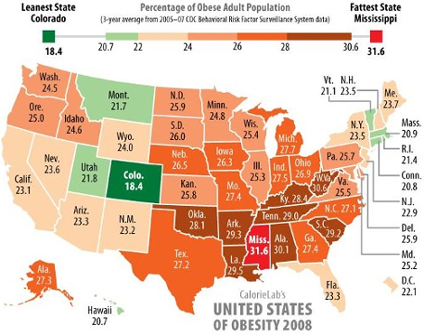
Yesterday I noticed that Richard Florida and Andrew Sullivan re-posted a map (created by calorielab) that color coded US states by the percentage of the population that was obese. I wondered if a similar map existed for Canada. Although there are several that highlight obesity – such as this one and this one – none are quite like this one. More importantly, none allowed for an easy and direct comparison between the two countries.
So I’ve taken the calorielab map, remade it, and extend it to all of North America by applying its criteria to Canadian provinces (and by using some Statistics Canada figures found here). The result is a “green armband” (of relative health) stretching across the continent.
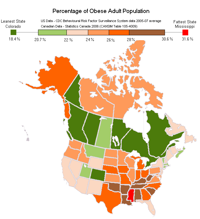
If Canadian provinces were ranked along side US States, they would rank 1st (BC), 2nd (QC), 3rd (ON), 4th (AB) and tied for 5th (MB) (YK) as the least obese provinces/states. Colorado would be the first American state placing 7th, with the provinces of NS in 8th and SK in 9th. PEI and NB would appear 15th and 16th and NFLD would appear 19th. NWT and NU would close out in 30th and 31st position. You can see the original chart at the bottom of this page.
Actually even some of the grimmer looking patches of Canada’s map have a silver lining. The Arctic Territories, specifically Nunavut (NU) and the North-West Territories (NWT), appear obese and thus unhealthy. However, Statistics Canada notes that obesity criterion for Inuit populations should be more relaxed since a high BMI does not appear to have the same health risk for Inuit as for non-Inuit. Interesting, eh?
And here is the original map I’m riffing off of…

Excellent map! I saw Richard Florida’s blog posting on this too and immediately wished for THIS VERY MAP for comparison. Thank you for doing the work on this!
Cheers,
– Richard
Excellent map! I saw Richard Florida’s blog posting on this too and immediately wished for THIS VERY MAP for comparison. Thank you for doing the work on this!Cheers, – Richard
Pingback: Our Own System » Blog Archive » The Skinny on Canada (witty, right?)
Canada uses age-standardized data when measuring obesity rates, while the US doesn’t (it’s mentioned on the statistics Canada page) So, I don’t think it’s very statistically sound to compare the two sets of data like this.
But it’s still a very nice map.
Canada uses age-standardized data when measuring obesity rates, while the US doesn’t (it’s mentioned on the statistics Canada page) So, I don’t think it’s very statistically sound to compare the two sets of data like this.But it’s still a very nice map.
Unfortunately, the Canadian prevalence data used here are derived from self-reported surveys of height and weight, an approach that we know leads to an underestimation of true prevalence.
If we were to calculate % obese based on physically measured heights and weights (see StatCan’s Health Reports, Vol 17(3), 2006), then:
– BC would remain dark green;
– Quebec and Ontario would become that light fleshy colour;
– NS and AB, light orange;
– PEI, dark orange; and
– other provinces and territories, brown.
Unfortunately, the Canadian prevalence data used here are derived from self-reported surveys of height and weight, an approach that we know leads to an underestimation of true prevalence.If we were to calculate % obese based on physically measured heights and weights (see StatCan’s Health Reports, Vol 17(3), 2006), then:- BC would remain dark green; – Quebec and Ontario would become that light fleshy colour; – NS and AB, light orange;- PEI, dark orange; and- other provinces and territories, brown.
Al, thank you so much for this. I’m going to try to track down the data you cited and I’ll remap the map accordingly.
Al, thank you so much for this. I’m going to try to track down the data you cited and I’ll remap the map accordingly.
Pingback: Creative Class » Blog Archive » Mapping North America - Creative Class
AL? Alabama in 4th place?
Hi Jon, AL = Alberta.
Alberta should be AB, not AL
Thank you Matt – noted and changed in the original post now.
Just as a note, Newfoundland and Labrador is NL. Puts things in perspective though!
coincides perfectly with the dominant Nigger population in the US. Like we don't have enough to worry about with:Their high school dropout rate (3x higher than whites)50% of black men have been incarcerated by age 25. And one in four are in PRISON now.High out of wedlock birthrate. 90% of Nigglets are born to single Moms.65% of those Mom's are on welfare or some kind of public assistance.Blacks are twice as obese as white people on average.They commit 50% of the violent crime in America (40% is committed by the Spicks)This despite being lucky enough to live in a country that literally hands success to you if you are just prepared to reach out and grab it. But even asking them to reach out for it is asking to much.Overall, they are lazy, fat and stupid.But Blackbama thinks this will all just go away if we all just stay positive, sing Koombayaa and hold hands.They, along with the flood of illegals across our borders will lead to this countries demise. In fact it has already started.Fucking Nigger, Jews and Spicks.
Apparently “All of North America” does not include Mexico…
Made me laugh
aren't they the predominantly black states?
removing the above comment would be nice.very interesting map, thanks for doing the work mate.
I know people will view my comment as racist but it is a genuine question.
Sorry, curious, but is race a factor in weight? I assume it's more to do with poverty and culture. But just to see, a quick check of demographic stats for West Virginia shows 94.5% white, 3.6% black. Kentucky has 89.9% white, 7.7% black. Oklahoma has 78% white, 8% black. Those are all well below the national average of 12.8%. http://quickfacts.census.gov/qfd/index.html
with respect to the race issue see the following : http://www.cdc.gov/obesity/data/trends.html – just the facts… no predjudice
Freedom of speech…mmm. We fight for it, but then someone like you comes along and spoils it.I wonder what you do to support the economy? Care to share? Are you in a position to try and positively change the equivocal statistics you spout above?It never ceases to amaze me that there are still people like you around. IF you were educated, perhaps you might be able to construct your argument in a less…..neanderthal way. In the UK we have an old saying “More to be pitied than blamed”. Poor you! As a doctor, I do however gain some solace in the fact that what you ennunciate, will in the end have a negative impact on all the biological systems within your body. This will eventually result in a CVA, MI or even possibly Ca. I wish you well!Betzy
#1 leanest state!
Doesn't North America extend down to Panama?
I have removed this comment for racists and inappropriate comments. Apologies it took a few hours, I was on a plane.
This is cool. I wish I was able to do the same for Australia (where I am). I heard last year that Australia is now the most obese country in the world. I couldn't believe it, but it was on the news so it must be true (ha ha, btw).
you really need to subdivide Ontario into northern and southern. People in northern Ontario tend to be bigger,I mean fatter
Pingback: uberVU - social comments
Pingback: Open Letter to Dr. Laura - Page 2 - Interfaithforums.com
For the geographically-challenged you forgot to label the two countries. And what's up with the placement of Hawaii?Here's a slightly revised and labeled map:http://farm5.static.flickr.com/4118/4787931008_…<img src=”http://farm5.static.flickr.com/4118/4787931008_265b6de023_z.jpg”>
Pingback: US vs Canada – obesity color keys | The Daily Conservative
For the geographically-challenged you forgot to label the two countries. And what's up with the placement of Hawaii?Here's a slightly revised and labeled map:http://farm5.static.flickr.com/4118/4787931008_…<img src=”http://farm5.static.flickr.com/4118/4787931008_265b6de023_z.jpg”>
There’s some monster asses out there…wish I carried my camera around more to capture the magic.
Pingback: Fatness Index 2 years on: the good, the bad, the ugly | eaves.ca
Pingback: Has Florida gone mad? - (FL) - Page 6 - City-Data Forum
trés belle blog. Mais moi à mon avis ouain je pense ke les amériancs sont bine plus grosse ke nous les candiennes.
Je pense que tu devrais prendre des cours de francais ….. ou d`arreter de faire le `dumb`
Pingback: The Skinny on Canada (witty, right?) – Hi, I’m Drew Weilage.
Grateful for shharing this