Category Archives: commentary

How the WSJ's former owners could REALLY screw Rupert Murdoch

When the News of the World scandal began to really explode at the beginning of the month some intrepid reporter went and tracked down members of the Bancroft family – the former owners of the Wall Street Journal – and asked them if they regretted selling their controlling stock of the newspaper to Rupert Murdoch’s News Corporation.

Many did.

Since then, there has been some talk about the recourse available to the Bancrofts with an emphasis on a toothless special committee – which is supposed to ensure editorial independence – and how it could create some headaches for News Corp. I doubt it will matter.

But if the Bancrofts really do care about the Journal – or if a sub-segment of them do – there is something much more powerful they could do to screw Murdoch.

Offer to buy it back.

Remember, News Corporation paid $60 per share to the Bancrofts for their stake of Dow Jones & Company (the publisher of the Wall Street Journal). This represented an enormous 67% premium, or $2.24 billion, over the market valuation. In 2009, a mere 14 months later, News Corp wrote down the value of the purchase by almost half, accepting a loss of $2.8 billion. In other words, the value of Dow Jones is now back to, or even below the $35 a share it was at when the Bancrofts sold it.

Why not offer to buy it back at a theoretical valuation of $40 a share? The Bancrofts (or the members of the family that want to) certainly have some of the capital. They would essentially be using Murdoch’s own money to regain control of the WSJ at 2/3’s the price they paid for it. Clearly they would need to find other investors to be part of the group. But they couldn’t form the core of a new investor group.

Of course, you would say: Rupert Murdoch would never sell his crown jewel. But that’s the fun of it.

This week’s Economist references Nomura investment analyst Michael Nathanson’s assessment of News Corporation after the scandal:

Michael Nathanson, an analyst at Nomura, separated News Corporation into three hypothetical companies: a good one, based on television; a bad one, which makes films; and a downright toxic one, which runs newspapers. He suggests investors focus on the former.

An offer by the Bancrofts would force Murdoch to tell investors what type of company he intends to run. Refusing to sell the Wall Street Journal could confirm investors worst fears that Murdoch intends to cling to his newspapers empire. Worse, he would have to do this at a moment when defending that option is the most difficult for him. It could further weaken him as CEO in the eyes of investors and potentially speed up efforts to replace him. So even if the Bancrofts were rebuffed, it would allow them to extract some revenge for how Murdoch treated the Journal after their departure. On the flip side, if accepted, the Bancrofts would recapture their prized asset at a fraction of what they paid for it.

Of course, in The Man who Owns the News biographer Michael Wolff hardly paints the Bancrofts as a united group. Quite the opposite. So I’ll admit the above scenario does not feel all that likely: the Bancroft capital is no longer sufficiently concentrated. But it would have made for an interesting power play to observe.

Depression and Decline: American Irresponsibility is Ending the American Era with a Bang

Despite the assurances of US Treasury Secretary Timothy Geithner it is increasingly likely there will be no debt deal. The United States is going to default on its debt. I know it sounds crazy, but I believe it is going to happen. If it does, this is the black swan event no one imagined or was prepared to contemplate. Its impacts are going to be significant. Possibly immeasurable.

For history, August 2nd, 2011 could end up marking the end of the American Era. Sadly, it will not have been inevitable, it will have been entirely self-inflicted and it may now be irreversible. Even if an agreement is reached tomorrow I suspect the world will increasingly be unwilling to entrust the role of global financial system caretaker to the United States. The world has lost faith in America. And why not. Its Congress has demonstrated that it can no longer be trusted with the responsibility of global financial management. Indeed, even its closest allies have had their confidence shaken.

The economic and geopolitical ramifications of this outcome cannot be underestimated.

Economically, we may now be closer to a global depression than at anytime since 1930s. For all the talk of the financial crises being a near miss, this could potentially be much, much worse, simply because the consequences fall outside our predictive models.

What is clear is that America is trapped. In the short term spending less will devastate its population. Today more Americans (18.1%) than ever use food stamps. It takes American workers 40 weeks (and rising) to find a job, twice as long than in any previous recession. 1 in every 6 Americans use Medicaid. Any cuts to these services will have an immediate and harsh affect on the quality of life of a huge number of Americans.

Longer term, America cannot restart its economy. Already the top 5% of Americans by income account for 37% of all consumer outlays. This is unsurprising given the top 5% of Americans account for 34.7% of all income. This is similar to 1929 when the top 5% accounted for the top third of all personal income. This is precisely the type of economic structure that Kenneth Galbraith argues in The Great Crash, 1929, transformed the great crash into the great depression. Rather than being able to rely on a broad consumer base to power economic growth, the United States then (as now) was dependent on a high level of investment and luxury consumer spending driven by a small elite. The crash caused that elite to seize up, leaving the American economy paralyzed.

In other words, the Bush Tax cuts may have killed the US economically, and possibly geopolitical. By killing the surpluses they have broken the US treasury. By radically curtailing wealth redistribution they have fatally eroded the capacity of the US domestic economy to power new growth. Combine this with two wars that have sapped trillions of taxpayer dollars, and it is hard not to see a United States more ill prepared than at any time in its history to deal with an economic crisis. The only question that may remain is how much of the rest of the world it drags down with it.

Of course economic decline could become a leading indicator for political decline.

When I arrived to grad school in 1998 to study international relations the field had spent much of the previous decade grappling with the issue of American decline. Books like The Rise and Fall of Great Powers and Lester Thurow’s Head to Head seemed to suggest that economically and militarily, the United States was in, at the very least, relative decline as a the world’s leading power.

But then the successes of the US economy – coupled with the turn around in the size of the US government’s debt –  meant that as a peer, China felt a long way off while Brazil and India seemed more distant still. Europe was too old, disorganized and unambitious to matter. Russia, was fading quickly from the scene. Suddenly decline theory was, itself in decline.

But today the writings of Kennedy feel even more urgent. America, with or without a raised debt ceiling, cannot afford its empire, or the means to protect it. It may be able to find allies to help shoulder the burden – today the central challenge of 21st century geopolitics is the integration of India into the Western Alliance, something that proceeds apace. But if it defaults (and maybe even if it does not) it’s capacity to raise money at a reasonable rate should a major conflict arise, may be compromised. War, for America, is going to get more expensive because investors may be more nervous.

I want to clearly state that I don’t write any of this with any glee. Leftish non-americans who relish a world without the US hegemony should look at the what the period after Britain’s decline, or any period of hegemonic decline. They generally aren’t pretty. Indeed, they are often unstable, violent and nasty. Not something any country should wish for, especially smaller countries (such as my own – Canada). Moreover, while there is no immediate peer that could take America’s place, it isn’t clear that the most likely candidate – China – is one that most people would feel more comfortable with. Be careful what you wish for.

I hope that I’m wrong. I hope a deal will be reached. And that if it is, or if it isn’t, the impact on the markets will be minimal or non-existent. Or maybe, I just need to have more confidence in what I have often tell others: do not to underestimate America. As Sir Winston Churchill famously noted: “Americans can always be counted on to do the right thing…after they have exhausted all other possibilities.” And maybe they’ll have enough time to boot.

But I genuinely fear that in the haze of summer this crisis, as much as it has spurred some scary headlines, remains a sleeper. That we are confronting the mother of all black swans, and that a period of financial turmoil that will make the last two years look like a merry ride, could be upon us. Worse, that that financial turmoil will lead to other, great military and/or political turmoil.

These are scary times.

I can honestly say I never written a blog post that I hope I’m more wrong about.

Update: The Atlantic has a great article worth reading about the origins of the deficit published later this morning that includes a reference this fantastic graph from a few months ago.

Why I’m Struggling with Google+

So it’s been a couple of weeks since Google+ launched and I’ll be honest, I’m really struggling with the service. I wanted to give it a few weeks before writing anything, which has been helpful in letting my thinking mature.

First, before my Google friends get upset, I want to acknowledge the reason I’m struggling has more to do with me than with Google+. My sense is that Google+ is designed to manage personal networks. In terms of social networking, the priority, like at Facebook, is on a soft version of the word “social” eg. making making the experience friendly and social, not necessarily efficient.

And I’m less interested in the personal experience than in the learning/professional/exchanging experience. Mark Jones, the global communities editor for Reuters, completely nailed what drives my social networking experience in a recent Economist special on the News Industry: “The audience isn’t on Twitter, but the news is on Twitter.” Exactly! That’s why I’m on Twitter. Cause that’s where the news is. It is where the thought leaders are interacting and engaging one another. Which is very different activity than socializing. And I want to be part of all that. Getting intellectually stimulated and engaged – and maybe even, occasionally, shaping ideas.

And that’s what threw me initially about Google+. Because of where I’m coming from, I (like many people) initially focused on sharing updates which begged comparing Google+ to Twitter, not Facebook. That was a mistake.

But if Google+ is about about being social above all else, it is going to be more like Facebook than Twitter. And therein lies the problem. As a directory, I love Facebook. It is great for finding people, checking up on their profile and seeing what they are up to. For some people it is good for socializing. But as a medium for sharing information… I hate Facebook. I so rarely use it, it’s hard to remember the last time I checked my stream intentionally.

So I’m willing to accept that part of the problem is me. But I’m sure I’m not alone so if you are like me, let me try to further breakdown why I (and maybe you too) are struggling.

Too much of the wrong information, too little of the right information.

The first problem with Google+ and Facebook is that they have both too much of the wrong information, and too little of the right information.

What do I mean by too much of the wrong? What I love about Twitter is its 140 character limit. Indeed, I’m terrified to read over at Mathew Ingram’s blog that some people are questioning this limit. I agree with Mathew: changing Twitter’s 140 character limit is a dumb idea. Why? For the same reason I thought it made sense back in March of 2009, before Google+ was even a thought:

What I love about Twitter is that it forces writers to be concise. Really concise. This in turn maximizes efficiency for readers. What is it Mark Twain said?  “I didn’t have time to write a short letter, so I wrote a long one instead.” Rather than having one, or even thousands or readers read something that is excessively long, the lone drafter must take the time and energy to make it short. This saves lots of people time and energy. By saying what you’ve got to say in 140 characters, you may work more, but everybody saves.

On the other hand, while I want a constraint over how much information each person can transmit, I want to be able to view my groups (or circles) of people as I please.

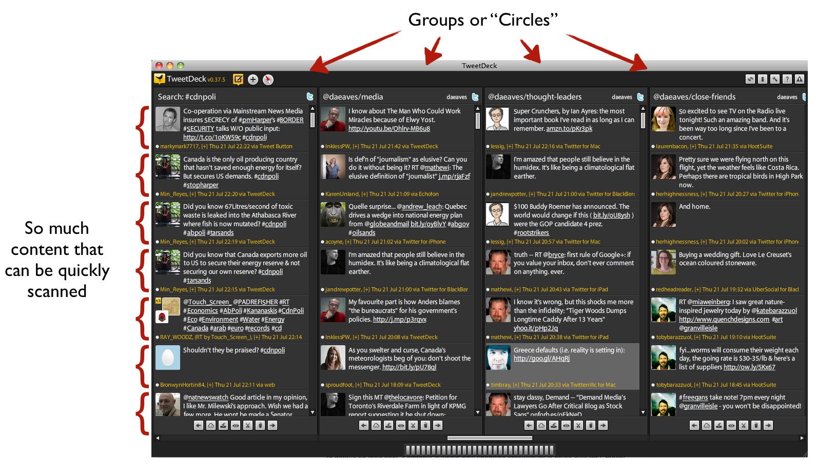
Consider the screen shot of TweetDeck below. Look how much information is being displayed in a coherent manner (of my choosing). It takes me maybe, maybe 30-60 seconds to scan all this. In one swoop I see what friends are up to, some of my favourite thought leaders, some columnists I respect… it is super fast and efficient. Even on my phone, switching between these columns is a breeze.

twitter

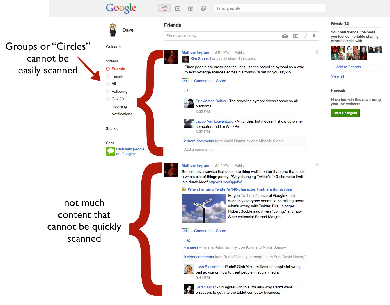
But now look at Google+. There are comments under each item…but I’m not sure I really care to see. Rather then the efficient stream of content I want, I essentially have a stream of content I didn’t ask for. Worse, I can see, what, maybe 2-5 items per screen, and of course I see multiple circles on a single screen.

Google+1

Obviously, some of this is because Google+ doesn’t have any applications to display it in alternative forms. I find the Twitter homepage equally hard to use. So some of this could be fixed if (and hopefully when) Google makes public their Google+ API.

But it can’t solve some underlying problems. Because an item can be almost as long as the author wants, and there can be comments, Google+ doesn’t benefit from Twitter’s 140 character limit. As one friend put it, rather than looking at a stream of content, I’m looking at a blog in which everybody I know is a writer submitting content and in which an indefinite number of comments may appear. I’ll be honest: that’s not really a blog I’m interested in reading. Not because I don’t like the individual authors, but because it’s simply too much information, shared inefficiently.

Management Costs are too high

And herein lies the second problem. The management costs of Google+ are too high.

I get why “circles” can help solve some of the problems outlined above. But, as others have written, it creates a set of management costs that I really can’t be bothered with. Indeed this is the same reason Facebook is essentially broken for me.

One of the great things about Twitter is that it’s simple to manage: Follow or don’t follow. I love that I don’t need people’s permission to follow them. At the same time, I understand that this is ideal for managing divergent social groups. A lot of people live lives much more private than mine or want to be able to share just among distinct groups of small friends. When I want to do this, I go to email… that’s because the groups in my life are always shifting and it’s simple to just pick the email addresses. Managing circles and keeping track of them feels challenging for personal use. So Google+ ends up taking too much time to manage, which is, of course, also true of Facebook…

Using circles to manage for professional reasons makes way more sense. That is essentially what I’ve got with Twitter lists. The downside here is that re-creating these lists is a huge pain.

And now one unfair reason with some insight attached

Okay, so going to the Google+ website is a pain, and I’m sure it will be fixed. But presently my main Google account is centered around my eaves.ca address and Google+ won’t work with Google Apps accounts so I have to keep flipping to a gmail account I loathe using. That’s annoying but not a deal breaker. The bigger problem is my Google+ social network is now attached to an email account I don’t use. Worse, it isn’t clear I’ll ever be able to migrate it over.

My Google experience is Balkanizing and it doesn’t feel good.

Indeed, this hits on a larger theme: Early on, I often felt that one of the promises of Google was that it was going to give me more opportunities to tinker (like what Microsoft often offers in its products), but at the same time offer a seamless integrated operating environment (like what Apple, despite or because of their control freak evilness, does so well). But increasingly, I feel the things I use in Google are fractured and disconnected. It’s not the end of the world, but it feels less than what I was hoping for, or what the Google brand promise suggested. But then, this is what everybody says Larry Page is trying to fix.

And finally a bonus fair reason that’s got me ticked

Now I also have a reason for actively disliking Google+.

After scanning my address book and social network, it asked me if I wanted to add Tim O’Reilly to a circle. I follow Tim as a thought leader on Twitter so naturally I thought – let’s get his thoughts via Google+ as well. It turns out however, that Tim does not have a Google+ account. Later when I decided to post something a default settings I failed to notice sent emails to everyone in my circles without a Google+ account. So now I’m inadvertently spamming Tim O’Reilly who frankly, doesn’t need to get crap spam emails from me or anyone. I’m feeling bad for him cause I suspect, I’m not the only one doing it. He’s got 1.5 million followers on Twitter. That could be a lot of spam.

My fault? Definitely in part. But I think there’s a chunk of blame that can be heaped on to a crappy UI that wanted that outcome. In short: Uncool, and not really aligned with the Google brand promise.

In the end…

I remember initially, I didn’t get Twitter; after first trying it briefly I gave up for a few months. It was only after the second round that it grabbed me and I found the value. Today I’m struggling with Google+, but maybe in a few months, it will all crystallize for me.

What I get, is that it is an improvement on Facebook, which seems to becoming the new AOL – a sort of gardened off internet that is still connected but doesn’t really want you off in the wilds having fun. Does Google+ risk doing the same to Google? I don’t know. But at least circles are clearly a much better organizing system than anything Facebook has on offer (which I’ve really failed to get into). It’s far more flexible and easier to set up. But these features, and their benefits, are still not sufficient to overcome the cost setting it up and maintaining it…

Ultimately, if everybody moves, I’ll adapt, but I way prefer the simplicity of Twitter. If I had my druthers, I’d just post everything to Twitter and have it auto-post over to Google+ and/or Facebook as well.

But I don’t think that will happen. My guess is that for socially driven users (e.g. the majority of people) the network effects probably keep them at Facebook. And does Google+ have enough features to pull the more alpha type user away? I’m not sure. I’m not seeing it yet.

But I hope they try, as a little more competition in the social networking space might be good for everyone, especially when it comes to privacy and crazy end-user agreements.

Using Data to Make Firefox Better: A mini-case study for your organization

I love Mozilla. Any reader of this blog knows it. I believe in its mission, I find the organization totally fascinating and its processes engrossing. So much so I spend a lot of time thinking about it – and hopefully, finding ways to contribute.

I’m also a big believer in data. I believe in the power of evidence-based public policy (hence my passion about the long-form census) and in the ability of data to help organizations develop better products, and people make smarter decisions.

Happily, a few months ago I was able to merge these two passions: analyzing data in an effort to help Mozilla understand how to improve Firefox. It was fun. But more importantly, the process says a lot about the potential for innovation open to organizations that cultivate an engaged user community.

So what happened?

In November 2010, Mozilla launched a visualization competition that asked: How do People Use Firefox? As part of the competition, they shared anonymous data collected from Test Pilot users (people who agreed to share anonymous usage data with Mozilla). Working with my friend (and quant genius) Diederik Van Liere, we analyzed the impact of add-on memory consumption on browser performance to find out which add-ons use the most memory and thus are most likely slowing down the browser (and frustrating users!). (You can read about our submission here).

But doing the analysis wasn’t enough. We wanted Mozilla engineers to know we thought that users should be shown the results – so they could make more informed choices about which add-ons they download. Our hope was to put pressure on add-on developers to make sure they weren’t ruining Firefox for their users. To do that we visualized the data by making a mock up of their website – with our data inserted.

FF-memory-visualizations2.001

For our efforts, we won an honourable mention. But winning a prize is far, far less cool than actually changing behaviour or encouraging an actual change. So last week, during a trip to Mozilla’s offices in Mountain View, I was thrilled when one of the engineers pointed out that the add-on site now has a page where they list add-ons that most slow down Firefox’s start up time.

Slow-Performing-Add-ons-Add-ons-for-Firefox_1310962746129

(Sidebar: Anyone else find it ironic that “FastestFox: Browse Faster” is #5?)

This is awesome! Better still, in April, Mozilla launched an add-on performance improvement initiative to help reduce the negative impact add-ons can have on Firefox. I have no idea if our submission to the visualization competition helped kick-start this project; I’m sure there were many smart people at Mozilla already thinking about this. Maybe it was already underway? But I like to believe our ideas helped push their thinking – or, at least, validated some of their ideas. And of course, I hope it continues to. I still believe that the above-cited data shouldn’t be hidden on a webpage well off the beaten path, but should be located right next to every add-on. That’s the best way to create the right feedback loops, and is in line with Mozilla’s manifesto – empowering users.

Some lessons (for Mozilla, companies, non-profits and governments)

First lesson. Innovation comes from everywhere. So why aren’t you tapping into it? Diederik and I are all too happy to dedicate some cycles to thinking about ways to make Firefox better. If you run an organization that has a community of interested people larger than your employee base (I’m looking at you, governments), why aren’t you finding targeted ways to engage them, not in endless brainstorming exercises, but in innovation challenges?

Second, get strategic about using data. A lot of people (including myself) talk about open data. Open data is good. But it can’t hurt to be strategic about it as well. I tried to argue for this in the government and healthcare space with this blog post. Data-driven decisions can be made in lots of places; what you need to ask yourself is: What data are you collecting about your product and processes? What, of that data, could you share, to empower your employees, users, suppliers, customers, whoever, to make better decisions? My sense is that the companies (and governments) of the future are going to be those that react both quickly and intelligently to emerging challenges and opportunities. One key to being competitive will be to have better data to inform decisions. (Again, this is the same reason why, over the next two decades, you can expect my country to start making worse and worse decisions about social policy and the economy – they simply won’t know what is going on).

Third, if you are going to share, get a data portal. In fact, Mozilla needs an open data portal (there is a blog post that is coming). Mozilla has always relied on volunteer contributors to help write Firefox and submit patches to bugs. The same is true for analyzing its products and processes. An open data portal would enable more people to help find ways to keep Firefox competitive. Of course, this is also true for governments and non-profits (to help find efficiencies and new services) and for companies.

Finally, reward good behaviour. If contributors submit something you end up using… let them know! Maybe the idea Diederik and I submitted never informed anything the add-on group was doing; maybe it did. But if it did… why not let us know? We are so pumped about the work they are doing, we’d love to hear more about it. Finding out by accident seems like a lost opportunity to engage interested stakeholders. Moreover, back at the time, Diederik was thinking about his next steps – now he works for the Wikimedia Foundation. But it made me realize how an innovation challenge could be a great way to spot talent.

The Audacity of Shaw: How Canada's Internet just got Worse

It is really, really, really hard to believe. But as bad as internet access is in Canada, it just got worse.

Yesterday, Shaw Communications, a Canadian telecommunications company and internet service provider (ISP) that works mostly in Western Canada announced they are launching Movie Club, a new service to compete with Netflix.

On the surface this sounds like a good thing. More offerings should mean more competition, more choice and lower prices. All things that would benefit consumers.

Look only slightly closer and you learn the very opposite is going on.

This is because, as the article points out:

“…subscribers to Movie Club — who initially can watch on their TV or computer, with phones and tablets planned to come on line later — can view content without it counting against their data plan.

“There should be some advantage to you being a customer,” Bissonnette said.”

The very reason the internet has been such an amazing part of our lives is that every service that is delivered on it is treated equally. You don’t pay more to look at the Vancouver Sun’s website than you do to look at eaves.ca or CNN or to any other website in the world. For policy and technology geeks this principle of equality of access is referred to as net neutrality. The idea is that ISPs (like Shaw) should not restrict or give favourable access to content, sites, or services on the internet.

But this is precisely what Shaw is doing with its new service.

This is because ISPs in Canada charge what are called “overages.” This means if you use the internet a lot, say you watch a lot of videos, at a certain point you will exceed a “cap” and Shaw charges you extra, beyond your fixed monthly fee. If, for example, you use Netflix (which is awesome and cheap, for $8 a month you get unlimited access to a huge quantity of content) you will obviously be watching a large number of videos, and the likelihood of exceeding the cap is quite high.

What Shaw has announced is that if you use their service – Movie Club – none of the videos you watch will count against your cap. In other words they are favouring their service over that of others.

So why should you care? Because, in short, Shaw is making the internet suck. It wants to turn your internet from the awesome experience where you have unlimited choice and can try any service that is out there, into the experience of cable, where your choice is limited to the channels they choose to offer you. Today they’ll favour their movie service as opposed to (the much better) Netflix service. But tomorrow they may decide… hey you are using Skype instead of our telephone service, people who use “our skype” will get cheaper access than people who use skype. Shaw is effectively applying a tax on new innovative and disruptively cheap service on the internet so that you don’t use them. They are determining – through pricing – what you can and cannot do with your computer while elsewhere in the world, people will be using cool new disruptive services that give them better access to more fun content, for cheaper. Welcome to the sucky world of Canada’s internet.

Doubling down on Audacity: The Timing

Of course what makes this all the more obscene is that Shaw has announced this service at the very moment the CRTC – the body that regulates Canada’s Internet Service Providers – is holding hearings on Usage Based Billings. One of the reasons Canada’s internet providers say that have to charge “overages” for those who use the internet a lot is because of there isn’t enough bandwidth. But how is it that there is enough bandwidth for their own services?

As Steve Anderson of the OpenMedia – a consumer advocacy group – shared with me yesterday “It’s a huge abuse of power.” and that “The launch of this service at the time when the CRTC is holding a hearing on pricing regulation should be seen as a slap in the face to the the CRTC, and the four hundred and ninety one thousand Canadians that signed the Stop The Meter petition.”

My own feeling is the solution is pretty simple. We need to get the ISPs out of the business of delivering content. Period. Their job should be to deliver bandwidth, and nothing else. You do that, you’ll have them competing over speed and price very, very quickly. Until then the incentive of ISPs isn’t to offer good internet service, it’s to do the opposite, it’s to encourage (or force) users to use the services they offer over the internet.

For myself, I’m a Shaw customer and a Netflix customer. Until now I’ve had nothing to complain about with either. Now, apparently I have to choose between the two. I can tell you right now who is going to win. Over the next few months I’m going to be moving my internet service to another provider. Maybe I’ll still get cable TV from Shaw, I don’t know, but my internet service is going to a company that gives me the freedom to choose the services I want and that doesn’t ding me with fees that apparently, I’m being charged under false pretenses. I’ll be telling by family members, friends and pretty much everyone I know, to do the same.

Shaw, I’m sorry it had to end this way. But as a consumer, it’s the only responsible thing to do.

The End of the World and Journalism in the Era of Open

For those not in the United Kingdom a massive scandal has erupted around allegations that one of the country’s tabloids – the News of the World ( a subsidiary of Rupert Murdoch’s News Corporation) – was illegally hacking into and listening in on the voicemails of not only the royal family members and celebrities but also murder victims and family members of soldiers killed in Afghanistan.

The fall out from the scandal, among other things, has caused the 168 year old newspaper to be unceremoniously closed, prompted an enormous investigation into the actions of editors and executives at the newspaper, forced the resignation (and arrest) of Andy Coulson – former News of the World editor and director of communications for the Prime Minister – and thrown into doubt Rupert Murdoch’s bid to gain complete control over the British satellite television network BskyB.

For those wanting to know more I encourage you to head over to the Guardian, which broke the story and has done some of the best reporting on it. Also, possibly the best piece of analysis I’ve read on the whole sordid affair is this post from reuters which essentially points out that by shutting down News of the World, Newscorp may shrewdly ensure that all incriminating documents can (legally) be destroyed. Evil genius stuff.

But why bring this all up here at eaves.ca?

Because I think this is an example of a trend in media that I’ve been arguing has been going on for some time.

Contrary to what news people would have you believe, my sense is that most people don’t trust newspapers – no more so then they trust governments. Starting in 1983 Ipsos MORI and the British Medical Association have asked UK citizens who they trust. The results for politicians are grim. The interesting thing is, they are no better for journalists (although TV news anchors do okay). Don’t believe me? Take a look at the data tables from Ipsos MORI. Or look at the chart Benne Dezzle over at Viceland created out of the data.

There is no doubt people value the products of governments and the media – but this data suggests they don’t trust the people creating them, which I really think is a roundabout way of saying: they don’t trust the system that creates the news.

I spend a lot of my time arguing that government’s need to be more transparent, and that this (contrary to what many public servants feel) will make them more, not less, effective. Back in 2009, in reaction to the concern that the print media was dying, I wrote a blog post saying the same was true for journalism. Thanks, in part, to Jay Rosen listing it as part of his flying seminar on the future of news, it became widely read and ended up as getting reprinted along with Taylor Owen and I’s article Missing the Link, in the journalism textbook The New Journalist. Part of what I think is going in the UK is a manifestation of the blog post, so if you haven’t read it, I think now is as good a time as any.

The fact is, newsrooms are frequently as opaque (both in process and, sometimes, in motivations) as governments are. People may are willing to rely on them, and they’ll use them if their outputs are good, but they’ll turn on them, and quickly, if they come to understand that the process stinks. This is true of any organization and news media doesn’t get a special pass because of the job it plays – indeed the opposite may be true. But more profoundly I think it is interesting how what many people consider to be two of the key pillars to western democracy are staffed by people who are among the least trusted in our society. Maybe that’s okay. But maybe it’s not. But if we think we need better forms of government – which many people seem to feel we do – it may also be that we believe we need better ways of generating, managing and engaging in the accountability of that government.

Of course, I don’t want to overplay the situation here. News of the World doomed itself because it broke the law. More importantly, it did so in a truly offensive way: hacking into the cell phone of a murder victim who was an everyday person. Admitedly, when the victims were celebrities, royals and politicians, it percolated as a relatively contained scandal. But if we believe that transparency is the sunlight that causes governments to be less corrupt – or at least forces politicians to recognize their decisions will be more scrutinized – maybe a little transparency might have caused the executives and editors at News Corp to behave a little better as well. I’m not sure what a more open media organization might look like – although wikipedia does an interesting job – but from both a brand protection and values based decision making perspective a little transparency could be the right incentive to ensure that the journalists, editors and executives in a news system few of us seem to trust, behave a little better. And that might cause them to earn more of the trust I think many deserve.


Lots of Open Data Action in Canada

A lot of movement on the open data (and not so open data) front in Canada.

Canadian International Development Agency (CIDA) Open Data Portal Launched

IATI-imagesSome readers may remember that last week I wrote a post about the imminent launch of CIDA’s open data portal. The site is now live and has a healthy amount of data on it. It is a solid start to what I hope will become a robust site. I’m a big believer – and supporter of the excellent advocacy efforts of the good people at Engineers Without Borders – that the open data portal would be greatly enhanced if CIDA started publishing its data in compliance with the emerging international standard of the International Aid Transparency Initiative as these 20 leading countries and organizations have.

If anyone creates anything using this data, I’d love to see it. One simple start might be to try using the Open Knowledge Foundation’s open source Where Does my Money Go code, to visualize some of the spending data. I’d be happy to chat with anyone interested in doing this, you can also check out the email group to find some people experienced in playing with the code base.

Improved License on the CIDA open data portal and data.gc.ca

One thing I’ve noticed with the launch of the CIDA open data portal was how the license was remarkably better than the license at data.gc.ca – which struck me as odd, since I know the feds like to be consistent about these types of things. Turns out that the data.gc.ca license has been updated as well and the two are identical. This is good news as some of the issues that were broken with the previous license have been fixed. But not all. The best license out there remains the license at data.gov (that’s a trick question, because data.gov has no license, it is all public domain! Tricky eh…? Nice!) but if you are going to have a license, the UK Open Government License used by at data.gov.uk is more elegant, freer and satisfies a number of the concerns I cite above and have heard people raise.

So this new data.gc.ca license is a step in the right direction, but still behind the open gov leaders (teaching lawyers new tricks sadly takes a long time, especially in government).

Great site, but not so open data: WellBeing Toronto

Interestingly, the City of Toronto has launched a fabulous new website called Well Being Toronto. It is definitely worth checking out. The main problem of course is that while it is interesting to look at, the underlying data is, sadly, not open. You can’t play with the data, such as mash it up with your own (or another jurisdiction’s) data. This is disappointing as I believe a number of non-profits in Toronto would likely find the underlying data quite helpful/important. I have, however, been told that the underlying data will be made open. It is something I hope to check in on again in a few months as I fear that it may never get prioritized, so it may be up to Torontonians to whold the Mayor and council’s feet to the fire to ensure it gets done.

Parliamentary Budget Office (PBO) launches (non-open) data website

It seems the PBO is also getting in on the data action with the launch of a beta site that allows you to “see” budgets from the last few years. I know that the Parliamentary Budget Office has been starved of resources, so they deserve to be congratulated for taking this first, important step. Also interesting is that the data has no license on the website, which could make it the most liberally licensed open data portal in the country. The site does have big downsides. First, the data can only be “looked” at, there is no obvious (simple) way to download it and start playing with it. More oddly still the PBO requires that users register with their email address to view the data. This seems beyond odd and actually, down right creepy, to me. First, parliament’s budget should be free and open and one should not need to hand over an email address to access it. Second, the email addresses collected appear to serve no purpose (unless the PBO intends to start spamming us), other than to tempt bad people to hack their site so they can steal a list of email addresses.

Links on Social Media & Politics: Notes from "We Want Your Thoughts #4"

Last night I had a great time taking the stage with Alexandra Samuel in Vancouver for “We Want Your Thoughts” at the Khafka coffee house on Main St. The night’s discussion was focused on Social Media – from chit chat to election winner – what next?” (with a little on the social media driven response to the riots thrown in for good measure).

Both Alex and I promised to post some links from our blogs for attendees so what follows is a list of some thoughts on the subject I hope everyone can find engaging.

On Social Media generally, probably the most popular post on this blog is this piece: Twitter is my Newspaper: explaining twitter to newbies. More broadly thinking about the internet and media, this essay I wrote with Taylor Owen is now a chapter in this university textbook on journalism. Along with this post as a sidebar note (different textbook), which has been one of my most read.

On the riots, I encourage you to read Alexandra Samuel’s post on the subject (After a Loss in Vancouver, Troubling Signals of Citizen Surveillance) and my counter thoughts (Social Media and Rioters) – a blogging debate! You can also hear me talk about the issue on an interview on CBC’s Cross Country Checkup on the issue (around hour 1).

On social media and politics, maybe some of the most notable pieces include a back forth between myself and Michael Valpy who felt that social media was ending our social cohesion and destroying democracy (obviously, this was pre-Middle East Riots and the proroguing Parliament debate). I responded with a post on why his arguments were flawed and that actually the reverse was true. He responded to that post in The Mark. And I posted response to that as well. It all makes for a good read.

Rob-Cottingham-graphic-summary

Rob Cottingham’s Visual Notes of the first 15 minutes

Then there were some pieces on Social Media and the Proroguing of Parliament. I had this piece in the Globe and then this post talking a little more about the media’s confused relationship with social media and politics.

Finally, one of the points I referred to several times yesterday was the problem of assuming social values won’t change when talking about technology adoption and its impact, probably the most explicit post I’ve written on the subject is this one: Why the Internet Will Shape Social Values (and not the other way around)

Finally, some books/articles I mentioned or on topic:

Everything Bad is Good for You by Steven Johnson

What Technology Wants by Kevin Kelly

Here Comes Everybody by Clay Shirky

The Net Delusion: How Not to Liberate the World by Evgeny Morozov

The Inside Story of How Facebook Responded to Tunisian Hacks an article in the Atlantic by Alexis Madrigal

I hope this is interesting.

The next Open Data battle: Advancing Policy & Innovation through Standards

With the possible exception of weather data, the most successful open data set out there at the moment is transit data. It remains the data with which developers have experimented and innovated the most. Why is this? Because it’s been standardized. Ever since Google and the City of Portland creating the General Transit Feed Specification (GTFS) any developer that creates an application using GTFS transit data can port their application to over 100+ cities around the world with 10s and even 100s of millions of potential users. Now that’s scale!

All in all the benefits of a standard data structure are clear. A public good is more effectively used, citizens receive enjoy better service and companies (both Google and the numerous smaller companies that sell transit related applications) generate revenue, pay salaries, etc…

This is why, with a number of jurisdictions now committed to open data, I believe it is time for advocates to start focusing on the next big issue. How do we get different jurisdictions to align around standard structures so as to increase the number of people to whom an application or analysis will be relevant? Having cities publish open data sets is a great start and has led to real innovation, next generation open data and the next leaps in innovation will require some more standards.

The key, I think, is to find areas that meet three criteria:

  • Government Data: Is there relevant government data about the service or issue that is available?
  • Demand: Is this a service for which there is regular demand? (this is why transit is so good, millions of people touch the service on a daily basis)
  • Business Model: Is there a business that believes it can use this data to generate revenue (either directly, or indirectly)


opendata-1.0151

Two comments on this.

First, I think we should look at this model because we want to find places where the incentives are right for all the key stakeholders. The wrong way to create a data structure is to get a bunch of governments together to talk about it. That process will take 5 years… if we are lucky. Remember the GTFS emerged because Google and Portland got together, after that, everybody else bandwagoned because the value proposition was so high. This remains, in my mind, not the perfect, but the fastest and more efficient model to get more common data structures. I also respect it won’t work for everything, but it can give us more successes to point to.

Which leads me to point two. Yes, at the moment, I think that target in the middle of this model is relatively small. But I think we can make it bigger. The GTFS shows cities, citizens and companies that there is value in open data. What we need are more examples so that a) more business models emerge and b) more government data is shared in a structured way across multiple jurisdictions. The bottom and and right hand circles in this diagram can, and if we are successful will, move. In short, I think we can create this dynamic:

opendata4.016

So, what does this look like in practice?

I’ve been trying to think of services that fall in various parts of the diagram. A while back I wrote a post about using open restaurant inspection data to drive down health costs. Specifically around finding a government to work with a Yelp!, Bing or Google Maps, Urban Spoon or other company to integrate the  inspection data into the application. That for me is an example of something that I think fits in the middle. Government’s have the data, its a service citizens could touch on a regular base if the data appeared in their workflow (e.g. Yelp! or Bing Maps) and for those businesses it either helps drive search revenue or gives their product a competitive advantage. The Open311 standard (sadly missing from my diagram), and the emergence of SeeClickFix strike me as another excellent example that is right on the inside edge of the sweet spot).

Here’s a list of what else I’ve come up with at the moment:

opendata3.015

You can also now see why I’ve been working on Recollect.net – our garbage pick up reminder service – and helping develop a standard around garbage scheduling data – the Trash & Recycling Object Notation. I think it is a service around which we can help explain the value of common standards to cities.

You’ll notice that I’ve put “democracy data” (e.g. agendas, minutes, legislation, hansards, budgets, etc…) in the area where I don’t think there is a business plan. I’m not fully convinced of this – I could see a business model in the media space for this – but I’m trying to be conservative in my estimate. In either case, that is the type of data the good people at the Sunlight Foundation are trying to get liberated, so there is at least, non-profit efforts concentrated there in America.

I also put real estate in a category where I don’t think there is real consumer demand. What I mean by this isn’t that people don’t want it, they do, but they are only really interested in it maybe 2-4 times in their life. It doesn’t have the high touch point of transit or garbage schedules, or of traffic and parking. I understand that there are businesses to be built around this data, I love Viewpoint.ca – a site that takes mashes opendata up with real estate data to create a compelling real estate website – but I don’t think it is a service people will get attached to because they will only use it infrequently.

Ultimately I’d love to hear from people on ideas they on why might fit in this sweet spot. (if you are comfortable sharing the idea, of course). Part of this is because I’d love to test the model more. The other reason is because I’m engaged with some governments interested in getting more strategic about their open data use and so these types of opportunities could become reality.

Finally, I just hope you find this model compelling and helpful.

Visualizing how everything in Beijing is built at a Las Vegas scale

One of the things that struck me most about Beijing was the sheer size of everything. Beijing, it often seems, is built at a Las Vegas scale – the buildings, the roads, the airport – it’s all huge.

The size can be deceptive when looking at a map, it is not unusual for a city block in Beijing to be 500 meters long, so you might look at a map and say: “hey look that’s only 3 blocks from here! let’s walk over there.” A kilometer and a half isn’t a long walk – but it is if you were expecting to walk 3 or 4 hundred meters.

Of course, there are lots of small things in Beijing, lots of weaving alleys (indeed, it sometimes felt like there were only two types of streets in Beijing 6-10 lane super roads, or tiny alleyways and side streets) but the grandiose parts of it dominate the experience. More interestingly, this is not a recent thing. The Forbidden Palace – world famous and which I first remember being introduced to while watching the visually stunning The Last Emperor in elementary school – is perhaps the best example of how big has always been a part of Beijing. The complex – which was home to China’s emperor since its completion in 1420 – spans an area of  178 acres. If, like me, you find that number hard to assign meaning to, I thought I’d visualize it against an American and Canadian landmark that would make it easier to understand.

All of these images are taken from Google Map at the same scale. The top left hand image shows the Forbidden Palace in Beijing, the lower left shows the same area super imposed over Stanley Park in Vancouver and on the right super imposed over Central Park in New York.

FP-vs-SP-vs-CP

What’s amazing is you could literally pour all of Stanley Park into the Forbidden Palace and have room left over, while the complex consumers around 40% of Central Park. Mind boggling.

I also hope this blog post demonstrates how a simple visualization can be much more powerful than numbers, even using common tools like Google maps and keynote (powerpoint for Mac).