Tag Archives: visualization

Great Hacks from the Open Data in Vancouver

Last weekend I helped host an Open Data Day in Vancouver. With the generous support of Domain7, who gave us a place to host talks and hack, over 30 Vancouverites braved the sleet and snow to spend the day sharing ideas and working on projects.

We had opening comments from Andy Yan – whose may be the most prolific user of Open Data in Vancouver, possibly Canada. I encourage you to check out his work here. We were also incredibly lucky to have Jeni Tennison – the Technical Director of the Open Data Institute – onsite to talk to participants about the ODI.

After the opening talks, people simply shared what they hoped to work on and people just found projects to contribute to. Minimal organization was involved… and here a taste of the awesome projects that got worked on! Lots of ideas here for other communities.

1. Open Data Licenses Resource: JSON + search + compatibility check = Awesome.

Kent Mewhort, who recently moved to Vancouver from Ottawa (via the Congo) updated his ongoing CLIPol project by adding some of the recently published licenses. If you’ve not seen CLIPol it is… awesome. It allows you to easily understand and compare the restrictions and rights of many open government licenses.

CLIPol Data

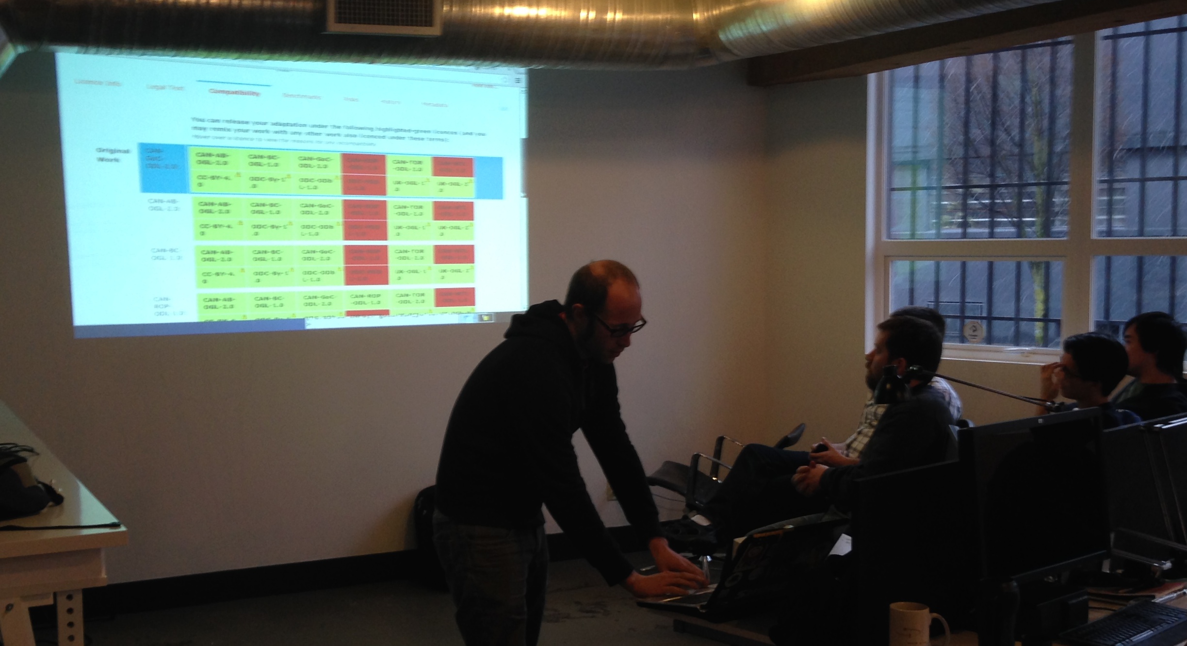
Better still CLIPol also lets you to see how compatible a license is (see example here). Possibly the best tool of all is one that allows you to determine what license you can apply to your re-mixed work in a way that is compliant with the original licenses (check out that tool here – screenshot below).

CLIPol compatibility

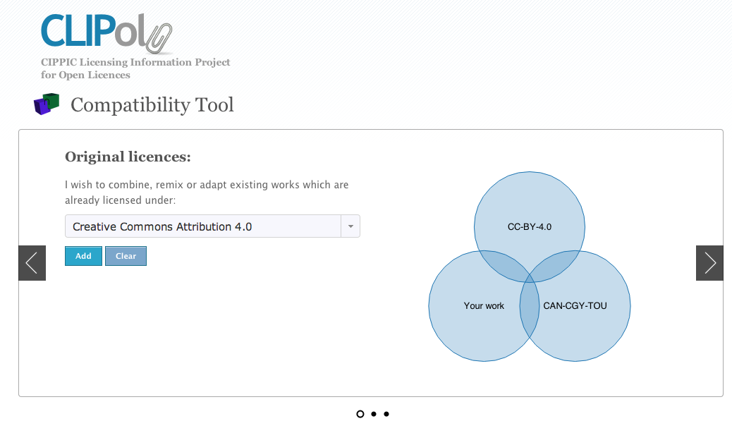
CLIPol is just such a fantastic tool – can’t recommend it enough and encourage people to add more licenses to it.

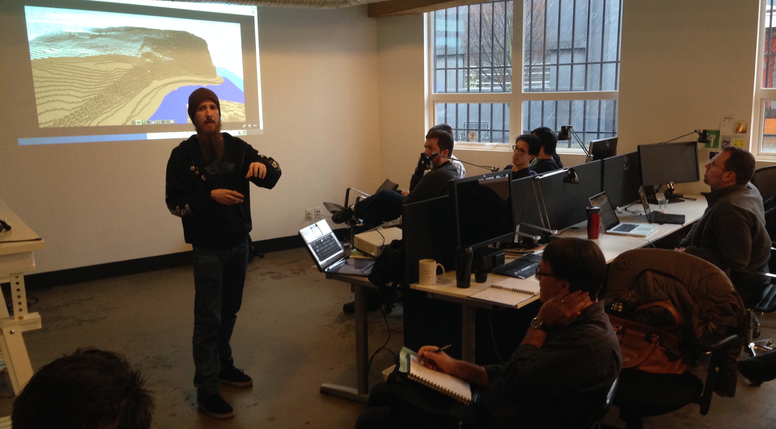
2. Vancouver in MineCraft

I have previously written about how Minecraft is being used to help in public consultations and urban planning – I love how the game becomes a simple tool that enables anyone to shape the environment.

So I was crazy excited I heard that Ryan Smith (aka Goldfish) had used the City of Vancouver’s open elevation data to recreate much of the city in Minecraft.

Below is a photo of Ryan presenting at the end of the day. The projection behind him shows Stanley park, near Siwash Rock. The flat feature at the bottom is the sea wall. Indeed Ryan notes that the sea wall makes for one of the clearest features since it creates almost perfectly flat structure along the city’s coast.

Mincraft Data

3. Vancouver’s Capital Budget Visualized in Where Does my Money Go

It is hard to imagine a project going better. I’m going to do a separate blog post on it.

This is a project I’ve always wanted to do – create a bubble tree visualization with Where Does my Money Go. Fortunately two developers – Alexandre Dufournet and Luc Lussier – who had never hacked on open data jumped on the idea. With help from City of Vancouver’s staff who were on site, I found a PDF of the capital budget which we then scraped.

WDMYG Data

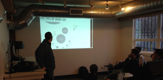
The site is not actually live, but for developers who are interested in seeing this work (hint, hint City of Vancouver staff) you can grab their code from github here.

4. Monitoring Vancouver’s Bike Accident Data – Year 3

Eric Promislow has been coming to Open Data Hack-a-thons ever since Luke Closs and I started organizing them in 2009. During the first Open Data Day in 2011 you can read in my wrap up post about a bike accident monitoring website Eric created that day which Eric would eventual name Bent Frame. Well, Bent Frame has been live ever since and getting bigger. (Eric blogs about it here)

Each open data day, Eric updates Bent Frame with new data from ICBC – the province’s insurance monopoly. With over 6 years of data now in Eric is starting to be able to analyze trends – particularly around the decline of bike accidents along many roads with bike lanes, and an increase in accidents where the bike lanes end.


Bike Data

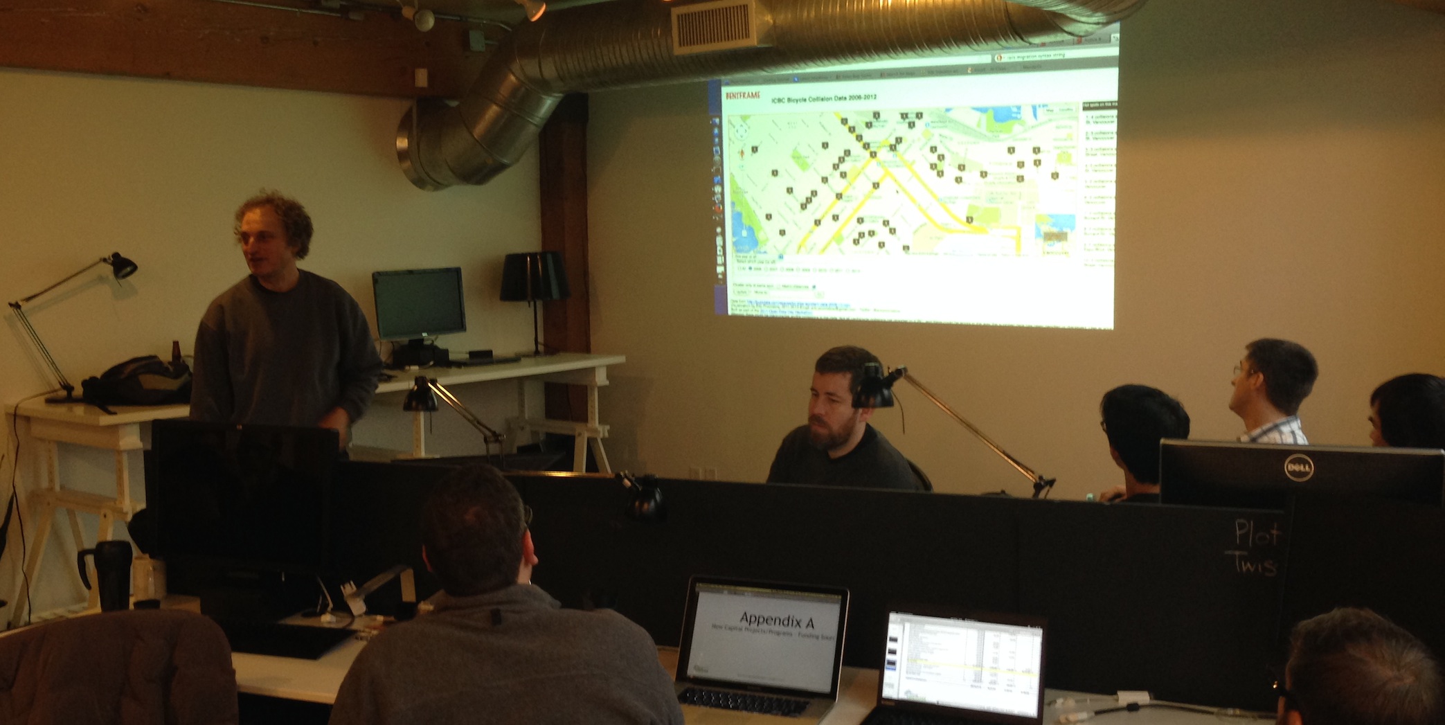
I initially had conversations with ICBC to persuade them to share their data with Eric and they’ve been in touch with him ever since, passing along the data on a regular basis. It is a real example of how an active citizen can change an organization’s policies around sharing important data that can help inform public policy debates.

5. ProactiveDisclosure.ca – Making government information easier to search

Kevin McArthur is the kind of security guy most governments dreads having around but should actually love (example his recent post on e-voting).  He continued to hack on one of his side projects: proactivedisclosure.ca. The site is a sort of front end for open data sets, making it easier to do searches based on people or companies. Thus, want to find all the open data about a specific minister… proactive disclosure organizes it for you.

Proactive Data

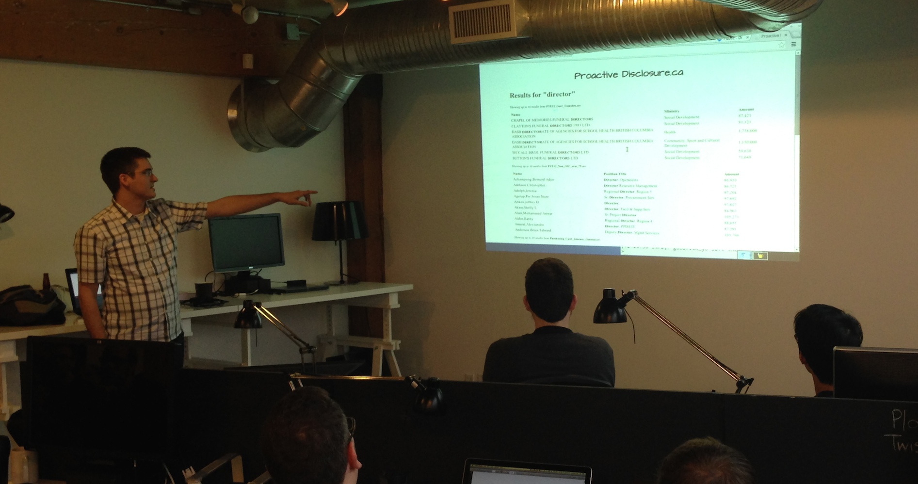
Kevin and a small team of players uploaded more data into their site and allowed it to consume unstructured data. Very cool stuff.

6. Better Open Data Search

Herb Lainchbury – another fantastic open data advocate – worked on a project in which he tried to rethink what an open data search engine would look like. This is a topic that I think matters A LOT. There is simply not a lot of good ways to find data that you are interested in.

Herb’s awesome insight was invert the traditional way of thinking about data search. He created a search engine that didn’t search for the data set keywords or titles, but rather searched the meta data exclusively.

One interesting side outcome of this approach is that it made related data sets easier and, made locating identical data sets but from different years a snap. As Herb notes the meta data becomes a sort of “finger print” that makes it easy to see when it has been duplicated. (Quick aside rant: I loath it when governments releases 20 data files of the same data set – say crime data – with each file representing a different year and then claiming that it is 20 unique data sets in their catalogue. No. It is one data set. You just have 20 years of it. Sigh).

7. School Performance Chart

Two local video game programers – Louie Dinh and Raymond Huang – with no experience in open data looked around the BC Government Open Data catalogue and noticed the data on test scores. Since they attended school here in British Columbia they thought it might be interesting to chart the test scores to see how their own schools had preformed over time.

They were able to set up a site which graphed how a number of elementary schools had performed over time by looking at the standardized test scores.

Test SCore Data

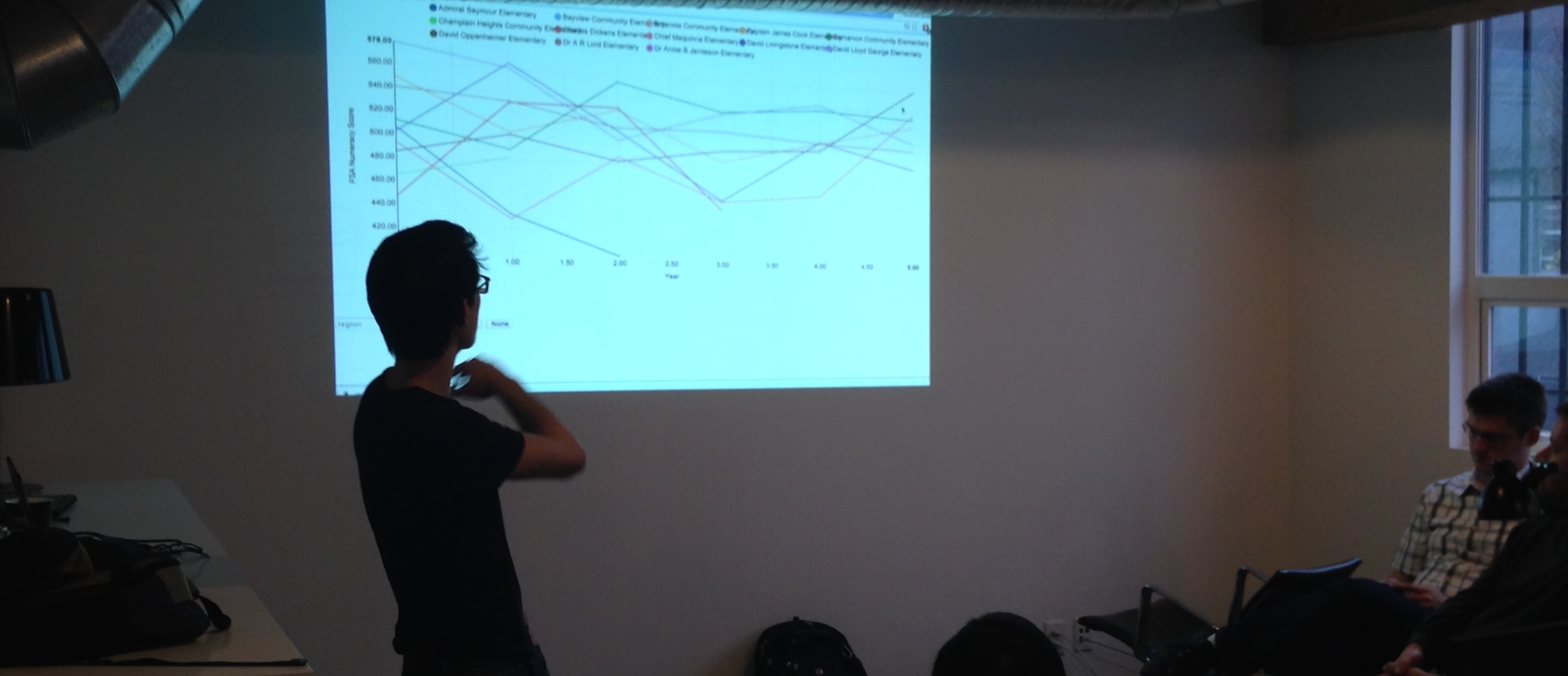
This is just a great example of data as a gateway to learning. Here a simple hackathon project become a bridge for two citizens to dive into a area of public policy and learn more about it. No one is claiming that there chart is definitive, rather it is the start of a learning process around what matters and what doesn’t and what can be measured and what can’t in education.

Congratulations to everyone who participated in the day – thank you for making it such an amazing success!

Visualizing Open Energy Data in Canada

If you haven’t seen it yet, Glen Newton has done some really awesome visualizations of Canada’s energy production/consumption data. Here’s a version I “edited”:

What is cool is that, what I mean when I say “edited” is that any of the colour bars can be dragged vertically, so one can move around the components to accentuate different elements or paint a different story. This relatively simple interactivity is really quite powerful.

In addition, I was able to understand what is actually a quite complicated piece of information very quickly. If you tried to write this out I would take pages to explain or, would be numbers in a spreadsheet I would never really wrap my head around. This form is so intuitive to understand it really is fantastic. And of course, the fact that you can move it around means you can interact with it, play with it, and so engage it and try to understand it more readily than something that is static.

These flows are visualized in terms of petajoules, but it would be interesting to see if graphed in terms of value (dollars) as well, as I suspect, that the “pipes” would be very different in size.

Really awesome work by Glen here.

Lying with Maps: How Enbridge is Misleading the Public in its Ads

The Ottawa Citizen has a great story today about an advert by Enbridge (the company proposing to build a oil pipeline across British Columbia) that includes a “broadly representational” map that shows prospective supertankers steaming up an unobstructed Douglas Channel channel on their way to and from Kitimat – the proposed terminus of the pipeline.

Of course there is a small problem with this map. The route to Kitimat by sea looks nothing like this.

Take a look at the Google Map view of the same area (I’ve pasted a screen shot below – and rotated the map so you are looking at it from the same “standing” location). Notice something missing from Enbridge’s maps?

Kitimate-Google2

According to the Ottawa Citizens story an Enbridge spokesperson said their illustration was only meant to be “broadly representational.” Of course, all maps are “representational,” that is what a map is, a representation of reality that purposefully simplifies that reality so as to aid the reader draw conclusions (like how to get from A to B). Of course such a representation can also be used to mislead the reader into drawing the wrong conclusion. In this case, removing 1000 square kilometers that create a complicated body of water to instead show that oil tankers can steam relatively unimpeded up Douglas Channel from the ocean.

The folks over at Leadnow.ca have remade the Enbridge map as it should be:

EnbridgeV2

Rubbing out some – quite large – islands that make this passage much more complicated of course fits Enbridge’s narrative. The problem is, at this point, given how much the company is suffering from the perception that it is not being fully upfront about its past record and the level of risk to the public, presenting a rosy eyed view of the world is likely to diminish the public’s confidence in Enbridge, not increase their confidence in the project.

There is another lesson. This is great example of how facts, data and visualization matter. They do. A lot. And we are, almost every day, being lied to through visual representations from sources we are told to trust. While I know that no one thinks of maps as open or public data in many ways they are. And this is a powerful example of how, when data is open and available, it can enable people to challenge the narratives being presented to them, even when those offering them up are powerful companies backed by a national government.

If you are going to create a representation of something you’d better think through what you are trying to present, and how others are going to see it. In Enbridge’s case this was either an effort at guile gone horribly wrong or a communications strategy hopelessly unaware of the context in which it is operating. Whoever you are, and whatever you are visualization – don’t be like Enbridge – think through your data visualization before you unleash it into the wild.

Beautiful Maps – Open Street Map in Water Colours

You know, really never know what the web is going to throw at you next. The great people over at Stamen Design (if you’ve never heard of Stamen you are really missing out – they are probably the best data visualization company I know) have created a watercolor version of Open Street Maps.

Why?

Because they can.

It’s a wonderful example of how you, with the web, you can build on what others have done. Pictured below my home town of Vancouver – I suggest zooming out a little as the city really comes into focus when you can see more of its geography.

Some Bonus Awesomeness Facts about all this Stamen goodness:

  • Stamen has a number of Creative Commons licensed map templates that you can use here (and links to GitHub repos)
  • Stamen housed Code for America in its early days. So they don’t just make cool stuff. The pitch in and help out with cool stuff too.
  • Former Code for America fellow Michael Evans works there now.


International Open Data Hackathon Updates and Apps

With the International Open Data Hackathon getting closer, I’m getting excited. There’s been a real expansion on the wiki of the number of cities where people are sometimes humbly, sometimes grandly, putting together events. I’m seeing Nairobi, Dublin, Sydney, Warsaw and Madrid as some of the cities with newly added information. Exciting!

I’ve been thinking more and more about applications people can hack on that I think would be fun, engage a broad number of people and that would help foster a community around viable, self-sustaining projects.

I’m of course, all in favour of people working on whatever peaks their interest, but here are a few projects I’m encouraging people to look at:

1. Openspending.org

What I really like about openspending.org is that there are lots of ways non-coders can contribute. Specifically finding, scraping and categorizing budget data, which (sadly) is often very messy are things almost anyone with a laptop can do and are essential to getting this project off the ground. In addition, the reward for this project can be significant, a nice visualization of whatever budget you have data for – a perfect tool for helping people better understand where their money (or taxes) go. Another big factor in its favour… openspending.org – a project of the Open Knowledge Foundation who’ve been big supporters and sponsors of the international open data hackathon – is also perfect because, if all goes well, it is the type of project that a group can complete in one day.

So I hope that some people try playing with website using your own local data. It would be wonderful to see the openspending.org community grow.

2. Adopt a Hydrant

Some of you have already seen me blog about this app – a project that comes of out Code for America. If you know of a government agency, or non profit, that has lat/long information for a resource that it wants people to help take care of… then adopt a hydrant could be for you. Essentially adopt a hydrant – which can be changed to adopt an anything – allows people to sign up and “adopt” what ever the application tracks. Could be trees, hydrants, playgrounds… you name it.

Some of you may be wondering… why adopt a hydrant? Well because in colder places, like Boston, MA, adopt a hydrant was created in the hopes that citizens might adopt a hydrant and so agree that when it snows they would keep the hydrant clear of snow. That way, in case their is a fire, the emergency responders don’t end up wasting valuable minutes locating and then digging out, the hydrant. Cool eh?

I think adopt a hydrant has the potential of become a significant open source project, one widely used by cities and non-profits. Would be great to see some people turned on to it!

3. Mapit

What I love about mapit is that it is the kind of application that can help foster other open data applications. Created by the wonderful people over at Mysociety.org this open source software essentially serves as a mapping layer so that you can find out what jurisdictions a given address or postal code or GPS device currently sits in (e.g. what riding, ward, city, province, county, state, etc… am I in?). This is insanely useful for lots of developers trying to build websites and apps that tell their users useful information about a given address or where they are standing. Indeed, I’m told that most of Mysociety.org’s project use their instance of MapIt to function.

This project is for those seeking a more ambitious challenge, but I love the idea that this service might exist in multiple countries and that a community might emerge around another one of mysociety.org’s projects.

No matter what you intend to work on, drop me a line! Post it to the open data day mailing list and let me know about it. I’d love to share it with the world.

Using Data to Make Firefox Better: A mini-case study for your organization

I love Mozilla. Any reader of this blog knows it. I believe in its mission, I find the organization totally fascinating and its processes engrossing. So much so I spend a lot of time thinking about it – and hopefully, finding ways to contribute.

I’m also a big believer in data. I believe in the power of evidence-based public policy (hence my passion about the long-form census) and in the ability of data to help organizations develop better products, and people make smarter decisions.

Happily, a few months ago I was able to merge these two passions: analyzing data in an effort to help Mozilla understand how to improve Firefox. It was fun. But more importantly, the process says a lot about the potential for innovation open to organizations that cultivate an engaged user community.

So what happened?

In November 2010, Mozilla launched a visualization competition that asked: How do People Use Firefox? As part of the competition, they shared anonymous data collected from Test Pilot users (people who agreed to share anonymous usage data with Mozilla). Working with my friend (and quant genius) Diederik Van Liere, we analyzed the impact of add-on memory consumption on browser performance to find out which add-ons use the most memory and thus are most likely slowing down the browser (and frustrating users!). (You can read about our submission here).

But doing the analysis wasn’t enough. We wanted Mozilla engineers to know we thought that users should be shown the results – so they could make more informed choices about which add-ons they download. Our hope was to put pressure on add-on developers to make sure they weren’t ruining Firefox for their users. To do that we visualized the data by making a mock up of their website – with our data inserted.

FF-memory-visualizations2.001

For our efforts, we won an honourable mention. But winning a prize is far, far less cool than actually changing behaviour or encouraging an actual change. So last week, during a trip to Mozilla’s offices in Mountain View, I was thrilled when one of the engineers pointed out that the add-on site now has a page where they list add-ons that most slow down Firefox’s start up time.

Slow-Performing-Add-ons-Add-ons-for-Firefox_1310962746129

(Sidebar: Anyone else find it ironic that “FastestFox: Browse Faster” is #5?)

This is awesome! Better still, in April, Mozilla launched an add-on performance improvement initiative to help reduce the negative impact add-ons can have on Firefox. I have no idea if our submission to the visualization competition helped kick-start this project; I’m sure there were many smart people at Mozilla already thinking about this. Maybe it was already underway? But I like to believe our ideas helped push their thinking – or, at least, validated some of their ideas. And of course, I hope it continues to. I still believe that the above-cited data shouldn’t be hidden on a webpage well off the beaten path, but should be located right next to every add-on. That’s the best way to create the right feedback loops, and is in line with Mozilla’s manifesto – empowering users.

Some lessons (for Mozilla, companies, non-profits and governments)

First lesson. Innovation comes from everywhere. So why aren’t you tapping into it? Diederik and I are all too happy to dedicate some cycles to thinking about ways to make Firefox better. If you run an organization that has a community of interested people larger than your employee base (I’m looking at you, governments), why aren’t you finding targeted ways to engage them, not in endless brainstorming exercises, but in innovation challenges?

Second, get strategic about using data. A lot of people (including myself) talk about open data. Open data is good. But it can’t hurt to be strategic about it as well. I tried to argue for this in the government and healthcare space with this blog post. Data-driven decisions can be made in lots of places; what you need to ask yourself is: What data are you collecting about your product and processes? What, of that data, could you share, to empower your employees, users, suppliers, customers, whoever, to make better decisions? My sense is that the companies (and governments) of the future are going to be those that react both quickly and intelligently to emerging challenges and opportunities. One key to being competitive will be to have better data to inform decisions. (Again, this is the same reason why, over the next two decades, you can expect my country to start making worse and worse decisions about social policy and the economy – they simply won’t know what is going on).

Third, if you are going to share, get a data portal. In fact, Mozilla needs an open data portal (there is a blog post that is coming). Mozilla has always relied on volunteer contributors to help write Firefox and submit patches to bugs. The same is true for analyzing its products and processes. An open data portal would enable more people to help find ways to keep Firefox competitive. Of course, this is also true for governments and non-profits (to help find efficiencies and new services) and for companies.

Finally, reward good behaviour. If contributors submit something you end up using… let them know! Maybe the idea Diederik and I submitted never informed anything the add-on group was doing; maybe it did. But if it did… why not let us know? We are so pumped about the work they are doing, we’d love to hear more about it. Finding out by accident seems like a lost opportunity to engage interested stakeholders. Moreover, back at the time, Diederik was thinking about his next steps – now he works for the Wikimedia Foundation. But it made me realize how an innovation challenge could be a great way to spot talent.

Honourable Mention! The Mozilla Visualization Challenge Update

Really pleased to share that Diederik and I earned an honourable mention for our submission to the Mozilla Open Data Competition.

For those who missed it – and who find opendata, open source and visualization interesting – you can read a description of and see images from our submission to the competition in this blog post I wrote a month ago.