Tag Archives: design

StreetMix for testing bike lanes – Burrard St. Bridge Example

I’m MCing the Code for America Summit at the moment, so short on time to write a post, but I’m just LOVING StreetMix so much I had to give it a shout out. If you are a councillor, urban planner or community activist, StreetMix is a site you HAVE to check out.

What does it do? I basically allows you to create or edit and street you want. It is so simple to use it takes about 1 minute to master. At that point, you can build, copy and redesign any street in the world.

Here, for example I’ve recreated the Burrard St. Bridge in Vancouver as it exists today, with bike lanes and below, as it existed before the addition bike lane.

Burrard Bridge new

Burrard Bridge old

How Car2Go ruins Car2Go

So let me start by saying, in theory, I LOVE Car2Go. The service has helped prevent me from buying a car and has been indispensable in opening up more of Vancouver to me.

For those not familiar with Car2Go, it is a car sharing service where the cars can be parked virtually anywhere in the city, so when you need one, you just use a special card and pin number to access it, drive it to where you want to go and then log out of the car leaving it for the next person to use it. All this at the affordable rate of 38 cents a minute. It’s genius.

So what’s the problem?

Well, in practice, I’m having an increasingly worse experience with Car2Go, particularly when I’m most in need the service. What’s worse, the reasons are entirely within the control of Car2Go and specifically how it designed its app, its workflow and its security. My hope is there are lessons here for designers and anyone who is thinking about online services, particularly in the mobile space.

Let me explain.

Car2go-find-a-car-150x150First, understand that the Car2Go’s brand is built around convenience. Remember, the use case is that, at almost any time, you can find a car near you, access it, and get to where you want to go. Car2Go is not for people planning to use a car hours ahead (you don’t really want to be paying 38 cents a minute to “hold” a car for 3 hours until you need it. That would cost you $68!). Indeed the price point is designed to discourage long term use and encourage short, convenient trips. As a result ease of access is central to the service and the brand promise.

In theory here is what the process should look like.

  1. Fire up the Car2Go app on your smart phone and geolocate yourself
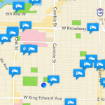
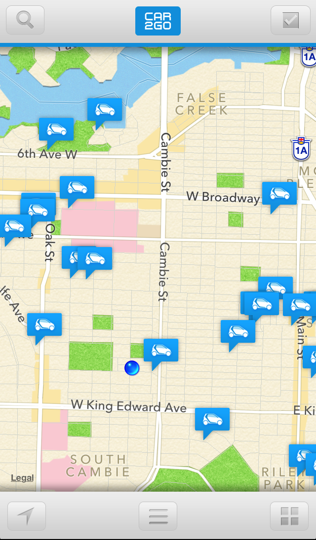
  2. Locate the nearest car (see screen shot to right)
  3. Reserve it (this allows you to lock the car down for 15 minutes)
  4. Walk to your car, access it using your Car2Go card and pin number
  5. Drive off!

Here is the problem. The process now regularly breaks down for me at step 3. At first blush, this may not seem like a big deal… I mean, if the car is only a few blocks away why not just walk over and grab it?

Alas, I do. But, often when you really want a car someone else does too! This is even more the case when say… it’s raining, or it’s the end of the business day. Indeed, many of the times when you would really like that car are times when someone else might also really want it. So being able to lock it down is important. Because if you can’t…? Well, the other week I walked 12 blocks in the rain trying to get to 4 different Car2Go cars that I could see in the app but couldn’t reserve. Why four? Because by  the time I got each of them, they were gone, scooped by another suer. After 30 minutes of walking around and getting wet, I gave up, abandoned my appointment (very suboptimal) and went home. This is not the first time this has happened.

The impact is that Car2Go is increasingly not a service I see myself relying on. Yes, I keep using it, but I no longer think of it as a service I can count on if I just cushion a little extra time. It’s just… kind of reliable because the split between really frustrating outcome and totally delight, is starting to be 40/60, and that’s not good.

Car2go-login-150x150But here is the killer part. Car2Go could fix this problem in a day. Tops.

The reason I can’t reserve a car is a because the Car2Go app forces you to log back in every once and a while. Why? I don’t know. Even if someone stole my phone and used it to reserve a car it would be useless. Let’s say they managed to also steal my wallet so had my Car2Go card. Even now it doesn’t help them since without my pin they couldn’t turn the car on. So having some rogue person with access to user’s account isn’t exactly putting Car2Go in any danger.

So maybe you’re thinking… well, just remember your password David! So here’s a big user moment.

I WISH I COULD.

But Car2Go has these insanely stupid, deeply unsafe password rules that require you to have at least one number, one letter and a capitalized letter (or a special character – god knows if I remember their rules) in your password. Since the multitude of default passwords I use don’t conform to their rules, I can never remember what my password is, leaving me locked out of my Car2Go app. And trust me, when you are late for a meeting, it’s raining and you’re getting soaked, the last thing you want to be doing is going through a password reset process on webpages built for desktop browsers that takes 10 t0 15 minutes to navigate and complete. Many a curse word has been directed at Car2Go in such moments.

What’s worse is there is evidence that shows that not only do these passwords rules create super crappy user experiences like the one I described above, they also user accounts less secure. Indeed, check out this Wired article on passwords and the tension between convenience and effectiveness:

Security specialists – and many websites – prompt us to use a combination of letters, numbers, and characters when selecting passwords. This results in suggestions to use passwords like “Pn3L!x8@H”, to cite a recent Wired article. But sorry, guys, you’re wrong: Unless that kind of password has some profound meaning for a user (and then he or she may need other help than password help), then guess what? We. Will. Forget. It.

It gets worse. Because you will you forget it, you’ll do something both logical and stupid. YOU’LL WRITE IT DOWN. Probably somewhere that will be easy to access. LIKE IN YOUR PHONE’S ADDRESS BOOK.

Stupid password rules don’t make users create smarter passwords. It makes them do dumb things that often make their accounts less secure.

The result? Car2Go’s design and workflow creates a process that suboptimizes the user experience, all in an effort to (I’m guessing) foster security but that, in reality, likely causes a number of Car2Go users to make terrible decisions and make their accounts more vulnerable.

So if you are creating an online service, I hope this cautionary tale about design, workflow is helpful and password authentication rules. Get them wrong and you can really screw up your product.

So please, don’t do to your service what Car2Go has done to theirs. As a potential user of your product, that would make me sad.

Doing Government Websites Right

Today, I have a piece over on Tech President about how the new UK government website – Gov.uk – does a lot of things right.

I’d love to see more governments invest two of the key ingredients that made the website work – good design and better analytics.

Sadly, on the design front many politicians see design as a luxury and fail to understand that good design doesn’t just make things look better, they make websites (and other things) easier to use and so reduce other costs – like help desk costs. I can personally attest to this. Despite being adept at using the web I almost always call the help desk for federal government services because I find federal government websites virtually unnavigable.  Often I find these websites transform my personality from happy affable guy into someone who teeters between grumpy/annoyed on the mild side, to raving crazy lunatic on the other as I fail to grasp what I’m supposed to do next.

If I have to choose between wasting 45 minutes on a website getting nowhere versus calling a help line, waiting for 45 minutes on hold while I do other work and then getting my problem resolved… I go with the latter. It’s not a good use of anyone’s time, but it is often the best option at the moment.

On the analytics front, many governments simply lack the expertise to do something as simple as Google analytics, or worse are hamstrung by privacy and procurement rules keep them from using services that would enable them to know how their users are (or are not) using their website.

Aside from gov.uk, another great example of where these two ingredients came together is over at Honolulu Answers. Here a Code for America team worked with the city to see what pages (e.g. services) residents were actually visiting and then prioritized those. In addition, they worked with staff and citizen to construct answers to commonly asked questions. I suspect a simple website like this could generate real savings on the city’s help desk costs – to say nothing of happier residents and tourists.

At some risk of pressing this point too heavily, I hope that my TechPresident piece (and other articles about gov.uk) gets widely read by public servants, managers and, of course, politicians (hint: the public wants easier access to services, not easoer access to photos and press releases about you). I’m especially hoping the good people at Treasury Board Secretariat in the Canadian Federal government read it since the old Common Look and Feel standard sadly ensured that Canadian government websites are particularly terrible when it comes to usability.

The UK has shown how national governments can do better. Let’s hope others follow their lead.


Beautiful Maps – Open Street Map in Water Colours

You know, really never know what the web is going to throw at you next. The great people over at Stamen Design (if you’ve never heard of Stamen you are really missing out – they are probably the best data visualization company I know) have created a watercolor version of Open Street Maps.

Why?

Because they can.

It’s a wonderful example of how you, with the web, you can build on what others have done. Pictured below my home town of Vancouver – I suggest zooming out a little as the city really comes into focus when you can see more of its geography.

Some Bonus Awesomeness Facts about all this Stamen goodness:

  • Stamen has a number of Creative Commons licensed map templates that you can use here (and links to GitHub repos)
  • Stamen housed Code for America in its early days. So they don’t just make cool stuff. The pitch in and help out with cool stuff too.
  • Former Code for America fellow Michael Evans works there now.


Design Matters: Looking at a Re-themed Bugzilla

I’ll be honest. There was a time when I thought design didn’t matter. To my credit, it was a long time ago… but I used to think, if the tool was good enough, the design won’t matter, people will use it cause it is helpful. (This may or may not have influenced some fashion choices earlier in life as well – I’d like to think things have improved – but not everyone may agree it has improved sufficiently).

Being useful may be sufficient (although take a look at the government website at the bottom of this post – it’s a very useful website). But it’s no excuse for not making things easier to use. Especially when you are running an open source community and want to encourage participation and ease people up the learning curve faster.

Hence why I enjoyed recently discovering ActiveState’s implementation of Bugzilla (re-themed by Tara Gibbs). Bugzilla is the software many open source projects use to identify, track and resolve bugs.

Here we have two identical pieces of software (so the “usefulness” is the same) but what makes ActiveState’s version of Bugzilla so nice are a few simple things they’ve done to make it more user friendly (doubly pleased to see them implement some ideas I’d blogged earlier as well – great minds think alike!).

So let’s start with the Mozilla instance of Bugzilla – as this was the one I was used to.

I’ve circled a couple of the key features to zero in on. Let me go through them as I want you to be thinking about them when you look at the ActiveState version:

  • Red circle: Notice that this has a lot of key items in it, but it is lost next to the “search” button, which pulls your attention away
  • Dark orange arrow: the search button! most often you won’t find a search box located here in an application.
  • Green circle: Tons of useful stuff down here, but arranged in one long horizontal list, that makes it hard to find what you’re look for (and another search box!)
  • Light orange arrow: another log out option… didn’t I see that somewhere else as well?

I want to be clear, the Bugzilla team at Mozilla is awesome. Recently hired they are trying to do a ton of stuff and this is not where I’d expect them to start (and they’ve been super responsive to everything I’ve blogged about so I’m a huge fan), I want to flag this because everyone, from software engineers to government officials need to recognize that we rely on good design to make our lives easier, to help with decision fatigue and streamline our work, every day.

Now check out the ActiveState version of the exact same software, but re-designed.

So, my cartoonish circles and arrows are mucking up the design and ascetics of both theses sites, so please forgive that. (I suggest opening them in adjacent tabs – Mozilla here, ActiveState here – so you can see them uninterrupted).

So, a few things:

  • Red circle: Now everything to do with the administration of your account is in the top, top right hand corner. This is where Google, Facebook and most websites put this info now, that’s why you’re expecting to find it there!
  • Dark orange arrow: now the search button is in the top right hand corner. Pretty much the same location it appears in Firefox (and safari, IE, chrome, OS X, etc…) and so where users have come to expect it.
  • Green circle: This part really is genius. Did you know there were saved searches in the above version? There are, but the feature didn’t stand out. This theme sorts the users options and displays them vertically within a menu: much, much easier to digest quickly.
  • Light orange arrow: Features appear only once! For example, the sign out and search feature do not appear at the top and bottom. This helps reduce clutter and allows the user to find things more quickly

My point is that a few minor changes can dramatically improve the usability of a website or tool. Is Mozilla’s bugzilla radically worse than ActiveState’s? No, but I definitely prefer ActiveState’s design. Moreover, when you are relying on volunteer contributors and attracting new contributors is something that matters to you, this is an important gateway and so you want it to be as seamless as possible.

What’s interesting is that often it is in the non-profit and government sector that design gets neglected because it is deemed a luxury, or the “substantive” people don’t think design matters and so ignore it.

The results can be disastrous.

I mean, especially if you are in government, then you’ve really got to be advocating for better design. Consider the website below. Remember, this may be the most important citizen facing website in the Canadian government – the one stop shop to find every service you need. It is better than most government website, and yet, you’ve got a site that is still maddeningly difficult to navigate. Where am I supposed to look??? Eyes… being… pulled… in… so… many… directions…

Personally, I think you could solve 80% of the problem with this page just by getting rid of the left hand column and put a search button in the top right hand corner. But I’m supremely confident that would violate some arcane website design rule the government has and so will remain a post for another day…

Creating effective open government portals

In the past few years a number of governments have launched open data portals. These sites, like www.data.gov or data.vancouver.ca share data – in machine readable formats (e.g. that you can play with on your computer) that government agencies collect.

Increasingly, people approach me and ask: what makes for a good open data portal? Great question. And now that we have a number of sites out there we are starting to learn what makes a site more or less effective. A good starting point for any of this is 8 Open Government principles, and for those newer to this discussion, there are the 3 laws of open data (also available in German Japanese, Chinese, Spanish, Dutch and Russian).

But beyond that, I think there are some pretty tactical things, data portal owners should be thinking about. So here are some issues I’ve noticed and thought might be helpful.

1. It’s all about automating the back end

Probably the single greatest mistake I’ve seen governments make is, in the rush to get some PR or meet an artificial deadline, they create a data portal in which the data must be updated manually. This means that a public servant must run around copying the data out of one system, converting (and possibly scrubbing it of personal and security information) and then posting it to the data portal.

There are a few interrelated problems with this approach. Yes, it allows you to get a site up quickly but… it isn’t sustainable. Most government IT departments don’t have a spare body that can do this work part time, even less so if the data site were to grow to include 100s or 1000s of data sets.

Consequently, this approach is likely to generate ill-will towards the government, especially from the very community of people who could and should be your largest supporters: local tech advocates and developers.

Consider New York, here is a site where – from I can tell – the data is not regularly updated and grumblings are getting louder. I’ve heard similar grumblings out of some developers and citizens in Canadians cities where open data portals get trumpeted despite infrequent updates and having few data sets available.

If you are going to launch an open data portal, make sure you’ve figured out how to automate the data updates first. It is harder to do, but essential. In the early days open data sites often live and die based on the engagement of a relatively small community or early adopters – the people who will initially make the data come alive and build broader awareness. Frustrate the community and the initiative will have a harder time gaining traction.

2. Keep the barriers low

Both the 8 principles and 3 laws talk a lot about licensing. Obviously there are those who would like the licenses on many existing portals to be more open, but in most cases the licenses are pretty good.

What you shouldn’t do is require users to register. If the data is open, you don’t care who is using it and indeed, as a government, you don’t want the hassle of tracking them. Also, don’t call your data open if members must belong to a educational institution or a non-profit. That is by definition not data that is open (I’m looking at you StatsCan, its not liberated data if only a handful of people can look at it, sadly, you’re not the only site to do this). Worst is one website that, in order to access the online catalogue you have to fax in a form outlining who you are.

This is the antithesis of how an open data portal should work.

3. Think like (or get help from) good librarians and designers

The real problem is when sites demand too much of users to even gain access to the data. Readers of this blog know about my feelings regarding Statistics Canada’s website, the data always seems to be one click away. Of course, that’s if you even think you are able to locate the data you are interested in, which usually seems impossible to find.

And yes, I know that Statistics Canada’s phone operators are very helpful and can help you locate datasets quickly – but I submit to you that this is a symptom of a problem. If every time I went to Amazon.com I had to call a help desk to find the book I was interested in I don’t think we’d be talking about how great Amazon’s help desk was. We’d be talking about how crappy their website is.

The point here is that an open data site is likely to grow. Indeed, looking at data.gov and data.gov.uk these sites now have thousands of data sets on them. In order to be navigable they need to have excellent design. More importantly, you need to have a new breed of librarian – one capable of thinking in the online space – to help create a system where data sets can be easily and quickly located.

This is rarely a problem early on (Vancouver has 140 data sets up, Washington DC, around 250, these can still be trolled through without a sophisticated system). But you may want to sit down with a designer and a librarian during these early stages to think about how the site might evolve so that you don’t create problems in the future.

4. Feedback

Finally, I think good open data portals want, and even encourage feedback. I like that data.vancouver.ca has a survey on the site which asks people what data sets they would be interested in seeing made open.

But more importantly, this is an area where governments can benefit. No data set is perfect. Most have a typo here or there. Once people start using your data they are going to find mistakes.

The best approach is not to pretend like the information is perfect (it isn’t, and the public will have less confidence in you if you pretend this is true). Instead, ask to be notified about errors. Remember, you are using this data internally, so any errors are negatively impacting your own planning and analysis. By harnessing the eyes of the public you will be able to identify and fix problems more quickly.

And, while I’m sure we all agree this is probably not the case, maybe the face that the data us public, there will be a small added incentive to fixing it quickly. Maybe.


My Unfinished Business Talk in Toronto

ocad logoI’m really pleased to share that I’ll be giving a talk at the Ontario College of Art & Design this January 14th, 2010. The talk is one I’ve been giving for government officials a fair bit of late – it is on how technology, open methodologies and social change are creating powerful pressures for reform within our government bureaucracies. The ideas in it also form the basis of a chapter I’ve written for the upcoming O’Reilly Media book on Open Government due out in January (in the US, assuming here in Canada too – more on this in a later post).

I completely thrilled to be giving a talk at OCAD and especially want to thank Michael Anton Dila for making this all happen. It was his idea, and he pushed me to make it happen. It is especially of Michael and OCAD since they have kept the talk free and open to the public.

The talk details are below and you can register here. More exciting has been the interest in the talk – I saw that 100 tickets disappeared in the first 4 hours yesterday – people care about government and policy!

We have much unfinished business with our government – look forward to digging into it.

ABOUT UNFINISHED BUSINESS

The Unfinished Lecture is a monthly event hosted by the Strategic Innovation Lab at OCAD and sponsored by Torch Partnership. Part of the Unfinished Business initiative, the lectures are intended to generate an open conversation about strategic innovation in the business and design of commercial enterprises and public organizations.

AFTER THE COLLAPSE: Technology, Open and the Future of Government

What do Facebook, 911 and NASA all have in common? They all offer us a window into how our industrial era government may be redesigned for the digital age. In this lecture David Eaves will look at how open methodologies, technology and social change is reshaping the way public service and policy development will be organized and delivered in the future: more distributed, adaptive and useful to an increasingly tech savvy public. Whether a interested designer, a disruptive programmer, a restless public servant or a curious citizen David will push your thinking on what the future has in store for the one institution we all rely on: Government.
As a closing remark, I’d also like to thank Health Canada & Samara, both of who asked me to put my thoughts on this subject together into a single talk.
Hope to see you in Toronto.

Articles I'm digesting 24/7/2009

Been a while since I’ve done one of these and I’ve got a lot of great pieces I’ve been reading. So let’s get to it.

Designs on Policy by Allison Arieff (via David B.) and TED Talk: Are we in Control of our own Decisions? by Dan Ariely

I keep hearing about the interaction between policy and design (most flatteringly an architecture professor said I had a designer’s mind” the other day) and so over the past few years I try (with some success) to read as much as I can about design. David B sent me the Arieff piece which, of course, weds my passion for public policy with design. One thing I like is the way the piece doesn’t try to boil the ocean – it doesn’t claim (like in other places) that good design will solve every problem – just that it will help mitigate against it. Most intriguing for me is this line:

“It feels weird to have to defend design’s importance, yet also completely necessary. The United Kingdom has had a policy in place since 1949; Japan since 1956. In countries like Finland, Sweden, South Korea and the Netherlands, design is a no-brainer, reflected by the impeccable elegance, usability and readability of everything in those countries from currency to airport signage.”

A design policy? How civilized. That’s something I could get behind – especially after listening to Dan Ariely’s TED talk which is downright frightening at moments given how susceptible our decisions are (and most disconcerting the decisions of our doctors, dates and who knows whose) to the layout/perception of the choice.

Lost in the Cloud by John Zittrain

A few months ago I was in Ottawa and – surprisingly and unplanned – ended up at a pub with Richard Stallman. I asked him what he thought of Cloud Computing (a term he believes is too vague to be helpful) but was nonetheless viscerally opposed to it. Many of the reasons he cites are covered by Zittrain in this thoughtful piece. The fact is, Cloud Computing (or whatever term you may wish to use) is very convenient and it carries with it huge privacy, security and access challenges. This is potentially the next big challenge for those of us who support and Open Internet – the possibility of the internet being segmented into a series of walled gardens controlled by those who run the cloud servers is real and must be thought through. If you care about public policy and/or are a geek, read this.

Is it Time to Get Rid of the Foreign Service Designation?

Am I reading my own articles? No. I am, however, absorbed by the fascinating and constructive conversation taking place – mostly involving public servants – in the comments section underneath. Here are just some snippets:

  • “For 8 years I worked at DFAIT, observing and participating in the culture within the walls of a building named after a diplomat that Wikipedia states “is generally considered among the most influential Canadians of the 20th century.” Sadly, the elitism (whether earned or not) is only the cause of a bigger problem; lack of desire to collaborate, and almost no desire to change in an era where the only constant is change.”
  • “…as I left the issue of the FS classification was quietly but passionately part of the watercooler discussion. From my perspective, in spite of a nasty AG report on the dismal state of affairs of HR at DFAIT, the department has more pressing problems, such as credibility with central agencies, a coherent sense of mission and talent attraction and retention.”
  • “I am also a bit puzzled by people who saw your piece as an attack on DFAIT – you’re advocating for human resource reform to improve the department, after all. I’m still not sure why you think DFAIT is required though, or why Canadian foreign policy suffers when departments forumulate it without involving DFAIT.”
  • “It’s good to see that even Craig Weichel, President of PAFSO, is open to your suggestion that it might be good to have more foreign service officers circulate through other government departments…”

Putting the Cart Before the Horse by Peter Cowan

A great blog post about the lessons from implementing social media in a government agency. Peter Cowan – an Open Everything alum – is part of the team at Natural Resources Canada team that has been doing amazing work (NRCan is one of the most forward looking ministries in the world in this regard). Peter’s piece focuses on misunderstanding the “business case” for social media and how it often trips up large government bureaucracies. This abbreviated but extended quote on why traditional IT business cases don’t work or aren’t necessary is filled with great thoughts and comments:

“They (Social Media tools) are simple and viral and they cost very little to implement so the traditional requirements for upfront business needs definition to control risk and guide investment are not as important. In fact it would take more time to write a proposal and business case than to just put something out there and see what happens.

More importantly though social media are fundamentally new technologies and the best way to understand their business value is to get them into the hands of the users and have them tell you. To a large degree this is what has happened with the NRCan Wiki. Most of the innovative uses of the wiki came from the employees experimenting. They have not come from a clearly articulated business needs analysis or business case done in advance.

In fact, determining business needs in advance of having a tool in hand may actually lead to status quo approaches and tools. There is the famous Henry Ford… quote goes something like “if I had asked people what they wanted in a car they would have said faster horses”. We social media folks usually deploy this quote to highlight the weakness of focusing too much on responding to people’s perceptions of their existing business needs as a determinant of technology solution since people invariably define their needs in terms of improving the way they are already doing things, not how things could be done in a fundamentally new way.

Genius.

Google’s Microsoft Moment by Anil Dash

A fantastic piece about how Google’s self-perception is causing it to make strategically unsound choices at the same time as its public perception may be radically shifting (from cute fuzzy Gizmo in to mean nasty Stripe). A thoughtful critique and a great read on how the growth and maturation of a company’s culture needs to match its economic growth. I’ve added Anil Dash to by must read blogs – he’s got lots of great content.

Chicago's green roofs and our failed stimulus

I was completely floored (and excited) to read this article about how the Sears Tower in Chicago (recently renamed the Willis Tower) is to undergo a $350M green retrofit that will give it a green roof and it’s own wind turbines. This will reduce the energy consumed by the tower by 80% and its water consumption will drop by 24 million gallons.

As this blog notes:

the U.S Department of State estimates that buildings account for an estimated 36 percent of overall energy use, 65 percent of electricity consumption, 30 percent of all greenhouse gas emissions and 12 percent of water use in America. Green improvements to Sears Tower are aimed at reducing electricity use by 80% in just four years, equating to 68 million kilowatt hours or 150,000 barrels of oil per year. The architects firm responsible for the retro-design, Adrian Smith + Gordon Gill Architecture, has also designed a 50 storey highly sustainable tower to accompany Sears Tower on its south side which will draw power from the improved efficiency measures and work as a net-zero energy development.

So this renovation – which is to start immediately (note the shovel readiness of it) this project will:

  • create a more efficient and thus profitable building (benefiting Chicago businesses and the tax base)
  • reduce US consumption of oil by 150,000 barrels a year (reducing cash outflows and helping America’s balance of trade)
  • will immediately create 3600 jobs yo complete the work (in the construction industry, which has been hard hit by the financial crises)
  • help train and provide practical experience to, construction workers, contractors, design firms & others in creating green buildings (position them for the next economy)

This is a stimulus plan that works. Recently I argued we need a stimulus plan that is low of carbs and fat on data… this is just another example of the types of shovel ready projects that leave a legacy. Canada’s plan to date? Pave some roads and build some bridges all so that we can burn more gas moving cars around.