Category Archives: technology

Ontario's Open Data Policy: The Good, The Bad, The Ugly and the (Missed?) Opportunity

Yesterday the province of Ontario launched its Open Data portal. This is great news and is the culmination of a lot of work by a number of good people. The real work behind getting open data program launched is, by and large, invisible to the public, but it is essential – and so congratulations are in order for those who helped out.

Clearly this open data portal is in its early stages – something the province is upfront about. As a result, I’m less concerned with the number of data sets on the site (which however, needs to, and should, grow over time). Hopefully the good people in the government of Ontario have some surprises for us around interesting data sets.

Nor am I concerned about the layout of the site (which needs to, and should, improve over time – for example, once you start browsing the data you end up on this URL and there is no obvious path back to the open data landing page, it makes navigating the site hard).

In fact, unlike some I find any shortcomings in the website downright encouraging. Hopefully it means that speed, iteration and an attitude to ship early has won out over media obsessive, rigid, risk adverse approach governments all to often take. Time will tell if my optimism is warranted.

What I do want to focus on is the license since this is a core piece of infrastructure to an open data initiative. Indeed, it is the license that determines whether the data is actually open or closed. And I think we should be less forgiving of errors in this regard than in the past. It was one thing if you launched in the early days of open data two or four years ago. But we aren’t in early days anymore. There over 200 government open data portal around the world. We’ve crossed the chasm people. Not getting the license right is not a “beta” mistake any more. It’s just a mistake.

So what can we say about the Ontario Open Data license?

First, the Good

There is lots of good things to be said about it. It clearly keys off the UK’s Open Government License much like BC’s license did as does the proposed Canadian Open Government License. This means that above all, it is written in  plain english and is easily understood. In addition, the general format is familiar to many people interested in open data.

The other good thing about the license (pointed out to me by the always sharp Jason Birch) is that it’s attribution clause is softer than the UK, BC or even the proposed Federal Government license. Ontario uses the term “should” whereas the others use the term “must.”

Sadly, this one improvement pales in comparison to some of the problems and, most importantly the potentially lost opportunity I urgently highlight at the bottom of this post.

The Bad

While this license does have many good qualities initiated by the UK, it does suffer from some major flaws. The most notable comes in this line:

Ontario does not guarantee the continued supply of the Datasets, updates or corrections or that they are or will be accurate, useful, complete, current or free and clear of any possible third party copyright, moral right, other intellectual property right or other claim.

Basically this line kills the possibility that any business, non-profit or charity will ever use this data in any real sense. Hobbyests, geeks, academics will of course use it but this provision is deeply flawed.

Why?

Well, let me explain what it means. This says that the government cannot be held accountable to only release data it has the right to release. For example: say the government has software that tracks road repair data and it starts to release it and, happily all sorts of companies and app developers use it to help predict traffic and do other useful things. But then, one day the vendor that provided that road repair tracking software suddenly discovers in the fine print of the contract that they, not the government, own that data! Well! All those companies, non-profits and app developers are suddenly using proprietary data, not (open) government data. And the vendor would be entirely in its rights to go either sue them, or demand a license fee in exchange of letting them continue to use the data.

Now, I understand why the government is doing this. It doesn’t want to be liable if such a mistake is made. But, of course, if they don’t want to absorbe the risk, that risk doesn’t magically disappear, it transfers to the data user. But of course they have no way of managing that risk! Those users don’t know what the contracts say and what the obligations are, the party best positioned to figure that out is the government! Essentially this line transfers a risk to the party (in this case the user) that is least able to manage it. You are left asking yourself, what business, charity or non-profit is going to invest hundreds of thousands of dollars (or more) and people time to build a product, service or analysis around an asset (government data) that it might suddenly discover it doesn’t have the right to use?

The government is the only organization that can clear the rights. If it is unwilling to do so, then I think we need to question whether this is actually open data.

The Ugly

But of course the really ugly part of the license (which caused me to go on a bit of a twitter rant) comes early. Here it is:

If you do any of the above you must ensure that the following conditions are met:

  • your use of the Datasets causes no harm to others.

Wowzers.

This clause is so deeply problematic it is hard to know where to begin.

First, what is the definition of harm? If I use open data from the  Ontario government to rate hospitals and the some hospitals are sub-standard am I “harming” the hospital? Its workers? The community? The Ministry of Health?

So then who decides what the definition is? Well, since the Government of Ontario is the licensor of the data… it would seem to suggest that they do. Whatever the standing government of the data wants to decree is a “harm” suddenly becomes legit. Basically this clause could be used to strip many users – particularly those interested in using the data as a tool for accountability – of their right to use the data, simply because it makes the licensor (e.g. the government) uncomfortable.

A brief history lesson here for the lawyers who inserted this clause. Back in in March of 2011 when the Federal Government launched data.gc.ca they had a similar clause in their license. It read as follows:

“You shall not use the data made available through the GC Open Data Portal in any way which, in the opinion of Canada, may bring disrepute to or prejudice the reputation of Canada.”

While the language is a little more blunt, its effect was the same. After the press conference launching the site I sat down with Stockwell Day (who was the Minister responsible at the time) for 45 minutes and walked him through the various problems with their license.

After our conversations, guess how long it took for that clause to be removed from the license? 3 hours.

If this license is going to be taken seriously, that clause is going to have to go, otherwise, it risks being a laughing stock and a case study of what not to do in Open Government workshops around the world.

(An aside: What was particularly nice was the Minister Day personally called my cell phone to let me know that he’d removed that clause a few hours after our conversation. I’ve disagreed with Day on many, many, many things, but was deeply impressed by his knowledge of the open data file and his commitment to its ideals. Certainly his ability to change the license represents one of the fastest changes to policy I’ve ever witnessed.)

The (Missed?) Opportunity

What is ultimately disappointing about the Ontario license however is that it was never needed. Why every jurisdiction feels the need to invent its own license is always beyond me. What, beyond the softening of the attribution clause, has the Ontario license added to the Open Data world. Not much that I can see. And, as I’ve noted above, it many ways it is a step back.

You know data users would really like? A common license. That would make it MUCH easier to user data from the federal government, the government of Ontario and the Toronto City government all at the same time and not worry about compatibility issues and whether you are telling the end user the right thing or not. In this regard the addition of another license is a major step backwards. Yes, let me repeat that for other jurisdictions thinking about doing open data: The addition of another new license is a major step backwards.

Given that the Federal Government has proposed a new Open Government License that is virtually identical to this license but has less problematic language, why not simply use it? It would make the lives of the people who this license is supposed to enable  – the policy wonks, the innovators, the app developers, the data geeks – lives so much easier.

That opportunity still exists. The Government of Ontario could still elect to work with the Feds around a common license. Indeed given that the Ontario Open Data portal says they are asking for advice on how to improve this program, I implore, indeed beg, that you consider doing that. It would be wonderful if we could move to a single license in this country, and if a partnership between the Federal Government and Ontario might give such an initiative real momentum and weight. If not, into the balkanized abyss of a thousand licenses we wil stumble.

 

What the Quantified Self Movement Says and Tech and Gender

Over the past year or two I’ve been to a couple of unconferences sessions about how people are increasingly measuring different parts of their lives: how far they run, how they sleep, what they eat, etc… As some readers may be aware, these efforts are often referred to as part of the “Quantified Self Movement.” For those readers less aware (and curious), you can watch Wired Magazine editor and quantified movement originator Gary Wolf give a brief overview in this 6 minute TED talk.

All of this sounds very geeky I’m sure. And as a general data geek and avid fitbit user I am – I suppose – part of the quantified self movement myself.

Reflecting on these (few) experiences with the movement, I find it interesting that almost every session I’ve been to has been almost entirely populated by men. I’m open to the possibility that I’ve simply been to the wrong conferences or the wrong sessions, but I’m not sure that is the case. Even looking at the quantified self Wikipedia page, virtually all the gadgets referred to deal with fitness and sleep. Obviously these are not things that men exclusively care about, but they are notable because of what is absent.

Humans have, of course, probably been quantifying themselves for as long as we’ve been around. But when I think of a group of people that have been engaged in quantifying themselves in a meaningful way,for well over a millennia,it is women.

More specifically, it is women measuring their menstrual cycles. I mean as important as losing a few pounds or getting a good nights sleep may be (and it is important to me), I’m pretty sure the stakes are much lower than preventing, or trying to get, pregnancy (now that’s a life changing event!). Indeed, given that it is hard to imagine most men having any pressing needs to measure much about their bodies on a regular basis a thousand years ago, it think it would be safe to argue that women were societies first quantified selfers.

And yet I don’t think I’ve ever seen this activity discussed, looked to as a model, or engaged in by the quantified self movement. Lauren Bacon has a great post on her own experience measuring her menstrual cycle as part of her quantified self but it is pretty rare to see women adopt that language. Given that women have been measuring their periods for years, and that there is likely a strong oral and written history to look into around this, I’d think this was a line of research or inquiry that the movement would be interested at looking into. Doubly so since it would give us a window into what a community of quantified selfers looks like, especially when its activities have been more normalized (as during some parts of our history) and marginalized (during other parts).

This all feels like a lost opportunity, and the kind of thing that happens when there are too many men and not enough women in a conversation. You want to talk about the consequences of not having women in tech – this strikes me as a great example. A rich and important history is not (sufficiently) reflected in the conversation and so important lessons and practices are potentially missed.

Maybe I’m wrong. Maybe women have been part of the quantified self movement from the beginning and that this is not a larger reflection of the challenges we face when the ratio of men and women in an industry is out of whack. But my sense is that this is actually a very nice, and potentially wonderfully quantifiable, case study around the issues of women in tech.


Requiring Facebook for Your News Site (or website) – the Missed Opportunity

Last week I published I blog post titled Why Banning Anonymous Comments is Bad for Postmedia and Bad for Society in reaction to the fact that PostMedia’s newspapers( including the Vancouver Sun, Ottawa Citizen, National Post, etc…) now requires readers to login with a Facebook account to make comments.

The piece had a number of thoughtful and additive comments – which is always rewarding for an author to read.

Two responses, however, came from those in the newspaper industry. One came from someone claiming to be the editor of a local newspaper. I actually believe that this person is such an editor and their comments were sincere and additive. That said, there is some irony that they did not comment using their real name, while talking about how helpful and important it is that real names/identities be used. Of course they did use an identity of sorts – their role – although this is harder to verify.

The other comment came from Alex Blonski the Social Media Director at Postmedia Network Inc.

Again, both comments were thoughtful sincere and engaging – exactly what you want from a comment, especially those that don’t entirely agree with post. I also felt like while they raised legitimate interests and concerns, they, in part, missed my point. Both ultimately ended up in the same place: that handing commenting over to Facebook made life easier for newspapers since it meant less spam and nonconstructive comments.

I agree – if the lens by which you are looking at the problem is one of management, Facebook is the easier route. No doubt. My point is that it also comes at a non-trivial cost, one that potentially sees power asymmetries in a society reinforced. Those with privilege, who have financial and social freedom to be critical, will do so. Those who may be more marginalized may not feel as safe. This tradeoff was barely addressed in these responses.

As I noted in my piece, other sites appear to have found ways to foster commenting communities that are positive and additive without requiring people to use their real identities (although giving them the freedom to do so if they wish). But of course these sites have invested in developing their community. And as I tried to stress in my last post – if you are unhappy with the comments on your website – you really have yourself to blame, it’s the community you created. Anil Dash has good thoughts on this too.

As a result, it is sometimes hard to hear of newspapers talk about people not willing to pay for the news and complain of diminishing revenue while at the same time appearing blind to recognizing that what makes for a great website is not just the content (which, especially in the news world be commoditized) but rather that community that gathers around and discusses it. Restricting that community to Facebook users (or more specifically, people willing to use their Facebook account to comment – a far smaller subset) essentially limits the part of your website that can be the most unique and the most attractive to users – the community. This is actually a place where brand loyalty and market opportunities could be built, and yet I believe PostMedia’s move will make it harder, not easier to capitalize on this asset.

I also found some of specific’s of PostMedia’s comments hard to agree with. Alex Blonski noted that they had commenters pretending to be columnists, that they were overwhelmed with spam, and claiming that Discus – the commenting system I use on my site has similar requirements to Facebook. The later is definitely not true (while you may use your real identity, I don’t require you to, I don’t even require a legit email address) and the former two comments feel eminently manageable by any half decent commenting system.

Indeed Alexander Howard – the Gov 2.0 journalist who uses the twitter handle @digiphile seems to manage just fine on his own. He recently updated his policies around moderation – and indeed his (and Mathew Ingram’s) opinions on commenting should be read by everyone in every newspaper – not just PostMedia. In the end, here is a single journalist who has more than three times the twitter followers of the Vancouver Sun (~151,000 vs. ~43,000) so is likely dealing with a non-trivial amount of comments and other social media traffic. If he can handle it, surely PostMedia can to?


Is the Internet bringing us together or is it tearing us apart?

The other day the Vancouver Sun – via Simon Fraser University’s Public Square program – asked me to pen a piece answering the questions: Is the Internet bringing us together or is it tearing us apart?

Yesterday, they published the piece.

My short answer?

Trying to unravel whether the Internet is bringing us together or tearing us apart is impossible. It does both. What really matters is how we build generative communities, online and off.

My main point?

That community organizing is both growing and democratizing. On MeetUp alone there are 423 coming events in Vancouver. That’s 423 emergent community leaders, all learning how to mobilize people, whether it is for a party, to teach them how to knit, grow a business or learn how to speak Spanish.

This is pretty exciting.

A secondary point?

Is that it is not all good news. There are lots of communities, online and off, that are not generative. So if we are creating more communities, many of them will also be those we don’t agree with, and that are even destructive.

Check it

It always remains exciting to me what you can squeeze into 500 words. Yesterday, the Sun published the piece here, if you’re interested, please do consider checking it out.

Lies, Damned Lies, and Open Data

I have an article titles Lies, Damn Lies and Open Data in Slate Magazine as part of their Future Tense series.

Here, for me, is the core point:

On the surface, the open data movement was about who could access and use government data. It rested on the idea that data was as much a public asset as a highway, bridge, or park and so should be made available to those who paid for its creation and curation: taxpayers. But contrary to the hopes of some advocates, improving public access to data—that is, access to the evidence upon which public policy is going to be constructed—does not magically cause governments’, and politicians’, desire for control to evaporate. Quite the opposite. Open data will not depoliticize debate. It will force citizens, and governments, to realize how politicized data is, and always has been.

The long form census debacle here in Canada was, I think, a great example of data getting politicized, and was really helped clarify my thinking around this. This piece has been germinating since then, but the core thesis has occasionally leaked out during some of my talks and discussion. Indeed, you can see me share some of it during the tail end of my opening keynote at the Open Knowledge Foundation International Open Data Camp almost three years ago.

Anyways, please hop on over to Slate and take a look – I hope you enjoy the read.

Community Managers: Expectations, Experience and Culture Matter

Here’s an awesome link to grind home my point from my OSCON keynote on Community Management, particularly the part where I spoke about the importance of managing wait times – the period between when a volunteer/contributor takes and action and when they get feedback on that action.

In my talk I referenced code review wait times. For non-developers, in open source projects, a volunteer (contributor) will often write a patch which they must be reviewed by someone who oversees the project before it gets incorporated into the software’s code base. This is akin to a quality assurance process – say, like if you are baking brownies for the church charity event, the organizer probably wants to see the brownies first, just to make sure they aren’t a disaster. The period between which you write the patch (or make the brownies) and when the project manager reviews them and say they are ok/not ok, that’s the wait time.

The thing is, if you never tell people how long they are going to have to wait – expect them to get unhappy. More importantly, if, while their waiting, other contributors come and make negative comments about their contributions, don’t be surprised if they get even more unhappy and become less and less inclined to submit patches (or brownies, or whatever makes your community go round).

In other words while your code base may be important but expectations, experience and culture matter, probably more. I don’t think anyone believes Drupal is the best CMS ever invented, but its community has a pretty good expectations, a great experience and fantastic culture, so I suspect it kicks the ass of many “technically” better CMS’s run by lesser managed communities.

Because hey, if I’ve come to expect that I have to wait an infinite or undetermined amount of time, if the experience I have interacting with others suck and if the culture of the community I’m trying to volunteer with is not positive… Guess what. I’m probably going to stop contributing.

This is not rocket science.

And you can see evidence of people who experience this frustration in places around the net. Edd Dumbill sent me this link via hacker news of a frustrated contributor tired of enduring crappy expectations, experience and culture.

Heres what happens to pull requests in my experience:

  • you first find something that needs fixing
  • you write a test to reproduce the problem
  • you pass the test
  • you push the code to github and wait
  • then you keep waiting
  • then you wait a lot longer (it’s been months now)
  • then some ivory tower asshole (not part of the core team) sitting in a basement finds a reason to comment in a negative way.
  • you respond to the comment
  • more people jump on the negative train and burry your honestly helpful idea in sad faces and unrelated negativity
  • the pull dies because you just don’t give a fuck any more

If this is what your volunteer community – be it software driven, or for poverty, or a religious org, or whatever – is like, you will bleed volunteers.

This is why I keep saying things like code review dashboards matter. I bet if this user could at least see what the average wait time is for code review he’d have been much, much happier. Even if that wait time were a month… at least he’d have known what to expect. Of course improving the experience and community culture are harder problems to solve… but they clearly would have helped as well.

Most open source projects have the data to set up such a dashboard, it is just a question of if we will.

Okay, I’m late for an appointment, but really wanted to share that link and write something about it.

NB: Apologies if you’ve already seen this. I accidentally publishes this as a page, not a post on August 24th, so it escaped most people’s view.

Lying with Maps: How Enbridge is Misleading the Public in its Ads

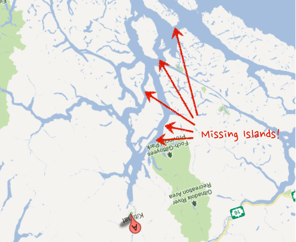
The Ottawa Citizen has a great story today about an advert by Enbridge (the company proposing to build a oil pipeline across British Columbia) that includes a “broadly representational” map that shows prospective supertankers steaming up an unobstructed Douglas Channel channel on their way to and from Kitimat – the proposed terminus of the pipeline.

Of course there is a small problem with this map. The route to Kitimat by sea looks nothing like this.

Take a look at the Google Map view of the same area (I’ve pasted a screen shot below – and rotated the map so you are looking at it from the same “standing” location). Notice something missing from Enbridge’s maps?

Kitimate-Google2

According to the Ottawa Citizens story an Enbridge spokesperson said their illustration was only meant to be “broadly representational.” Of course, all maps are “representational,” that is what a map is, a representation of reality that purposefully simplifies that reality so as to aid the reader draw conclusions (like how to get from A to B). Of course such a representation can also be used to mislead the reader into drawing the wrong conclusion. In this case, removing 1000 square kilometers that create a complicated body of water to instead show that oil tankers can steam relatively unimpeded up Douglas Channel from the ocean.

The folks over at Leadnow.ca have remade the Enbridge map as it should be:

EnbridgeV2

Rubbing out some – quite large – islands that make this passage much more complicated of course fits Enbridge’s narrative. The problem is, at this point, given how much the company is suffering from the perception that it is not being fully upfront about its past record and the level of risk to the public, presenting a rosy eyed view of the world is likely to diminish the public’s confidence in Enbridge, not increase their confidence in the project.

There is another lesson. This is great example of how facts, data and visualization matter. They do. A lot. And we are, almost every day, being lied to through visual representations from sources we are told to trust. While I know that no one thinks of maps as open or public data in many ways they are. And this is a powerful example of how, when data is open and available, it can enable people to challenge the narratives being presented to them, even when those offering them up are powerful companies backed by a national government.

If you are going to create a representation of something you’d better think through what you are trying to present, and how others are going to see it. In Enbridge’s case this was either an effort at guile gone horribly wrong or a communications strategy hopelessly unaware of the context in which it is operating. Whoever you are, and whatever you are visualization – don’t be like Enbridge – think through your data visualization before you unleash it into the wild.

Is Civic Hacking Becoming 'Our Pieces, Loosely Joined?'

I’ve got a piece up over on the WeGov blog at TechPresident – Is Civic Hacking Becoming ‘Our Pieces, Loosely Joined?

Juicy bit:

There is however, a larger issue that this press release raises. So far, it appears that the spirit of re-use among the big players, like MySociety and the Sunlight Foundation*, only goes so deep. Indeed often it seems they are limited to believing others should re-use their code. There are few examples where the bigger players dedicate resources to support other people’s components. Again, it is fine if this is all about creating competing platforms and competing to get players in smaller jurisdictions who cannot finance creating whole websites on their own to adopt it. But if this is about reducing duplication then I’ll expect to see some of the big players throw resources behind components they see built elsewhere. So far it isn’t clear to me that we are truly moving to a world of “small pieces loosely joined” instead of a world of “our pieces, loosely joined.”

You can read the rest over there.

Living in the Future: My Car isn’t Flying, but it is Cheap and Gamified

I remember in the early 80’s when I was about 8 years old I walked up to my dad and said “you know the year 2000 really isn’t that far away, and unless something changes we aren’t going to get jetpacks and flying cars.” Even then I could see the innovation curve wasn’t going to meet the expectations movies and books had set for me.

Mostly I’m glad I reset my expectations at such an early age – since it is fairly rare that something comes along that makes me feel like I live in the future: things like the iPad and smartphones. Interestingly however, what feels most like magic to me these days – the thing I do regularly but that feels like it is the future – isn’t something I own, but a service that is all about whatI don’t have to own. A car.

A Car So Cheap, I don’t Own It

I actually belong to two car sharing entities: Modo (like Zipcar) and Car2Go. While I love both it is that latter that really has me feeling like I live in the future.

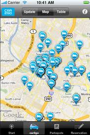
What makes Car2Go so amazing is that unlike ZipCar and Modo, which have fixed parking spots to which cars must be picked up and returned, Car2Go essentially scattered 600 cars around Vancouver. There are no dedicated parking spots to which you must return the car. You can leave it anywhere in the city that isn’t private parking or metered.

So, to lay it out. Here’s the process of using one of these cars:

  1. Fire up your smart phone and locate the nearest car – generally within 10-400 meters.
  2. Walk to said car
  3. Once you arrive, hold your Car2Go card against the windshield to “sign in” to the car
  4. Get in and start driving to your destination.
  5. Upon arrival, “sign out” by holding your card against the windshield

I then automatically get billed at $0.35 a minute for use, so basically a 10 minute car ride (about the average length of a trip when in Vancouver) comes to $3.50, about $1 more than bus fare. I can’t even begin to describe the convenience of this service. What it saves me over having to own a car… mind boggling. Between walking, transit, car2go, modo, taxis and uber…. living without owning a car has never been easier, even with a 7 month old.

But again, the magic is that, where ever I am in the city, I can pull up my phone, generally find a car within 2-3 minutes walk and drive anywhere I want without having to plan it all beforehand. There are, quite literally, cars scattered around Vancouver, at my disposal. Brilliant.

Gamifying my Car to help the environment

Once you get into a Car2Go (they are all two seater Smart cars built by Mercedes-Benz) there is a little screen that allows you to control a map and the radio. The other day however, I noticed a little green leaf icon with a number in it, so pushed that “button” to see what would happen.

Turns out Car2Go has a gamified driving. The onboard computer measures your performance around acceleration, cruising and deceleration and provides you with a score that reflects your performance. I took the photo below at the end of a ride the other day.

green-dashboard

What determines your score – from what I can tell-  is your efficiency around accelerating, cruising and decelerating. So the more smoothly you brake the gentler your acceleration (not an easy feat in a Smart Car) the better your score. Cruising appears to be about smoothness as well.

Once you are aware of these scoreboard – even if you are not looking at it and it is only in the back of your mind – I find myself trying to drive more smoothly.

In the subtitle, I point out that all this probably helps the environment by reducing the amount of gas consumed by Car2Go drivers. But I bet it also helps reduce maintenance costs on Car2Go’s cars. I’m sure many people are rougher on shared cars than they are on their own and that this gamification helps dampen that effect.

Either way, if you’d asked my six year old self if I’d not own a car when I’m 35, and that I’d actually be sharing a car with hundreds of other residents that I could swipe into using a simple card and that had a game inside it that urged me to drive more sustainable.. I suspect I’d just looked confused. But using Car2Go is probably the closest I get, on a regular basis, to doing something I really couldn’t have imagined when I was 6. And that’s kind of fun.

OSCON Community Management Keynote Video, Slides and some Bonus Material

Want to thank everyone who came to my session and who sent me wonderful feedback from both the keynote and the session. I was thrilled to see ZDnet wrote a piece about the keynote as well as have practioners, such as Sonya Barry, the Community Manager for Java write things like this about the longer session:

Wednesday at OSCON we kicked off the morning with the opening plenaries. David Eaves’ talk inspired me to attend his longer session later in the day – Open Source 2.0 – The Science of Community Management. It was packed – in fact the most crowded session I’ve ever seen here. People sharing chairs, sitting on every available spot on the floor, leaning up against the back wall and the doors. Tori did a great writeup of the session, so I won’t rehash, but if you haven’t, you should read it – What does this have to do with the Java Community? Everything. Java’s strength is the community just as much as the technology, and individual project communities are so important to making a project successful and robust.

That post pretty much made my day. It’s why we come to OSCON, to hopefully pass on something helpful, so this conference really felt meaningful to me.

So, to be helpful I wanted to lay out a bunch of the content for those who were and were not there in a single place, plus a fun photo of my little guy – Alec – hanging out at #OSCON.

A Youtube video of the keynote is now up – and I’ve posted my slides here.

In addition, I did an interview in the O’Reilly boothif it goes up on YouTube, I’ll post it.

There is no video of my longer session, formally titled Open Source 2.0 – The Science of Community Management, but informally titled Three Myths of Open Source Communities, but Jeff Longland helpfully took these notes and I’ll try to rewrite it as a series of blog posts in the near future.

Finally, I earlier linked to some blog posts I’ve written about open source communities, and on open source community management as these are a deeper dive on some of the ideas I shared.

Some other notes about OSCON…

If you didn’t catch Robert “r0ml” Lefkowitz’s talk: How The App Store Killed Free Software, And Why We’re OK With That which, contrary to some predictions was neither trolling nor link bait but a very thoughtful talk which I did not entirely agree with but has left me with many, many things to think about (a sign of a great talk) do try to see if an audio copy can be tracked down.

Jono Bacon, Brian Fitzpatrick and Ben Collins-Sussman are all menches of the finest type – I’m grateful for their engagement and support given I’m late arriving at a party they all started. While you are reading this, check out buying Brian and Ben’s new book – Team Geek: A Software Developer’s Guide to Working Well with Others.

Also, if you haven’t watched Tim O’Reilly’s opening keynote, The Clothesline Paradox and the Sharing Economy, take a look. My favourite part is him discussing how we break down the energy sector and claim “solar” only provides us with a tiny fraction of our energy mix (around the 9 minutes mark). Of course, pretty much all energy is solar, from the stuff we count (oil, hydroelectic, etc.. – its all made possible by solar) or the stuff we don’t count like growing our food, etc.. Loved that.

Oh, and this ignite talk on Cryptic Crosswords by Dan Bentley from OSCON last year, remains one of my favourite. I didn’t get to catch is talk this year on why the metric system sucks – but am looking forward seeing it once it is up on YouTube.

Finally, cause I’m a sucker dad, here’s early attempts to teach my 7 month old hitting the OSCON booth hall. As his tweet says “Today I may be a mere pawn, but tomorrow I will be the grandmaster.”

Alec-Chess