Canadian Real Estate Association Talk and Slides

A few months ago the Canadian Real Estate Association’s (CREA) board invited me to speak to their board about open/platform strategies and the future of the real estate industry. Last week I was invited back to give a similar talk at their annual general meeting in Ottawa.

I had a great time at both conferences and was impressed with how both the leadership and membership were trying to come to grips with the rapidly changing environment of their industry. I’m also impressed and grateful that they invited me – someone whose perspective they knew would challenge them – and that they engaged my ideas so openly.

A number of CREA members have asked if I would share my slide deck, so I’ve done so below.

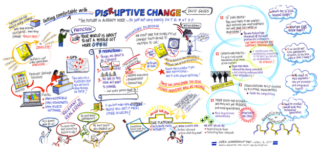
Also posted below is the graphic facilitation created by the very talented Avril Orloff who drew these while I was giving my talk!

Disruptive_Change.legal_

Developing Community Management Metrics and Tools for Mozilla

Background – how we got here

Over the past few years I’ve spent a great deal of time thinking about how we can improve both the efficiency of open source communities and contributors experience. Indeed, this was the focus, in part, of my talk at the Mozilla Summit last summer. For some years Diederik Van Liere – now with the Wikimedia foundation’s metrics team – and I have played with Bugzilla data a great deal to see if we could extract useful information from it. This led us to engaging closely with some members of the Mozilla Thunderbird team – in particular Dan Mosedale who immediately saw its potential and became a collaborator. Then, in November, we connected with Daniel Einspanjer of Mozilla Metrics and began to imagine ways to share data that could create opportunities to improve the participation experience.

Yesterday, thank’s to some amazing work on the part of the Mozilla Metrics team (listed at bottom of the post), we started sharing some of work at the Mozilla all hands. Specifically, Daniel demoed the first of a group of dashboards that describe what is going on in the Mozilla community, and that we hope, can help enable better community management. While these dashboards deal with the Mozilla community in particular I nonetheless hope they will be of interest to a number of open source communities more generally. (presently the link is only available to Mozilla staffers until the dashboard goes through security review – see more below, along with screen shots – you can see a screencast here).

Why – the contributor experience is a key driver for success of open source projects

My own feeling is that within the Mozilla community the products, like Firefox, evolve quickly, but the process by which people work together tends to evolve more slowly. This is a problem. If Mozilla cannot evolve and adopt new approaches with sufficient speed then potential and current contributors may go where the experience is better and, over time, the innovation and release cycle could itself cease to be competitive.

This task is made all the more complicated since Mozilla’s ability to fulfill its mission and compete against larger, better funded competitors depends on its capacity to tap into a large pool of social capital – a corps of paid and unpaid coders whose creativity can foster new features and ideas. Competing at this level requires Mozilla to provide processes and tools that can effectively harness and coordinate that energy at minimal cost to both contributors and the organization.

As I discussed in my Mozilla Summit talk on Community Management, processes that limit the size or potential of our community limit Mozilla. Conversely, making it easier for people to cooperate, collaborate, experiment and play enhances the community’s capacity. Consequently, open source projects should – in my opinion – constantly be looking to reduce or eliminate transactions costs and barriers to cooperation. A good example of this is how Github showed that forking can be a positive social contribution. Yes it made managing the code base easier, but what it really did was empower people. It took something everyone thought would kill open source projects – forking – and made it a powerful tool of experimentation and play.

How – Using data to enable better contributor experience

Unfortunately, it is often hard to quantitatively asses how effectively an open source community manages itself. Our goal is to change that. The hope is that these dashboards – and the data that underlies them – will provide contributors with an enhanced situational awareness of the community so they could improve not just the code base, but the community and its processes. If we can help instigate a faster pace of innovation of change in the processes of Mozilla, then I think this will both make it easier to improve the contributor experience and increase the pace of innovation and change in the software. That’s the hope.

That said, this first effort is a relatively conservative one. We wanted to create a dashboard that would allow us to identify some broader trends in the Mozilla Community, as well as provide tangible, useful data to Module Owners – particularly around identifying contributors who may be participating less frequently.


This dashboard is primarily designed to serve two purposes. First is to showcase what dashboards could be with the hope of inspiring the Mozilla community members to use it and, more importantly, to inspire them to build their own. The second reason was to provide module owners with a reliable tool with which to more effective manage their part of the community.  So what are some of the ways I hope this dashboard might be helpful? One important feature is the ability to sort contributors by staff or volunteer. An open source communities volunteer contributors should be a treasured resource. One nice things about this dashboard is that you can not only see just volunteers, but you can get a quick sense of those who haven’t submitted a patch in a while.

In the picture below I de-selected all Mozilla employees so that we are only looking at volunteer contributors. Using this view we can see who are volunteers who are starting to participate less – note the red circle marked “everything okay?” A good community manager might send these people an email asking if everything is okay. Maybe they are moving on, or maybe they just had a baby (and so are busy with a totally different type of patch – diapers), but maybe they had a bad experience and are frustrated, or a bunch of code is stuck in review. These are things we would want to know, and know quickly, as losing these contributors would be bad. In addition, we can also see who are the emerging power contributors – they might be people we want to mentor, or connect with mentors in order to solidify their positive association with our community and speed up their development. In my view, this should be core responsibilities of community managers and this dashboard makes it much easier to execute on these opportunities.

main-dasboard-notes
Below you can see how zooming in more closely allows you to see trends for contributors over time. Again, sometimes large changes or shifts are for reasons we know of (they were working on features for a big release and its shipped) but where we don’t know the reasons maybe we should pick up the phone or email this person to check to see if everything is okay.

user-dashboard-notes

Again, if this contributor had a negative experience and was drifting away from the community – wouldn’t we want to know before they silently disappeared and moved on? This is in part the goal.

Some of you may also like the fact that you can dive a little deeper by clicking on a user to see what specific patches that user has worked on (see below).

User-deep-dive1

Again, these are early days. My hope is that other dashboards will provide still more windows into the community and its processes so as to show us where there are bottlenecks and high transaction costs.

Some of the features we’d like to add to this or other dashboards include:

  • a code-review dashboard that would show how long contributors have been waiting for code-review, and how long before their patches get pushed. This could be a powerful way to identify how to streamline processes and make the experience of participating in open source communities better for users.
  • a semantic analysis of bugzilla discussion threads. This could allow us to flag threads that have become unwieldy or where people are behaving inappropriately so that module owners can better moderate or problem solve them
  • a dashboard that, based on your past bugs and some basic attributes (e.g. skillsets) informs newbies and experienced contributors which outstanding bugs could most use their expertise
  • Ultimately I’d like to see at least 3 core dashboards – one for contributors, one for module owners and one for overall projects – emerge and, as well as user generated dashboards developed using Mozilla metrics data.
  • Access to all the data in Bugzilla so the contributors, module owners, researchers and others can build their own dashboards – they know what they need better than we do

What’s Next – How Do I Get To Access it and how can I contribute

Great questions.

At the moment the dashboard is going through security review which it must complete before being accessible. Our hope is that this will be complete by the end of Q2 (June).

More importantly, we’d love to hear from contributors, developers and other interested users. We have a standing weekly call every other Friday at 9am PST where we discuss development issues with this and the forthcoming code-review dashboard, contributors needs and wanted features, as well as use cases. If you are interested in participating on these calls please either let me know, or join the Mozilla Community Metrics Google group.

Again, a huge shout out is deserved by Daniel Einspanjer and the Mozilla Metrics team. Here is a list of contributors both so people know who they are but also in case anyone has question about specific aspects of the dashboard:
Pedro Alves – Team Lead
Paula Clemente – Dashboard implementor
Nuno Moreira – UX designer
Maria Roldan – Data Extraction
Nelson Sousa – Dashboard implementor
City of Vancouver Wins Top Innovator Award from BC Business

To be clear, this is not top innovator among governments, this is top innovator among all organizations – for-profit, non-profit and government – in the province.

You can see the award write up here.

As the article states, Vancouver Open-Data initiative “floored the [judging] panel.” Indeed, one panellist stated: “I have never seen a municipality open to new ideas in my life. When was the last time any level of government said, Here are our books; fill your boots?”

Back in October BC Business asked me to write a think piece explaining open data, I ended up penning this piece entitled “The Difference Data Makes”. It fantastic to see the business community recognizing the potential of open data and how it could transform both the way government works, and the opportunities it poses for the private and non-profit organizations as well as citizens.

It’s a great data for the City of Vancouver and for Open Data.

Calgary Launches Business Plan and Budget App

So this is interesting. The City of Calgary has launched a Business Plan & Budget app for free from iTunes.

It’s a smart move as it creates an easy, “one button” option for citizens to participate in and learn about the city’s financial planning process. You can read (a tiny bit) more at the City of Calgary’s blog.

Looking more closely at the app, it doesn’t offer a huge amount but don’t dismiss it too quickly. Consolidating all the information into a single place and making it available to people on the go is a great starting point. Secondly, it is worth remembering that this is just a starting point – there is obviously lots to be learned about how to engage citizens online – especially using mobile technology. If this is done right, Calgary will be learning these lessons first, which means their 2nd and 3rd generation versions of the app and the process will be more sophisticated while others are left catching up (think of Apple and the iPad).

So while the app is fairly light on features today… I can imagine a future where it becomes significantly more engaging and comprehensive, using open data on the data and city services to show maps of where and how money is spent, as well as post reminders for in person meet ups, tours of facilities, and dial in townhall meetings. The best way to get to these more advanced features is to experiment with getting the lighter features right today. The challenge for Calgary on this front is that it seems to have no plans for sharing much data with the public (that I’ve heard of), it’s open data portal has few offerings and its design is sorely lacking. Ultimately, if you want to consult citizens on planning and the budget it might be nice to go beyond surveys and share more raw data and information with them, it’s a piece of the puzzle I think will be essential. This is something no city seems to be tackling with any gusto and, along with crime data, is emerging as a serious litmus test of a city’s intention to be transparent.
The possibilities that Calgary’s consultation app presents are exciting – and again it is early days – so it will be interesting if developers in Calgary and elsewhere can begin to figuring out how to easily extend and enhance this type of approach. Moreover, it’s nice to see a city venturing out and experimenting with this technology, I hope other cities will not just watch, but start experiments of their own, it’s the best way to learn.


Become an IDEO.org Resident

This looks quite interesting.

IDEO, an organization known for bringing spurring innovation, creative thinking and user-friendly design, is looking to focus on the social sector. As part of this effort they are going to be hiring a number of residents to use IDEO’s approach and methodology to focus on pressing social problems around the world. IDEO’s an organization I’ve a lot of time and respect for, certainly somewhere I think it would have been amazing to spend a summer in college or a few years afterwards.

Here’s two snippets from their website:

We’re launching IDEO.org to spread human-centered design through the social sector and improve the lives of people in low-income communities across the globe. IDEO.org is starting this September and looking for its first class of residents to be part of the team. Build empathy, generate ideas, prototype concepts, deliver solutions. Join us!

and

Through the course of 11 months, residents will work on poverty related challenges covering an array of topics – such as, agriculture, gender equity, financial services, health, and water and sanitation. Example projects include working with a microfinance institution in Kenya to create new ways for low-income customers to save, supporting a small Indian start-up to design a low-cost electricity system, or partnering with a domestic healthcare non-profit to bring birth control options to low-income women in the U.S.

Residents will be based in San Francisco, but will spend significant time traveling and in the field. Candidates should have an openness to other cultures and lifestyles and will be expected to be self-reliant and thrive in a start-up environment.

You can read more here. Definitely an opportunity worth checking out.

Access to Information is Fatally Broken… You Just Don’t Know it Yet

I’ve been doing a lot of thinking about access to information, and am working on a longer analysis, but in the short term I wanted to share two graphs – graphs that outline why Access to Information (Freedom of Information in the United States) is unsustainable and will, eventually, need to be radically rethought.

First, this analysis is made possible by the enormous generosity of the Canadian Federal Information Commissioners Office which several weeks ago sent me a tremendous amount of useful data regarding access to information requests over the past 15 years at the Treasury Board Secretariat (TBS).

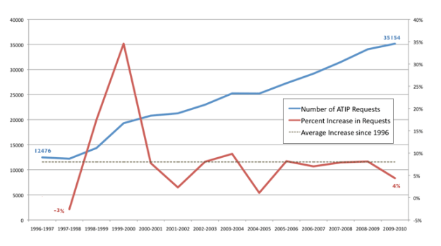
The first figure I created shows both the absolute number of Access to Information Requests (ATIP) since 1996 as well as the running year on year percentage increase. The dotted line represents the average percentage increase over this time. As you can see the number of ATIP requests has almost tripled in this time period. This is very significant growth – the kind you’d want to see in a well run company. Alas, for those processing ATIP requests, I suspect it represents a significant headache.

That’s because, of course, such growth is likely unmanageable. It might be manageable if say, the costs of handling each requests was dropping rapidly. If such efficiencies were being wrestled out of the system of routing and sorting requests then we could simply ignore the chart above. Sadly, as the next chart I created demonstrates this is not the case.

ATIPcosts

In fact the costs of managing these transactions has not tripled. It has more than quadrupled. This means that not only are the number of transactions increasing at about 8% a year, the cost of fulfilling each of those transactions is itself rising at a rate above inflation.

Now remember, I’m not event talking about the effectiveness of ATIP. I’m not talking about how quickly requests are turned around (as the Information Commissioner has discussed, it is broadly getting worse) nor am I discussing less information is being restricted (it’s not, things are getting worse). These are important – and difficult to assess – metrics.

I am, instead, merely looking at the economics of ATIP and the situation looks grim. Basically two interrelated problems threaten the current system.

1) As the number of ATIP requests increase, the manpower required to answer them also appears to be increasing. At some point the hours required to fulfill all requests sent to a ministry will equal the total hours of manpower at that ministry’s  disposal. Yes that day may be far off, but they day where it hits some meaningful percentage – say 1%, 3% or 5% of total hours worked at Treasury Board, may not be that far off. That’s a significant drag on efficiency. I recall talking to a foreign service officer who mentioned that during the Afghan prisoner scandal an entire department of foreign service officers – some 60 people in all – were working full time on assessing access to information requests. That’s an enormous amount of time, energy and money.

2) Even more problematic than the number of work hours is the cost. According to the data I received, Access to Information requests costs The Treasury Board $47,196,030 last year. Yes, that’s 47 with a “million” behind it. And remember, this is just one ministry. Multiply that by 25 (let’s pretend that’s the number of ministries, there are actually many more, but I’m trying to be really conservative with my assumptions) and it means last year the government may have spent over $1.175 Billion fulfilling ATIP requests. That is a staggering number. And its growing.

Transparency, apparently, is very, very expensive. At some point, it risks becoming too expensive.

Indeed, ATIP reminds me of healthcare. It’s completely unsustainable, and absolutely necessary.

To be clear, I’m not saying we should get rid of ATIP. That, I believe, to be folly. It is and remains a powerful tool for holding government accountable. Nor do I believe that requesters should pay for ATIP requests as a way to offset costs (like BC Ferries does) – this creates a barrier that punishes the most marginalized and threatened, while enabling only the wealthy or well financed to hold government accountable.

I do think it suggests that governments need to radical rethink how manage ATIP. More importantly I think it suggests that government needs to rethink how it manages information. Open data, digital documents are all part of a strategy that, I hope, can lighten the load. I’ve also felt that if/as government’s move their work onto online platforms like GCPEDIA, we should simply make non-classified pages open to the public on something like a 5 year timeline. This could also help reduce requests.

I’ve more ideas, but at its core we need a system rethink. ATIP is broken. You may not know it yet, but it is. The question is, what are we going to do before it peels off the cliff? Can we invent something new and better in time?

The Canadian Election – Conservatives put Harper's Reputation on the line

Sadly, not a lot of issues of come up so far in the Canadian election. Rather than talk ideas or about the challenges confronting the country we’ve been mired in a debate about one thing: coalition governments.

On the surface, as John Ibbitson points out, this has been a win for Stephen Harper. But I’m not so sure it will remain that way.

I’ve always felt that Harper’s greatest strength has been his perceived integrity. Canadians don’t particularly like Stephen Harper – nobody wants to have him over or to sit down for a beer with him. And many believe he is overly thuggish and ruthless. But most have come to trust him. But now, with Giles Duceppe running around waiving a signed letter between him, Harper and Layton, and Layton talking about how a Conservative-NDP-Block coalition was “on the table” the hypocrisy of the coalition argument, could be slowly eroding Harper’s brand. Combine it with the unwillingness of the Conservative government to disclose the real price of new fighter jets and the crime bill/new prisons and the mix could become toxic.

The flip side of the problem is that no one really cares for Ignatieff either. So getting that message to stick won’t be easy – but it’s probably the best chance the Liberals have had in a number of years with Mr. Harper. Indeed, on my flight to Toronto yesterday I asked 2 women sitting next to me what they thought of the election and they both said – “anyone but Harper” even though they thought “they were all pigs, but let’s give a new pig a chance.” Hardly flattering words for anyone, (and definitely not a representative sample) but harsh indictment of our politicians and potentially an ill omen for the governing party.

Finally, the one exception I’ve seen to the non-issue based campaign was out west where Jack Layton hammered on the HST issue. I thought this was an interesting strategy. From what I can tell living in BC most residents associate the HST decision with the provincial, not federal government. Moreover the anger of the tax has clearly waned. As Vaughn Palmer’s recent article “Recall campaigns test notion that any publicity is good publicity” outlines the issue has lost traction among the public. If the NDP can reignite and exploit it I’ll be impressed. But the strategy is not without risk, given people appear to have moved Layton risks seeming behind the times, and trying to exploit an issue for crass political gain, rather than addressing something that really worries BCers. Will be interesting to see if it the HST issue sizzles, fizzles or implodes.

Election Mashup!

Since we are, apparently, heading into an election up here in Canada, I thought it would be great time to share this fantastic website my friend Diederik Van Liere recently pointed out to me.

The site, created by Montreal developer Cedric Sam, is a mashup of 2008 federal election and polling data, federal open data from the Geogratis website and Google Earth. It allows users to see how support for candidates was distributed within ridings. Something any political junkie could enjoy.

You can read more about the project on Cedric’s blog. Here’s his description:

I used cartographic data from the Geogratis.gc.ca website. I imported the Shapefiles to a PostgreSQL database with Postgis. Then, I processed results by polling divisions from the 2008 election, data available on the Elections Canada website. It was put in a separate table on the same database. A custom program in Python using the very handy libkml (a code library developed and supported by Google) took the data and outputted pretty KML code. It was packed as a KMZ and uploaded to my webspace. [E-mail me, if you want to exchange ideas on the code].

I of course love the fact that Cedric, like many great hackers I meet, is always keen to work with others to make the code better or explore how it might be enhanced.

As I now live in Vancouver Centre I obviously couldn’t resist pulling it up. Here’s a screen shot… but I encourage you to check out the site yourself!

Screen-shot-2011-03-23-at-11.59.48-PM

New Canadian Award on Transparency: Grace-Pépin Access to Information Award

Last week I received an email from the Information Commissioner of Canada who, in collaboration with her provincial and territorial counterparts, has announced the creation of the Grace-Pépin Access to Information Award. If you know someone you think might be deserving of nomination there are more details here, including access to the nomination document.

Below is a blurb the office sent me promoting what I believe is a noteworthy award.

Do you take any opportunity to promote access to information? Do you spend your free time developing tools that facilitate access to information? Do you regularly ask for information under the Access to Information Act? Do your activities require public institutions to comply with policies that optimize transparency? Or, do you know someone who fits the above description?

If you answered yes to one of these questions, if you are involved in any other activities that promote access to information and increase government transparency and accountability, or if you know someone who does, Canada’s federal, provincial and territorial Access to Information and Privacy Commissioners want to recognize these efforts and invite you to submit a nomination to the first-ever Grace-Pépin Access to Information Award!

The Grace-Pépin Award was introduced on September 29 by the federal, provincial and territorial Access to Information and Privacy Commissioners. Presented in memory of John Grace, former Information Commissioner of Canada, and Marcel Pépin, president and founder of the Commission d’accès à l’information du Québec, the award recognizes those who promote access to information principles in Canada.

For more information on the Grace-Pépin Access to Information Award, visit the section about the award on the official Right to Know Web site.

Game Theory: Coalition, Libya, Gaddafi and the exit strategy

Great question Andrew – one that deserves answering.

Here’s my quick assessment. My guess is that the intention of the military action is to give Gaddafi alternatives to fighting. The goal of the no-fly zone and other military activities is designed to bring about a stalemate in the Libyan conflict. It’s goal is to provide the rebels with a clear safe haven which they can defend and sustain themselves. This fact, over time, would foster circumstances by which a negotiated agreement (or internationally mediated agreement) between the Libyan government and the rebels would be seen as necessary by both parties. This could, of course, come about with (or without) Gaddafi’s endorsement – but it would leave him some leverage if he chose to go down this path. Indeed, this political negotiated outcome is an explicit goal of the UN resolution. Moreover, the removal of Gaddafi is not called for. There is a wonderful analysis of the resolution on the BBC website, I’ve extracted the relevant parts below:

Screen-shot-2011-03-20-at-4.48.03-PM

The stalemate outcome analysis also feels plausible given it is hard to imagine the Libyan rebels have either the equipment, training, resources and resolve to topple the Libyan government, with or without air support. Occupying vast swaths of the country may simply be sufficient for the rebels to achieve their goals – to force Gaddafi to accept he can no longer rule the country alone.

So in short, Gaddafi has as simple choice. He can fight and try to win outright (or gain enough leverage so as to create a negotiated outcome that would achieve the same outcome as winning). This has the benefit of huge upside if he wins (with disastrous outcomes from the west – expect some retaliatory terrorism) but it also has more dramatic downsides. If he loses, a complete loss of power, death and/or imprisonment all seem very likely. So this is a high stakes path.

Alternatively, he can choose to negotiate. This route has more ambiguity, something that presents a risk in of itself (a reason why the back channels will matter so much – see below). Here the upsides and downsides are slightly less extreme, although there is a possibility of an outright “win” for Gaddafi is not off the table completely.

Given these choices it wouldn’t be inconceivable for Gaddafi to choose to fight at first to test the resolve of the Allies and the rebels (something we are seeing now) and, should that not work (which it probably won’t, but could) he can always change gears and retreat into a stalemate negotiation and put forward offers that attempt to fracture the rebel coalition. If he can do that, he could still win back enough support to retake the country, find some way to influence the next government, or at worst, be forced to retire.

I’ve tried to sum all this up on a choice matrix below. The sum of it is, the top lefthand outcome seemed a certain outcome a few days ago. Now the allies are forcing the right column back into the picture. Have downsides down the left become significant enough? And the upsides or exit strategies for Gaddafi on the right certain enough to chance the calculus? That’s really the question – but I do think it remains a possibility.

david-eaves-gaddafi-analysis

There are, of course, at least two other parts of the puzzle that need to be in place to ensure that Gaddafi isn’t forced into fighting.

1. Someone would need to back channel to him the allies intentions: that the UN resolution is designed only to force a stalemate, not oust the current government. It might be logical for Gaddafi to then try to continue fighting and see if he can win despite the airstrikes (as this would maximize his leverage) and, he can always choose to back down later.

2. The western allies and the rebels would need to not interpret the retreat or adoption of a defensive posture by Gaddafi forces as signs of imminent collapse and try to press the advantage.

Obviously I do not know if condition number 1 is in place. In regards to condition number 2, this is also unclear, although I suspect the risks are relatively low. The UN resolution would appear to suggest this isn’t as possible but maybe the biggest unknown is France, which appears unusually keen for battle. The worst case scenario here is that Sarkozy sees the conflict as a way to establish is “presidentialness” in the lead up to an election and so seeks to exploit it, dragging the rebels, and the rest of the allies down a path that needn’t be trodden. But even here, the likelihood feels relatively low.

Of course, there are always thousands of other variables and I’m sure there are more than a few holes to poke in this analysis (I’m all ears for those who want to take a stab – would be great to hear more), but hope this is a helpful attempt to answer that important question. If the only choice you give someone is to fight, expect a fight. And it isn’t clear that we have the resources or stomach to fight back to the bitter end, so I hope someone in Paris or Washington DC has thought this through from this perspective.