Category Archives: commentary

The State of Open Data 2011

What is the state of the open data movement? Yesterday, during my opening keynote at the Open Government Data Camp (held this year in Warsaw, Poland) I sought to follow up on my talk from last year’s conference. Here’s my take of where we are today (I’ll post/link to a video of the talk as soon as the Open Knowledge Foundation makes it available).

Successes of the Past Year: Crossing the Chasm

1. More Open Data Portals

One of the things that has been amazing to witness in 2011 is the veritable explosion of Open Data portals around the world. Today there are well over 50 government data catalogs with more and more being added. The most notable of these was probably the Kenyan Open Data catalog which shows how far, and wide, the open data movement has grown.

2. Better Understanding and More Demand

The things about all these portals is that they are the result of a larger shift. Specifically, more and more government officials are curious about what open data is. This is not to say that understanding has radically shifted, but many people in government (and in politics) now know the term, believe there is something interesting going on in this space, and want to learn more. Consequently, in a growing number of places there is less and less headwind against us. Rather than screaming from the rooftops, we are increasingly being invited in the front door.

3. More Experimentation

Finally, what’s also exciting is the increased experimentation in the open data space. The number of companies and organizations trying to engage open data users is growing. ScraperWiki, the DataHub, BuzzData, Socrata, Visua.ly, are some of the products and resources that have emerged out of the open data space. And the types of research and projects that are emerging – the tracking of the Icelandic volcano eruptions, the emergence of hacks and hackers, micro projects (like my own Recollect.net) and the research showing that open data could be generating savings of £8.5 million a year to governments in the Greater Manchester area, is deeply encouraging.

The Current State: An Inflection Point

The exciting thing about open data is that increasingly we are helping people – public servants, politicians, business owners and citizens imagine a different future, one that is more open, efficient and engaging. Our impact is still limited, but the journey is still in its early days. More importantly, thanks to success (number 2 above) our role is changing. So what does this mean for the movement right now?

Externally to the movement, the work we are doing is only getting more relevant. We are in an era of institution failure. From the Tea Party to Occupy Wall St. there is a recognition that our institutions no longer sufficiently serve us. Open data can’t solve this problem, but it is part of the solution. The challenge of the old order and the institutions it fostered is that its organizing principle is built around the management (control) of processes, it’s been about the application of the industrial production model to government services. This means it can only move so fast, and because of its strong control orientation, can only allow for so much creativity (and adaption). Open data is about putting the free flow of information at the heart of government – both internally and externally – with the goal of increasing government’s metabolism and decentralizing societies’ capacity to respond to problems. Our role is not obvious to the people in those movements, and we should make it clearer.

Internally to the movement, we have another big challenge. We are at a critical inflection point. For years we have been on the outside, yelling that open data matters. But now we are being invited inside. Some of us want to rush in, keen to make advances, others want to hold back, worried about being co-opted. To succeed, it is essential we must become more skilled at walking this difficult line: engaging with governments and helping them make the right decisions, while not being co-opted or sacrificing our principles. Choosing to not engage would, in my opinion, be to abscond from our responsibility as citizens and open data activists. This is a difficult transition, but it will be made easier if we at least acknowledge it, and support one another in it.

Our Core Challenges: What’s next

Looking across the open data space, my own feeling is that there are three core challenges that are facing the open data movement that threaten to compromise all the successes we’ve currently enjoyed.

1. The Compliance Trap

One key risk for open data is that all our work ends up being framed as a transparency initiative and thus making data available is reduced to being a compliance issue for government departments. If this is how our universe is framed I suspect in 5-10 years governments, eager to save money and cut some services, will choose to cut open data portals as a cost saving initiative.

Our goal is not to become a compliance issue. Our goal is to make governments understand that they are data management organizations and that they need to manage their data assets with the same rigour with which they manage physical assets like roads and bridges. We are as much about data governance as we are open data. This means we need to have a vision for government, one where data becomes a layer of the government architecture. Our goal is to make data platform one that not only citizens outside of government can build on, but one that government reconstructs its policy apparatus as well as its IT systems at top of. Achieving this will ensure that open data gets hardwired right into government and so cannot be easily shut down.

2. Data Schemas

This year, in the lead up to the Open Data Camp, the Open Knowledge Foundation created a map of open data portals from around the world. This was fun to look at, and I think should be the last time we do it.

We are getting to a point where the number of data portals is becoming less and less relevant. Getting more portals isn’t going to enable open data to scale more. What is going to allow us to scale is establishing common schemas for data sets that enable them to work across jurisdictions. The single most widely used open government data set is transit data, which because it has been standardized by the GTFS is available across hundreds of jurisdictions. This standardization has not only put the data into google maps (generating millions of uses everyday) but has also led to an explosion of transit apps around the world. Common standards will let us scale. We cannot forget this.

So let’s stop mapping open data portals, and start mapping datasets that adhere to common schemas. Given that open data is increasingly looked upon favourably by governments, creating these schemas is, I believe, now the central challenge to the open data movement.

3. Broadening the Movement

I’m impressed by the hundreds and hundreds of people here at the Open Data Camp in Warsaw. It is fun to be able to recognize so many of the faces here, the problem is that I can recognize too many of them. We need to grow this movement. There is a risk that we will become complacent, that we’ll enjoy the movement we’ve created and, more importantly, our roles within it. If that happens we are in trouble. Despite our successes we are far from reaching critical mass.

The simple question I have for us is: Where is the United Way, Google, Microsoft, the Salvation Army, Oxfam, and Greenpeace? We’ll know were are making progress when companies – large and small – as well as non-profits – start understanding how open government data can change their world for the better and so want to help us advance the cause.

Each of us needs to go out and start engaging these types of organizations and helping them see this new world and the potential it creates for them to make money or advance their own issues. The more we can embed ourselves into other’s networks, the more allies we will recruit and the stronger we will be.

 

Brain Candy – Great Quotes from Yesterday

I’m in San Francisco to co-chair the Code for America Summit this week, so lots going on, and some deep blog posts in the works. But first. Fun! Here are some of my favourite quotes I stumbled upon or heard in the last 24 hours.

“The 4-Hour Body” reads as if The New England Journal of Medicine had been hijacked by the editors of the SkyMall catalog.

Dwight Garner, in the New York Times review of the Four Hour Body by Timothy Ferriss

The entire review is pure genius. Definitely worth reading.

But more quotes await!

“Micro-managing isn’t that third thing that Amazon does better than us, by the way. I mean, yeah, they micro-manage really well, but I wouldn’t list it as a strength or anything. I’m just trying to set the context here, to help you understand what happened. We’re talking about a guy [Jeff Bezos] who in all seriousness has said on many public occasions that people should be paying him to work at Amazon. He hands out little yellow stickies with his name on them, reminding people “who runs the company” when they disagree with him. The guy is a regular… well, Steve Jobs, I guess. Except without the fashion or design sense. Bezos is super smart; don’t get me wrong. He just makes ordinary control freaks look like stoned hippies.”

Steve Yegge in a now no longer public but still accessible assessment of why Google doesn’t get platforms.

The broader read is fantastic, but this quote – mentioned to me by a friend – I thought was both fun and insightful. There is something to be said for super obsessive bosses. They care about their business. It is worth noting that both Jobs and Bezos founded their companies. A lot of other companies could do with this kind of love and attention – even if, in high doses, it can be totally toxic. It’s a fascinating tension.

So yes, tech and the four hour work week? I must be proximity to the valley… so let’s get away from that.

How about #occupywallst? There is a very interesting analysis of the data behind the We are the 99% tumblr feed over at rortybomb, definitely worth a read. But I was really struck by this quote about the nature of the demands:

The people in the tumblr aren’t demanding to bring democracy into the workplace via large-scale unionization, much less shorter work days and more pay.  They aren’t talking the language of mid-twentieth century liberalism, where everyone puts on blindfolds and cuts slices of pie to share.  The 99% looks too beaten down to demand anything as grand as “fairness” in their distribution of the economy.  There’s no calls for some sort of post-industrial personal fulfillment in their labor – very few even invoke the idea that a job should “mean something.”  It’s straight out of antiquity – free us from the bondage of our debts and give us a basic ability to survive.

Ooph. Now that is depressing. But check out his concluding remark.

We have piecemeal, leaky versions of each of these in our current liberal social safety net.  Having collated all these responses, I think completing these projects should be the ultimate goal of the 99%

This is what really strikes me. Here you have a welfare state that isn’t even that big by Western standards but is still not trivial in the resources it consumes, and yet it delivers a pretty crappy outcome to a huge number of citizens. It may be that enough funding from the wealthy restores that system and makes it work. But the financial crises in Europe would seem to suggest otherwise. For many, especially in America, the status quo is unacceptable, and the ability to go back may no longer exist. So until we start thinking about what the future looks like, one free of the systems of the past, we’re probably in trouble.

But any effort here is going to run into a pretty serious brick wall when it comes to coalition building. Consider this amazing line from this Change.org petition:

Rhee uses Change.org to post deceptively worded petitions with such titles as: “Join the Fight to Save Great Teachers” and “Pay Effective Teachers What They Deserve.” When you delve into it, she’s working to weaken unions and institute merit pay for teachers. These are insidious, corporate, anti-progressive reforms. Change.org should not be participating in Rhee’s union busting.

Merit pay is an insidious, corporate, anti-progressive reform? You have to be pretty far out on the left to believe that. Indeed, the notion of merit sat at the heart of the progressive revolution. Now I’m no fan of Rhee, but I’m also a believer that good work should be rewarded and, well, bad work should be punished. That isn’t saying your pay should be linked to test scores, but it also doesn’t mean it shouldn’t be linked to nothing other than tenure. If that is union busting, then the progressive movement it totally dead. This is why I think progressive reform is stopped dead in its tracks. The traditional left wants to defend the status quo of government (while happily attacking the equally problematic status quo of wall st.) while I suspect others, many of whom are sympathetic to the #occupywallst message, are actually equally uncomfortable with the status quo in both the public and private sphere.

This is bad news for those of us who don’t want to return to the Gilded Age. There may not be a coalition that can counter the conservatives on the left and the right. Maybe there needs to be a collapse of this complex system before there can be a rebuilding. It’s a pretty depressing and sobering thought.

Okay. so, you got suckered in by a few fun quotes only to find yourself in the serious world of protest politics. Sorry about that, but that’s the kind of technology fueled, politically driven 24 hours its been.

Hope to see you tomorrow…

The Geopolitics of the Open Government Partnership: the beginning of Open vs. Closed

Aside from one or two notable exceptions, there hasn’t been a ton of press about the Open Government Partnership (OGP). This is hardly surprising. The press likes to talk about corruption and bad government, people getting together to talk about actually address these things in far less sexy.

But even where good coverage exists analysts and journalists are, I think, misunderstanding the nature of the partnership and its broader implications should it take hold. Presently it is generally seen as a do good project, one that will help fight corruption and hopefully lead to some better governance (both of which I hope will be true). However, the Open Government Partnership isn’t just about doing good, it has real strategic and geopolitical purposes.

In fact, the OGP is, in part, about a 21st century containment strategy.

For those unfamiliar with 20th century containment, a brief refresher. Containment refers to a strategy outlined by a US diplomat – George Kennan – who while posted in Moscow wrote the famous The Long Telegram in which he outlined the need for a more aggressive policy to deal with an expansionist post-WWII Soviet Union. He argued that such a policy would need to seek to isolate the USSR politically and strategically, in part by positioning the United States as a example in the world that other countries would want to work with. While discussions of “containment” often focus on its military aspects and the eventual arms race, it was equally influential in prompting the ideological battle between the USA and USSR as they sought to demonstrate whose “system” was superior.

So I repeat. The OGP is part of a 21st century containment policy. And I’d go further, it is a effort to forge a new axis around which America specifically, and a broader democratic camp more generally, may seek to organize allies and rally its camp. It abandons the now outdated free-market/democratic vs. state-controlled/communist axis in favour of a more subtle, but more appropriate, open vs. closed.

The former axis makes little sense in a world where authoritarian governments often embrace (quasi) free-market to reign, and even have some of the basic the trappings of a democracy. The Open Government Partnership is part of an effort to redefine and shift the goal posts around what makes for a free-market democracy. Elections and a market place clearly no longer suffice and the OGP essentially sets a new bar in which a state must (in theory) allow itself to be transparent enough to provide its citizens with information (and thus power), in short: it is a state can’t simple have some of the trappings of a democracy, it must be democratic and open.

But that also leaves the larger question. Who is being contained? To find out that answer take a look at the list of OGP participants. And then consider who isn’t, and likely never could be, invited to the party.

OGP members Notably Absent
Albania
Azerbaijan
Brazil
Bulgaria
Canada
Chile
Colombia
Croatia
Czech Republic
Dominican Republic
El Salvador
Estonia
Georgia
Ghana
Guatemala
Honduras
Indonesia
Israel
Italy
Jordon
Kenya
Korea
Latvia
Liberia
Lithuania
Macedonia
Malta
Mexico
Moldova
Mongolia
Montenegro
Netherlands
Norway
Peru
Philippines
Romania
Slovak Republic
South Africa
Spain
Sweden
Tanzania
Turkey
Ukraine
United Kingdom
United States
Uruguay
ChinaIran

Russia

Saudi Arabia

(Indeed much of the middle East)

Pakistan

*India is not part of the OGP but was involved in much of initial work and while it has withdrawn (for domestic political reasons) I suspect it will stay involved tangentially.

So first, what you have here is a group of countries that are broadly democratic. Indeed, if you were going to have a democratic caucus in the United Nations, it might look something like this (there are some players in that list that are struggling, but for them the OGP is another opportunity to consolidate and reinforce the gains they’ve made as well as push for new ones).

In this regards, the OGP should be seen as an effort by the United States and some allies to find some common ground as well as a philosophical touch point that not only separates them from rivals, but that makes their camp more attractive to deal with. It’s no trivial coincidence that on the day of the OGP launch the President announced the United States first fulfilled commitment would be its decision to join the Extractive Industries Transparency Initiative (EITI). The EITI commits the American oil, gas and mining companies to disclose payments made to foreign governments, which would make corruption much more difficult.

This is America essentially signalling to African people and their leaders – do business with us, and we will help prevent corruption in your country. We will let you know if officials get paid off by our corporations. The obvious counter point to this is… the Chinese won’t.

It’s also why Brazil is a co-chair, and the idea was prompted during a meeting with India. This is an effort to bring the most important BRIC countries into the fold.

But even outside the BRICs, the second thing you’ll notice about the list is the number of Latin American, and in particular African countries included. Between the OGP, the fact that the UK is making government transparency a criteria for its foreign aid, and that World Bank is increasingly moving in the same direction, the forces for “open” are laying out one path for development and aid in Africa. One that rewards governance and – ideally – creates opportunities for African citizens. Again, the obvious counter point is… the Chinese won’t.

It may sounds hard to believe but the OGP is much more than a simple pact designed to make heads of state look good. I believe it has real geopolitical aims and may be the first overt, ideological salvo in the what I believe will be the geopolitical axis of Open versus Closed. This is about finding ways to compete for the hearts and minds of the world in a way that China, Russia, Iran and others simple cannot. And, while I agree we can debate the “openness” of the various the signing countries, I like the idea of world in which states compete to be more open. We could do worse.

What Re-Releases of Star Wars can Teach Us About Art and Product Management

The other day I noticed this tweet fly by in the twittersphere


Was this a complaint? In light of the fact the internet was rife with complaints about changes to the movies in the Blue Ray release of the original trilogy, I suspect so. While I do harbor Lucas a small amount of ill will for the disaster that was Star Wars Episodes I, II and III the more I think about his re-releases the more I think he is doing something rather interesting by adopting ideas from the software world, challenging notions of art in Hollywood and striving to constantly keep an old asset relevant. Considering all this, I also think there are lesson here for all of us. So, accepting the fact that half the world out there will think I’m wrong, and the other half will think this is just about extracting money from fans… here are nonetheless some thoughts.

Keeping an old asset relevant

Unlike the rest of Hollywood, I think Lucas should be applauded. Whether you think his updates are good or bad, he is, at least, trying to add value to his products long after they leave the theater. I actually remember enjoying watching one of the updated re-releases and trying to see if I could spot all the differences between the original Star Wars Episode IV (v1.0) and the newer Star Wars Episode IV (v1.1), it was fun…

But Lucas’s updates feel all the more interesting and relevant an experiment given the movie’s genre. There is a real risk that at some point the special effects in Star Wars are simply going to become so dated that the whole things will feel massively campy (some might argue that’s already happened – maybe I’m blinded by nostalgia), but integrating in newer effects might help prolong the movie’s relevance. I’m quite confident that there are lots of children out there who, despite their parents fanatic devotion to original Star Wars trilogy, can’t get over the fact that the special effects feel out of date. Maybe it’s easier for them to engage the movie when they see a little CGI? I’m not saying these releases are necessarily successful in hitting this target, but at least he is trying. There are lots of products (not to mention websites) that I wish the creators had gone back and updated… Sometimes the changes make it worse, but often the product was headed for obsolescence anyway, so the changes kept it relevant.

Learning from the Software World

Of course, if you don’t like the new versions one thing I think Lucas has done that is savvy (and frankly, helps line his pockets) is borrow from the software world and  functionally “version” the first Star Wars Trilogy. Yes, once again the initial release of the Blue Ray dvd will only have changes he is made (maybe it will include the original version as well) but eventually the original “classic” version will be released on DVD. As I outlined above, all this means is that there will be Star Wars Episode IV (v1.0), the late 1990’s Star Wars Episode IV (v1.1) and now the 2011 Star Wars Episode IV (v1.2). However, unlike many software vendors, Lucas is not ultimately forcing anyone to use v1.2. If you want to stick to v1.0, I’m confident it will be released on the format of your choice eventually. It’s like playing some of your favourite video games. Sure Civ V will come along, but that doesn’t mean you can’t play Civ III (or, obviously the best of them all, Alpha Centauri) anymore.

Of course the benefit of this is twofold. First, maybe everybody hates v1.1 and v1.2 (although I bet young fans really don’t care) and so sit around talking about it and cursing Lucas. Of course, this is still a coup. Imagine 30 years later, people are still sitting around talking passionately about your movie? That’s a pretty good outcome. Better still maybe there are Star Wars camps! The v1.0 camp is obviously largest, but I bet you’ll find v1.1 and v1.2 defenders. Now we have hours of endless debate! The fan base continues to be energized! Genius.

Challenging Notions of Art

But I also love that Lucas challenges peoples’ notion movies as art. The danger with the non-oral mediums is that the art itself becomes stale. Why can’t, or shouldn’t a movie evolve in the same way a spoken story might evolve as it is passed down? Why is it that a movie has to stay frozen in time just because it can?

There is a lot of art that we don’t treat that way.

Shakespeare’s Romeo and Juliet (v1.0) can, frankly, no longer be seen, all we watch now are derivative works based on the text we happened to have captured, and even then, who knows how Shakespeare himself actually wanted it to be acted and directed (I’m sure someone is about to tell me I’m wrong on that front). But regardless, none of this has stopped us from enjoying the literally 1000s of Romeo and Juliet remakes that have been made since the bard wrote the “original” (which we all concede was itself derivative).

Even in the movie world we don’t let things lie. Endless remakes are made – sometimes for the worse, sometimes for the better. Isn’t Lucase fundamentally doing the same thing? I’d rather watch a remake with the original Han Solo than without…

Part of the joy of a great story is the ability to retell it. To re-interpret it and to make it relevant to new people. Maybe that is all Lucas wants to do. If you don’t like it, you can always go back to the original. But maybe by evolving his art, Lucas is creating a bigger audience and enabling his story to touch more, or at least new, people. Thinking of George Lucas the artist, I think I respect that.

Smarter Ways to Have School Boards Update Parents

Earlier this month the Vancouver School Board (VSB) released an iPhone app that – helpfully – will use push notifications to inform parents about school holidays, parent interviews, and scheduling disruptions such as snow days. The app is okay, it’s a little clunky to use, and a lot of the data – such as professional days – while helpful in an app, would be even more helpful as an iCal feed parents could subscribe to in their calendars.

That said, the VSB deserves credit for having the vision of developing an app. Positively, the VSB app team hopes to add new features, such as letting parents know about after school activities like concerts, plays and sporting events.

This is a great innovation and without a doubt, other school boards will want apps of their own. The problem is, this is very likely to lead to an enormous amount of waste and duplication. The last thing citizens want is for every school board to be spending $15-50K developing iPhone apps.

Which leads to a broader opportunity for the Minister of Education.

Were I the Education Minister, I’d have my technology team recreate the specs of the VSB app and propose an RFP for it but under an open source license and using phonegap so it would work on both iPhone and Android. In addition, I’d ensure it could offer reminders – like we do at recollect.net – so that people could get email or text messages without a smart phone at all.

I would then propose the ministry cover %60 percent of the development and yearly upkeep costs. The other 40% would be covered by the school boards interested in joining the project. Thus, assuming the app had a development cost of $40K and a yearly upkeep of $5K, if only one school board signed up it would have to pay $16K for the app (a pretty good deal) and $2K a year in upkeep. But if 5 school districts signed up, each would only pay $3.2K in development costs and $400 dollars a year in upkeep costs. Better still, the more that sign up, the cheaper it gets for each of them. I’d also propose a governance model in which those who contribute money for develop would have the right to elect a sub-group to oversee the feature roadmap.

Since the code would be open source other provinces, school districts and private schools could also use the app (although not participate in the development roadmap), and any improvements they made to the code base would be shared back to the benefit of BC school districts.

Of course by signing up to the app project school boards would be committing to ensure their schools shared up to date notifications about the relevant information – probably a best practice that they should be doing anyways. This process work is where the real work lies. However, a simple webform (included in the price) would cover much of the technical side of that problem. Better still the Ministry of Education could offer its infrastructure for hosting and managing any data the school boards wish to collect and share, further reducing costs and, equally important, ensuring the data was standardized across the participating school boards.

So why should the Ministry of Education care?

First, creating new ways to update parents about important events – like when report cards are issued so that parents know to ask for them – helps improve education outcomes. That should probably reason enough, but there are other reasons as well.

Second, it would allow the ministry, and the school boards, to collect some new data: professional day dates, average number of snow days, frequency of emergency disruptions, number of parents in a district interested in these types of notifications. Over time, this data could reveal important information about educational outcomes and be helpful.

But the real benefit would be in both cost savings and in enabling less well resourced school districts to benefit from technological innovation wealthier school districts will likely pursue if left to their own devices. Given there are 59 english school districts in BC, if even half of them spent 30K developing their own iPhone apps, then almost $1M dollars would be collectively spent on software development. By spending $24K, the ministry ensures that this $1M dollars instead gets spent on teachers, resources and schools. Equally important, less tech savvy or well equipped school districts would be able to participate and benefit.

Of course, if the City of Vancouver school district was smart, they’d open source their app, approach the Ministry of Education and offer it as the basis of such a venture. Doing that wouldn’t just make them head of the class, it’d be helping everyone get smarter, faster.

Open Data and New Public Management

This morning I got an email thread pointing to an article by Justin Longo on #Opendata: Digital-Era Governance Thoroughbred or New Public Management Trojan Horse? I’m still digesting it all but wanted to share some initial thoughts.

The article begins with discussion about the benefits of open data but its real goal is to argue how open data is a pawn in a game to revive the New Public Management Reform Agenda:

My hypothesis, based on a small but growing number of examples highlighting political support for open data, is that some advocates—particularly politicians, but not exclusively—are motivated by beliefs (both explicit and unconscious) forged in the New Public Management (NPM) reform agenda.

From this perspective, support for more open data aims at building coalitions of citizen consumers who are encouraged to use open data to expose public service decisions, highlight perceived performance issues, increase competition within the public sector, and strengthen the hand of the citizen as customer.

What I found disappointing is the article’s one dimensional approach to the problem: open data may support a theory/approach to public management disliked by the author, consequently (inferring from the article’s title and tone) it must be bad. This is akin to saying any technology that could be used to advance an approach I don’t support, must be opposed.

In addition, I’d say that the idea of exposing public service decisions, highlighting perceived performance issues, increasing competition within the public sector, and strengthening the hand of the citizen as customer are goals I don’t necessarily oppose, certainly not categorically. Moreover, I would hope such goals are not exclusively the domain of NPM. Do we want a society where government’s performance issues are not highlighted? Or where public service decisions are kept secret?

These are not binary choices. You can support the outcomes highlighted above and simultaneously believe in other approaches to public sector management and/or be agnostic about the size of government. Could open data be used to advance NPM? Possibly (although I’m doubtful). But it definitely can also be used to accomplish a lot of other good and potentially advance other approaches as well. Let’s not conflate a small subset of ways open data can be used or a small subset of its supporters with the entire project and then to lump them all into a single school of thought around public service management.

Moreover, I’ve always argued that the biggest users and benefactors of open data would be government – and in particular the public service. While open data could be used to build “coalitions of citizen consumers who are encouraged to use open data to expose public service decisions” it will also be used by public servants to better understand citizens needs, be more responsive and allocate resources more effectively. Moreover, those “citizen consumers” will probably be effective in helping them achieve this task. The alternative is to have better shared data internally (which will eventually happen), an outcome that might allow the government to achieve these efficiencies but will also radically increase the asymmetry in the relationship between the government and its citizens and worse, between the elites that do have privileged access to this data, and the citizenry (See Taggart below).

So ignoring tangible benefits because of a potential fear feels very problematic. It all takes me back to Kevin Kelly and What Technology Wants… this is an attempt to prevent an incredibly powerful technology because of a threat it poses to how the public sector works. Of course, it presumes that a) you can prevent the technology and b) that not acting will allow the status quo or some other preferred approach to prevail. Again, there are outcomes much, much worse the NPM that are possible (again, I don’t believe that open data leads directly to NPM) and I would argue, indeed likely, given evolving public expectations, demographics, and fiscal constraints.

In this regard, the article sets of up a false choice. Open data is going to reshape all theories of public management. To claim it supports or biases in favour of one outcome is, I think beyond premature. But more importantly, it is to miss the trees for the forest and the much bigger fish we need to fry. The always thoughtful Chris Taggart summed much of this up beautifully in an email thread:

I think the title — making it out to be a choice between a thoroughbred or Trojan Horse — says it all. It’s a false dichotomy, as neither of those are what the open data advocates are suggesting it is, nor do most of us believe that open data is solution to all our problems (far from it — see some of my presentations[1]).

It also seems to offer a choice between New Public Management (which I think Emer Coleman does a fairly good job of illuminating in her paper[2]) and the brave new world of Digital Era Governance, which is also to misunderstand the changes being brought about in society, with or without open government data.
The point is not that open data is the answer to our problem but society’s chance to stay in the game (and even then, the odds are arguably against it). We already have ever increasing numbers of huge closed databases, many made up of largely government data, available to small number of people and companies.
This leads to an asymmetry of power and friction that completely undermines democracy; open data is not a sufficiency to counteract that, but I think it is a requirement.

It’s possible I’ve misunderstood Longo’s article and he is just across the straights at the University of Victoria, so hopefully we can grab a beer and talk it through. But my sense is this article is much more about a political battle between New Public Management and Digital Era Governance in which open data is being used as a pawn. As an advocate, I’m not wholly comfortable with that, as I think it risks misrepresenting it.

Design Matters: Looking at a Re-themed Bugzilla

I’ll be honest. There was a time when I thought design didn’t matter. To my credit, it was a long time ago… but I used to think, if the tool was good enough, the design won’t matter, people will use it cause it is helpful. (This may or may not have influenced some fashion choices earlier in life as well – I’d like to think things have improved – but not everyone may agree it has improved sufficiently).

Being useful may be sufficient (although take a look at the government website at the bottom of this post – it’s a very useful website). But it’s no excuse for not making things easier to use. Especially when you are running an open source community and want to encourage participation and ease people up the learning curve faster.

Hence why I enjoyed recently discovering ActiveState’s implementation of Bugzilla (re-themed by Tara Gibbs). Bugzilla is the software many open source projects use to identify, track and resolve bugs.

Here we have two identical pieces of software (so the “usefulness” is the same) but what makes ActiveState’s version of Bugzilla so nice are a few simple things they’ve done to make it more user friendly (doubly pleased to see them implement some ideas I’d blogged earlier as well – great minds think alike!).

So let’s start with the Mozilla instance of Bugzilla – as this was the one I was used to.

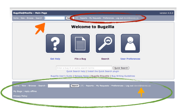
I’ve circled a couple of the key features to zero in on. Let me go through them as I want you to be thinking about them when you look at the ActiveState version:

  • Red circle: Notice that this has a lot of key items in it, but it is lost next to the “search” button, which pulls your attention away
  • Dark orange arrow: the search button! most often you won’t find a search box located here in an application.
  • Green circle: Tons of useful stuff down here, but arranged in one long horizontal list, that makes it hard to find what you’re look for (and another search box!)
  • Light orange arrow: another log out option… didn’t I see that somewhere else as well?

I want to be clear, the Bugzilla team at Mozilla is awesome. Recently hired they are trying to do a ton of stuff and this is not where I’d expect them to start (and they’ve been super responsive to everything I’ve blogged about so I’m a huge fan), I want to flag this because everyone, from software engineers to government officials need to recognize that we rely on good design to make our lives easier, to help with decision fatigue and streamline our work, every day.

Now check out the ActiveState version of the exact same software, but re-designed.

So, my cartoonish circles and arrows are mucking up the design and ascetics of both theses sites, so please forgive that. (I suggest opening them in adjacent tabs – Mozilla here, ActiveState here – so you can see them uninterrupted).

So, a few things:

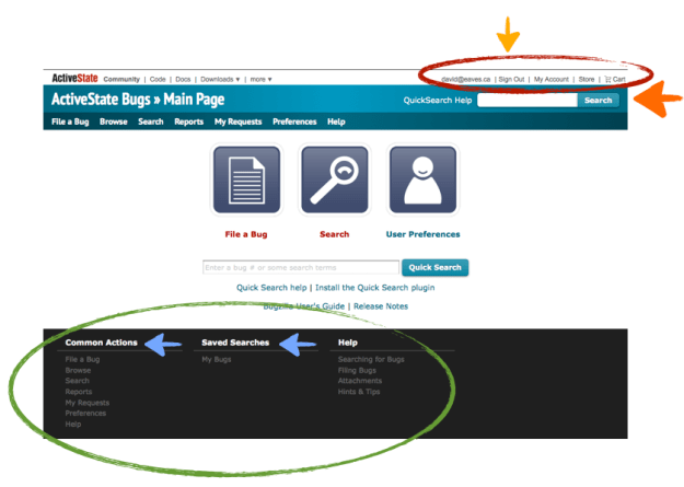
  • Red circle: Now everything to do with the administration of your account is in the top, top right hand corner. This is where Google, Facebook and most websites put this info now, that’s why you’re expecting to find it there!
  • Dark orange arrow: now the search button is in the top right hand corner. Pretty much the same location it appears in Firefox (and safari, IE, chrome, OS X, etc…) and so where users have come to expect it.
  • Green circle: This part really is genius. Did you know there were saved searches in the above version? There are, but the feature didn’t stand out. This theme sorts the users options and displays them vertically within a menu: much, much easier to digest quickly.
  • Light orange arrow: Features appear only once! For example, the sign out and search feature do not appear at the top and bottom. This helps reduce clutter and allows the user to find things more quickly

My point is that a few minor changes can dramatically improve the usability of a website or tool. Is Mozilla’s bugzilla radically worse than ActiveState’s? No, but I definitely prefer ActiveState’s design. Moreover, when you are relying on volunteer contributors and attracting new contributors is something that matters to you, this is an important gateway and so you want it to be as seamless as possible.

What’s interesting is that often it is in the non-profit and government sector that design gets neglected because it is deemed a luxury, or the “substantive” people don’t think design matters and so ignore it.

The results can be disastrous.

I mean, especially if you are in government, then you’ve really got to be advocating for better design. Consider the website below. Remember, this may be the most important citizen facing website in the Canadian government – the one stop shop to find every service you need. It is better than most government website, and yet, you’ve got a site that is still maddeningly difficult to navigate. Where am I supposed to look??? Eyes… being… pulled… in… so… many… directions…

Personally, I think you could solve 80% of the problem with this page just by getting rid of the left hand column and put a search button in the top right hand corner. But I’m supremely confident that would violate some arcane website design rule the government has and so will remain a post for another day…

Why Social Media behind the Government Firewall Matters

This comment, posted four months ago to my blog by Jesse G. in response to this post on GCPEDIA, remains one of the favorite comments posted to my blog ever. This is a public servant who understands the future and is trying to live it. I’ve literally had this comment sitting in my inbox because this whole time because I didn’t want to forget about it.

For those opposing to the use of wiki’s social media behind the government firewall this is a must read (of course I’d say it is a must read for those in favour as well). It’s just a small example of how tiny transactions costs are killing government, and how social media can flatten them.

I wish more elements of the Canadian government got it, but despite the success of GCPEDIA and its endorsement by the Clerk there are still a ton of forces pitted against it, from the procurement officers in Public Works who’d rather pay for a bulky expensive alternative that no one will use to middle managers who forbid their staff from using it out of some misdirected fear.

Is GCPEDIA the solution to everything? No. But it is a cheap solution to a lot of problems, indeed I’ll bet its solved more problems per dollar than any other IT solution put forward by the government.

So for the (efficient) future, read on:

Here’s a really untimely comment – GCPEDIA now has over 22,000 registered users and around 11,000 pages of content. Something like 6.5 million pageviews and around .5 million edits. It has ~2,000 visitors a week and around 15,000 pageviews a week. On average, people are using the wiki for around 5.5 minutes per visit. I’m an admin for GCPEDIA and it’s sister tools – GCCONNEX (a professional networking platform built using elgg) and GCForums (a forum build using YAF). Collectively the tools are known as GC2.0.

Anyways, I’m only piping up because I love GCPEDIA so much. For me and for thousand of public servants, it is something we use every day and I cannot emphasize strongly enough how friggin’ awesome it is to have so much knowledge in one place. It’s a great platform for connecting people and knowledge. And it’s changing the way the public service works.

A couple of examples are probably in order. I know one group of around 40 public servants from 20 departments who are collaborating on GCPEDIA to develop a new set of standards for IT. Every step of the project has taken place on GCPEDIA (though I don’t want to imply that the wiki is everything – face-to-face can’t be replaced by wiki), from the initial project planning, through producing deliverables. I’ve watched their pages transform since the day they were first created and I attest that they are really doing some innovative work on the wiki to support their project.

Another example, which is really a thought experiment: Imagine you’re a coop student hired on a 4 month term. Your director has been hearing some buzz about this new thing called Twitter and wants an official account right away. She asks you to find out what other official Twitter accounts are being used across all the other departments and agencies. So you get on the internet, try to track down the contact details for the comms shops of all those departments and agencies, and send an email to ask what accounts they have. Anyone who knows government can imagine that a best case turnaround time for that kind of answer will take at least 24 hours, but probably more like a few days. So you keep making calls and maybe if everything goes perfectly you get 8 responses a day (good luck!). There are a couple hundred departments and agencies so you’re looking at about 100 business days to get a full inventory. But by the time you’ve finished, your research is out of date and no longer valid and your 4 month coop term is over. Now a first year coop student makes about $14.50/hour (sweet gig if you can get it students!), so over a 4 month term that’s about $10,000. Now repeat this process for every single department and agency that wants a twitter account and you can see it’s a staggering cost. Let’s be conservative and say only 25 departments care enough about twitter to do this sort of exercise – you’re talking about $275,000 of research. Realistically, there are many more departments that want to get on the twitter bandwagon, but the point still holds.

Anyways, did you know that on GCPEDIA there is a crowd-sourced page with hundreds of contributors that lists all of the official GC twitter accounts? One source is kept up to date through contributions of users that literally take a few seconds to make. The savings are enormous – and this is just one page.

Because I know GCPEDIA’s content so well, I can point anyone to almost any piece of information they want to know – or, because GCPEDIA is also a social platform, if I can’t find the info you’re looking for, I can at least find the person who is the expert. I am not an auditor, but I can tell you exactly where to go for the audit policies and frameworks, resources and tools, experts and communities of practice, and pictures of a bunch of internal auditors clowning around during National Public Service Week. There is tremendous value in this – my service as an information “wayfinder” has won me a few fans.

Final point before I stop – a couple of weeks ago, I was doing a presentation to a manager’s leadership network about unconferences. I made three pages – one on the topic of unconferences, one on the facilitation method for building the unconference agenda, and one that is a practical 12-step guide for anyone who wants to plan and organize their own (this last was a group effort with my co-organizers of Collaborative Culture Camp). Instead of preparing a powerpoint and handouts I brought the page up on the projector. I encouraged everyone to check the pages out and to contribute their thoughts and ideas about how they could apply them to their own work. I asked them to improve the pages if they could. But the real value is that instead of me showing up, doing my bit, and then vanishing into the ether I left a valuable information resource behind that other GCPEDIA users will find, use, and improve (maybe because they are searching for unconferences, or maybe it’s just serendipity). Either way, when public servants begin to change how they think of their role in government – not just as employees of x department, but as an integral person in the greater-whole; not in terms of “information is power”, but rather the power of sharing information; not as cogs in the machine, but as responsible change agents working to bring collaborative culture to government – there is a huge benefit for Canadian citizens, whether the wiki is behind a firewall or not.

p.s. To Stephane’s point about approval processes – I confront resistance frequently when I am presenting about GCPEDIA, but there is always someone who “gets” it. Some departments are indeed trying to prevent employees from posting to GCPEDIA – but it isn’t widespread. Even the most security-conscious departments are using the wiki. And Wayne Wouters, the Clerk of the Privy Council has been explicit in his support of the wiki, going so far as to say that no one requires manager’s approval to use the wiki. I hope that if anyone has a boss that says, “You can’t use GCPEDIA” that that employee plops down the latest PS Renewal Action Plan on his desk and says, “You’ve got a lot to learn”.

Open Source Data Journalism – Happening now at Buzz Data

(there is a section on this topic focused on governments below)

A hint of how social data could change journalism

Anyone who’s heard me speak in the last 6 months knows I’m excited about BuzzData. This week, while still in limited access beta, the site is showing hints its potential – and it still has only a few hundred users.

First, what is BuzzData? It’s a website that allows data to be easily uploaded and shared among any number of users. (For hackers – it’s essentially github for data, but more social). It makes it easy for people to copy data sets, tinker with them, share the results back with the original master, mash them up with other data sets, all while engaging with those who care about that data set.

So, what happened? Why is any of this interesting? And what does it have to do with journalism?

Exactly a month ago Svetlana Kovalyova of Reuters had her article – Food prices to remain high, UN warns – re-published in the Globe and Mail.  The piece essentially outlined that food commodities were getting cheaper because of local conditions in a number of regions.

Someone at the Globe and Mail decided to go a step further and upload the data – the annual food price indices from 1990-present – onto the BuzzData site, presumably so they could play around with it. This is nothing complicated, it’s a pretty basic chart. Nonetheless a dozen or so users started “following” the dataset and about 11 days ago, one of them, David Joerg, asked:

The article focused on short-term price movements, but what really blew me away is: 1) how the price of all these agricultural commodities has doubled since 2003 and 2) how sugar has more than TRIPLED since 2003. I have to ask, can anyone explain WHY these prices have gone up so much faster than other prices? Is it all about the price of oil?

He then did a simple visualization of the data.

FoodPrices

In response someone from the Globe and Mail entitled Mason answered:

Hi David… did you create your viz based on the data I posted? I can’t answer your question but clearly your visualization brought it to the forefront. Thanks!

But of course, in a process that mirrors what often happens in the open source community, another “follower” of the data shows up and refines the work of the original commentator. In this case, an Alexander Smith notes:

I added some oil price data to this visualization. As you can see the lines for everything except sugar seem to move more or less with the oil. It would be interesting to do a little regression on this and see how close the actual correlation is.

The first thing to note is that Smith has added data, “mashing in” Oil Price per barrel. So now the data set has been made richer. In addition his graph quite nice as it makes the correlation more visible than the graph by Joerg which only referenced the Oil Price Index. It also becomes apparent, looking at this chart, how much of an outlier sugar really is.

oilandfood

Perhaps some regression is required, but Smith’s graph is pretty compelling. What’s more interesting is not once is the price of oil mentioned in the article as a driver of food commodity prices. So maybe it’s not relevant. But maybe it deserves more investigation – and a significantly better piece, one that would provide better information to the public – could be written in the future. In either case, this discussion, conducted by non-experts simply looking at the data, helped surface some interesting leads.

And therein lies the power of social data.

With even only a handful of users a deeper, better analysis of the story has taken place. Why? Because people are able to access the data and look at it directly. If you’re a follower of Julian Assange of wikileaks, you might call this scientific journalism, maybe it is, maybe it isn’t, but it certainly is a much more transparent way for doing analysis and a potential audience builder – imagine if 100s or 1000s of readers were engaged in the data underlying a story. What would that do to the story? What would that do to journalism? With BuzzData it also becomes less difficult to imagine a data journalists who spends a significant amount of their time in BuzzData working with a community of engaged pro-ams trying to find hidden meaning in data they amass.

Obviously, this back and forth isn’t game changing. No smoking gun has been found. But I think it hints at a larger potential, one that it would be very interesting to see unlocked.

More than Journalism – I’m looking at you government

Of course, it isn’t just media companies that should be paying attention. For years I argued that governments – and especially politicians – interested in open data have an unhealthy appetite for applications. They like the idea of sexy apps on smart phones enabling citizens to do cool things. To be clear, I think apps are cool too. I hope in cities and jurisdictions with open data we see more of them.

But open data isn’t just about apps. It’s about the analysis.

Imagine a city’s budget up on Buzzdata. Imagine, the flow rates of the water or sewage system. Or the inventory of trees. Think of how a community of interested and engaged “followers” could supplement that data, analyze it, visualize it. Maybe they would be able to explain it to others better, to find savings or potential problems, develop new forms of risk assessment.

It would certainly make for an interesting discussion. If 100 or even just 5 new analyses were to emerge, maybe none of them would be helpful, or would provide any insights. But I have my doubts. I suspect it would enrich the public debate.

It could be that the analysis would become as sexy as the apps. And that’s an outcome that would warm this policy wonk’s soul.

How Dirty is Your Data? Greenpeace Wants the Cloud to be Greener

My friends over at Greenpeace recently published an interesting report entitled “How dirty is your data?
A Look at the Energy Choices That Power Cloud Computing
.”

For those who think that cloud computing is an environmentally friendly business, let’s just say… it’s not without its problems.

What’s most interesting is the huge opportunity the cloud presents for changing the energy sector – especially in developing economies. Consider the follow factoids from the report:

  • Data centres to house the explosion of virtual information currently consume 1.5-2% of all global electricity; this is growing at a rate of 12% a year.
  • The IT industry points to cloud computing as the new, green model for our IT infrastructure needs, but few companies provide data that would allow us to objectively evaluate these claims.
  • The technologies of the 21st century are still largely powered by the dirty coal power of the past, with over half of the companies rated herein relying on coal for between 50% and 80% of their energy needs.

The 12% growth rate is astounding. It essentially makes it the fastest growing segment in the energy business – so the choices these companies make around how they power their server farms will dictate what the energy industry invests in. If they are content with coal – we’ll burn more coal. If they demand renewables, we’ll end up investing in renewables and that’s what will end up powering not just server farms, but lots of things. It’s a powerful position big data and the cloud hold in the energy marketplace.

And of course, the report notes that many companies say many of the right things:

“Our main goal at Facebook is to help make the world more open and transparent. We believe that if we want to lead the world in this direction, then we must set an example by running our service in this way.”

– Mark Zuckerberg

But then Facebook is patently not transparent about where its energy comes from, so it is not easy to assess how good or bad they are, or how they are trending.

Indeed it is worth looking at Greenpeace’s Clean Cloud report card to see – just how dirty is your data?

Report-card-cloud

I’d love to see a session at the upcoming (or next year) Strata Big Data Conference on say “How to use Big Data to make Big Data more Green.” Maybe even a competition to that effect if there was some data that could be shared? Or maybe just a session where Greenpeace could present their research and engage the community.

Just a thought. Big data has got some big responsibilities on its shoulders when it comes to the environment. It would be great to see them engage on it.